UX/UI Design
UX/UI Design for Complex Digital Products
I'm a UX/UI designer based in Kathmandu, Nepal. Whether a project is searching for a UX designer to fix a broken flow or a UI designer to bring a system to a product, the work I do covers both, because on most real products the two aren't separable. Getting the structure and logic right (UX) is what makes the interface (UI) actually usable, not just presentable.
Looking for broader product design and strategy work? See my product designer profile.
UX work, not just visual polish
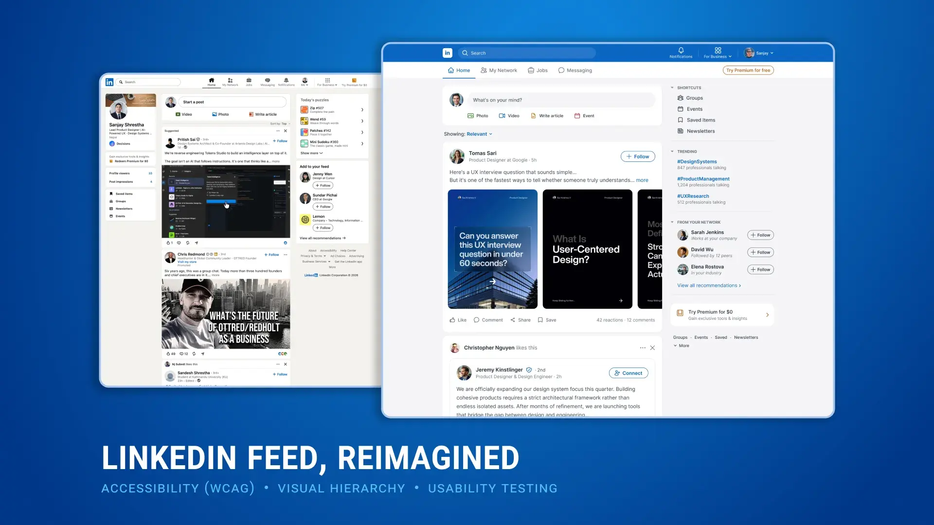
A lot of what gets labeled “UI design” is really just visual styling applied to an existing structure: better colors and spacing on the same flow. That can make a screen look better without making it work better. My process starts one layer earlier: understanding why users get stuck, mapping the information structure that's causing the confusion, then designing the interface on top of a structure that's already been tested and validated. The LinkedIn feed audit below is a direct example: fourteen findings, and none of them were about color.
How I Work
My UX Process
01
Research & Usability Testing
Starting with the people who use the product, not the screen. Interviews, competitive audits and moderated usability tests surface what’s actually breaking, before any redesign decision gets made.
02
Information Architecture
Mapping how content and features should be organized so the structure matches how people actually think about the task, not how the org chart happens to be arranged.
03
Interaction & Interface Design
Designing the flows, states and visual system together: hierarchy, spacing and typography aren’t decoration. They’re how a screen tells someone what matters and what to do next.
04
Accessibility
Checking contrast, focus order, semantics and screen-reader behavior as part of the design, not a QA pass bolted on afterward. Built to WCAG standards by default.
05
Prototyping
Building interactive prototypes real enough to test, validating a flow with actual users before it costs engineering time to build the wrong thing.
Evidence
UX Process in Practice
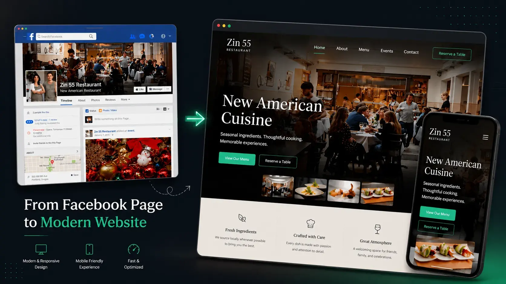
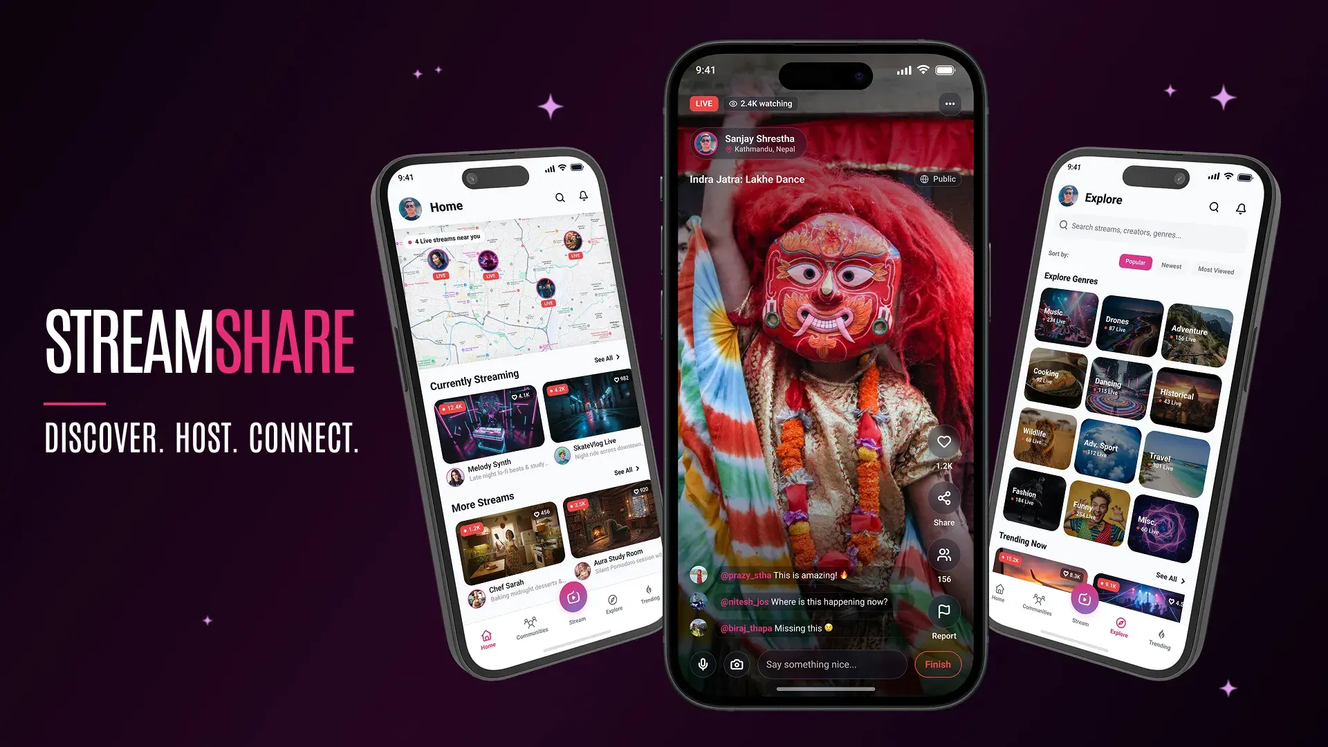
Three projects that show research, structure and interface decisions working together: a UX audit that rebuilt LinkedIn's feed hierarchy around one rule, an onboarding redesign for Pagevamp that lifted signups 30% by fixing a broken first five minutes, and a Streamshare concept built on five real user interviews rather than assumption.
Have a UX problem worth solving properly?
Whether it's a confusing flow, an inconsistent interface, or a product that needs research before it needs a redesign, I'd love to hear about it.
Get in Touch