SaaS · 2018
Pagevamp Onboarding Redesign: Fixing the First Five Minutes
A UX case study on redesigning SaaS onboarding for a one-click website builder — fixing five drop-off points and lifting free trial signups 30%+.
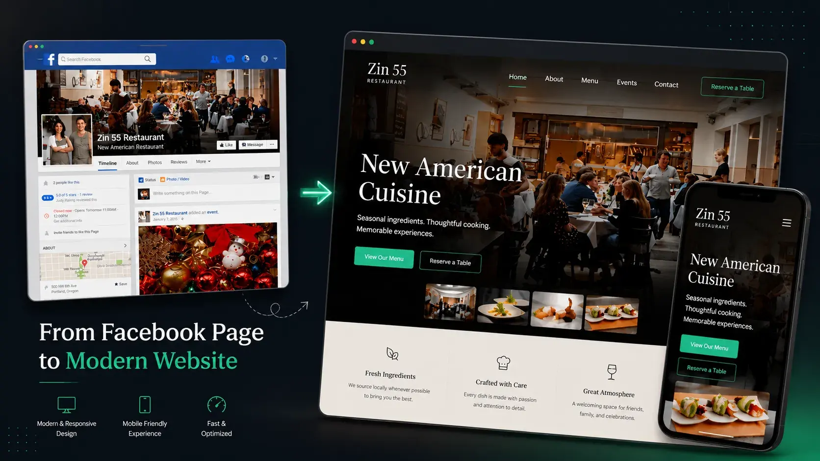
Project Details
My Role
Lead UX Designer. Solely responsible for the end-to-end onboarding redesign:
- User Research & Interviews
- UX Strategy & Flow Architecture
- Interaction Design & Prototyping
- Usability Testing
Duration
2-week research sprint + full redesign
Team
- 1 UX Designer (me)
- Cross-functional input from engineering
- Cross-functional input from support
The Impact
Redesigned onboarding lifted free trial signups by over 30% and cut privacy-related drop-off from 15% to under 5%.
Highlights
- Sequencing, not features. Domain selection, privacy disclosure, and basic info collection all existed in some form. They were just positioned after users had already lost patience.
- Competitive analysis reframed the gap. An absent domain step wasn't a subtle omission. It made Pagevamp look less capable than alternatives at the exact moment users were deciding whether to trust it.
- Designing for the segment outside the core assumption. Users without a Facebook Page were a fifth of the trial funnel, not an edge case. Building them a path drove real signup growth.
- Prefilling protected the differentiator. Asking users to re-enter data the product already had access to would have undercut the entire one-click premise.
Overview
Pagevamp turns a business's Facebook Page into a live, synced website in one click. It's a great pitch, but the onboarding flow built to deliver on it worked against the product's core promise.
Nearly a third of users hit a wall looking for a way to connect a domain they already owned. A fifth couldn't find where to fix Pagevamp's default subdomain. And one in five people without a Facebook Page simply left during the free trial, because the product had no idea what to do with them.
I led the research, strategy, and design of a new onboarding flow that surfaced the decisions that actually mattered, earlier, and gave the product a way to say yes to people it used to turn away.
- Scope: Solo UX design project: a two-week research sprint followed by a full onboarding redesign, with cross-functional input from engineering and support
- Process: User interviews & contextual inquiry → competitive analysis → persona development → flow redesign & prototyping → usability testing
- Problem: Five distinct drop-off points in the onboarding flow, each caused by information the product needed upfront but never asked for
- Fix: Reordered the flow around the decisions that mattered early (domain choice, privacy, and prefilled data) and built a real path for the fifth of trial users the product had no answer for
- Impact: Free trial signups up 30%+, privacy-related drop-off down from 15% to under 5%, ~99% basic-info completion
Context
Pagevamp's entire pitch is speed: point it at a Facebook Page and it builds a real, synced website in one click, with no coding, no blank page, and no manual content migration. For small business owners, freelancers, and organizations with no time or technical background, that speed is the product.
Onboarding is where that promise gets tested. It's the first few minutes of the free trial, the moment a time-poor restaurant owner or a self-employed photographer decides whether this tool will actually save them effort or become one more thing to manage. If onboarding didn't deliver the instant, done-for-you experience the marketing promised, the pitch fell apart before anyone got to see the result.
The Problem
The onboarding flow wasn't failing loudly. It was leaking users at several different points, for several different reasons, and each traced back to the same root: information the product needed upfront but didn't ask for.
- ~30% of users wanted to link a custom domain they already owned and couldn't find a clear way to do it
- ~20% wanted to customize Pagevamp's default subdomain and hit the same wall
- ~10% of published sites launched missing basic information that existed right there on the source Facebook Page
- ~15% of users had privacy concerns about linking their Facebook Page, concerns the product never addressed
- ~20% of trial users had no Facebook Page at all and dropped out immediately, because the entire flow assumed they did
None of these were edge cases. Together they described a flow that asked for commitment before it explained what came next, and had no answer for a meaningful segment of its own target audience.
If left alone, the product would keep losing trial users to confusion and mistrust at the exact moment it needed to earn confidence, and support would keep absorbing the cost of a flow that couldn't explain itself.
Initial Understanding
My working assumption going in was that these were mostly UI gaps: a missing settings page for domains, a missing form field or two. The unknowns turned out to be bigger.
I didn't yet know whether domain requests were about control, credibility, or just wanting a shareable link to test with. I didn't know whether the privacy concern was about the number of Facebook permissions, or something less tangible about trust. And I didn't know why a fifth of the trial base had no Facebook Page, since the entire product was built around having one.
The real constraint sat underneath all of it: whatever I changed couldn't slow down or complicate the "one-click" promise that makes Pagevamp different from a normal website builder. Add too many upfront questions to fix one problem, and I'd likely create a new one.
Discovery & Learning
I ran a two-week research sprint combining qualitative and quantitative input:
- 10+ user interviews and contextual inquiries
- 10+ client demo observations
- Customer support ticket analysis
- Competitive SWOT analysis
- Review of existing Facebook reviews from real users
A few things changed my thinking along the way.
The personas converged on the same need from different directions.
- David, a restaurant owner with almost no spare time, wanted something he could set up once and mostly ignore
- Sarah, a part-time photographer building a client base, wanted more control and a wider reach
Different motivations, same underlying ask: minimize ongoing effort. That told me the fix wasn't about adding more configuration. It was about asking for the right things once, upfront.
The competitive analysis reframed the domain problem. I expected Pagevamp's lack of an upfront domain step to be a minor gap. Instead, domain selection during setup was close to standard practice across competitors. Its absence wasn't a subtle omission: it made Pagevamp look less capable at the exact moment users were deciding whether to trust it.
The privacy concern wasn't about steps, it was about trust. Empathy and affinity mapping pointed to something closer to a trust gap: users were asked to link their Facebook Page without a clear, early explanation of why or what that meant for their data. Reducing friction wasn't the fix. Being upfront was.
The old flow and new flow told the real story. The core issue wasn't how much information the product asked for, it was when. Domain choice, content review, and the privacy conversation were all pushed to the end, after users had already invested time. By then, any friction was more likely to end in abandonment than a support ticket.
Defining the Real Problem
This wasn't a missing-features problem. It was a sequencing and inclusion problem.
Users weren't rejecting domain linking or Facebook Page permissions. They were discovering, too late, that the product hadn't planned for what they needed. And people without a Facebook Page weren't an edge case to explain away. They were a dead end the product had built into its own flow.
That reframing changed the brief. Instead of "add a domain settings page," the real task was:
Rebuild the order of the onboarding flow around the decisions users actually needed to make early, and build an actual path forward for the segment the product had never accounted for.
Exploring Solutions
A few directions came out of ideation, shaped directly by what the research surfaced.
Prefill versus manual entry. The product already had rich data sitting in the linked Facebook Page. Rather than asking users to re-enter information the product could pull automatically, the direction was to prefill as much as possible and let users confirm or edit it, keeping the "instant" feeling intact instead of turning onboarding into a form.
Where domain selection lives. The competitive read made this close to a settled question: domain and subdomain choices belonged in the setup flow itself, not buried in settings after launch. The tradeoff was adding a step to a flow built around speed, but interviews suggested users needed a real, shareable URL early anyway, for testing and for sharing with others before fully committing.
How to handle privacy. Rather than treating the Facebook Page permission as a technical step to click through, the direction was to make the privacy conversation an explicit, early part of the flow, addressing the "why" before asking for the "yes."
What to do with users who don't have a Facebook Page. This was the one true gap rather than a friction point. The direction was to give this segment an actual path: the ability to create a Facebook Page from within Pagevamp's own onboarding, rather than routing them out of the product entirely.
Design Decisions
These four decisions did the most work in the redesign.
1. Make the Privacy Conversation Explicit and Early
Discipline: UX Strategy, Interaction Design
The problem: About 15% of users had concerns about linking their Facebook Page, and the flow never addressed why that access was needed.
Alternatives considered: Reducing the number of permission-related steps, which treats the symptom (friction) rather than the cause (lack of trust).
Why this approach: The research pointed to a trust gap, not a friction problem. A clear, early privacy statement addressed the actual concern instead of just hiding it.
Impact: Privacy-related concern dropped from ~15% to under 5%.
2. Build a Path for Users Without a Facebook Page
Discipline: UX Strategy, Flow Architecture
The problem: About 20% of trial signups had no Facebook Page, and the flow had no answer for them beyond dropping them out of the funnel.
Alternatives considered: Leaving this segment unaddressed, since they fell outside the product's core assumption.
Why this approach: If the goal was to fix onboarding, it couldn't only fix onboarding for people the product was already built for. Writing off a fifth of trial traffic isn't a design constraint. It's a choice.
Impact: Free trial signups increased by more than 30%. Users without a pre-owned Facebook Page could now create one from within Pagevamp's onboarding instead of leaving.
3. Prefill from Facebook, Don't Re-ask
Discipline: Interaction Design, Flow Architecture
The problem: Users needed to review and sometimes correct information for their new site, but re-entering it manually would undercut the entire one-click premise.
Alternatives considered: A full manual setup form, which was simpler to build but directly contradicted what users valued about Pagevamp in the first place.
Why this approach: The data already existed. Asking for it again wasted the product's biggest advantage and added friction at the exact point where friction was costing trial signups.
Impact: ~99% of users completed the necessary basic information through the new flow, eliminating the segment of sites that had previously launched missing basic details.
4. Move Domain Selection into Setup, Not Settings
Discipline: Flow Architecture, Interaction Design
The problem: Roughly half of users combined wanted either a custom domain or a customized subdomain, and neither was available during setup.
Alternatives considered: Leaving domain configuration as a post-launch settings option. Lower effort, but ignored both the competitive standard and the user need for an early, shareable link.
Why this approach: Users needed something to test and share early. Hiding a mainstream capability behind a settings menu was actively costing trust during the exact window where trust mattered most.
Impact: Users linked custom domains successfully without needing support assistance. Subdomain customization usage increased by 20%.
Iteration
The process moved from low-fidelity paper sketches through to a visual prototype, testing and refining at each stage rather than jumping straight to polished screens.
The structural decisions held up from ideation through to what shipped: prefill first, domain choice upfront, privacy conversation early, a real path for users without a Facebook Page.
Outcome
Three months after release, every metric the original problem had touched moved.
| Metric | Before | After |
|---|---|---|
| Custom domain setup | Required support | Self-serve, no tickets |
| Subdomain customization usage | Baseline | +20% |
| Basic info completion | ~90% (with gaps) | ~99% |
| Privacy-related concern | ~15% of users | Under 5% |
| Free trial signups | Baseline | +30%+ |
The redesign also surfaced a clearer picture of what to build next. Requests for ecommerce support, new templates, a single-page option, and Instagram account support all came in post-launch. A reasonable sign that onboarding was no longer the thing standing between users and the rest of the product.
Reflection
The biggest thing this project taught me: "simple" isn't the same as "fewer steps." The old flow had fewer upfront questions than the new one, and it performed worse, because it asked the wrong things at the wrong time. Moving the domain decision and the privacy conversation earlier added steps and reduced drop-off, because those steps addressed what people actually needed to decide before they'd trust the product.
The other lesson was about who gets designed for by default. The users without a Facebook Page weren't a rounding error. They were a fifth of the trial funnel, and the product had no plan for them simply because they didn't match the primary assumption. Building them an actual path, rather than optimizing further for the majority case, is the kind of decision that's easy to skip because it doesn't show up in a persona built around the typical user.
If I were running this today, I'd want tighter, ongoing quantitative tracking through the test phase itself, not just a three-month post-release check-in, so any regressions would surface before they had months to compound.
The flow wasn't broken because it asked for too much. It was broken because it asked for the right things too late.
Key Takeaways
- Sequencing, not features. Domain selection, privacy disclosure, and basic info collection all existed in some form. They were just positioned after users had already lost patience.
- Competitive analysis reframed the gap. An absent domain step wasn't a subtle omission. At the exact moment users were deciding whether to trust the product, it made Pagevamp look less capable than alternatives.
- Designing for the segment outside your core assumption matters. Users without a Facebook Page were a fifth of the trial funnel, not an edge case. Building them a path drove real signup growth.
- Prefilling from existing data protected the differentiator. Asking users to re-enter what the product already had access to would have undercut the entire one-click premise.
- Every metric that moved traced back to a specific sequencing or trust decision, not a redesign of the visual interface.
End-to-end onboarding redesign: research, strategy, flow architecture, prototyping, and post-launch measurement.
Tools Used
Frequently Asked Questions
What was actually causing the drop-off before the redesign?
Why did privacy concerns drop from 15% to under 5%?
The one-click pitch was the product's whole value. How did you add steps without undermining it?
Who was the 20% of trial users the product previously had no path for?
More Work
Other Case Studies
Let's build something meaningful together.
Whether you're building a new product, improving an existing experience, or exploring AI-powered workflows, I'd love to hear what you're working on.
Get in Touch