Mobile App Concept · 2021
StreamShare: Designing the Discovery Layer Live Streaming Never Had
A self-directed live streaming app design case study: research-driven UX for finding content and hosts worth watching, built with no client brief.
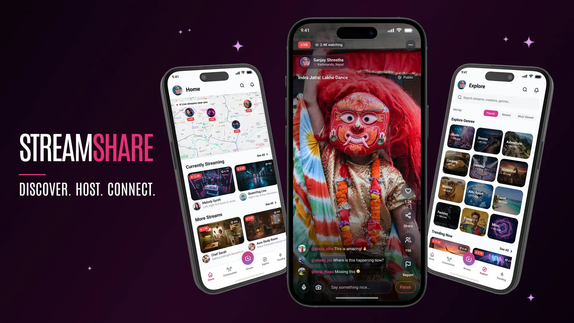
Project Details
My Role
Solo Designer. Every part of it, start to finish:
- Competitive Analysis
- Contextual Inquiry & User Interviews
- Persona Development
- Affinity Mapping
- Information Architecture
- UI Design & Prototyping
Duration
Originally conceived in 2021 during COVID-19 lockdown. Exact duration not tracked.
Team
- 1 Solo Designer (me)
- 5 interview participants (ages 20–40)
The Impact
Never shipped, so no production metrics. What it shows is a complete, defensible research-to-design process, run without a client's constraints.
Highlights
- Discovery wasn't the whole problem. Affinity mapping showed hosting and connection mattered just as much as finding content, and that reframing shaped the entire structure.
- A structural gap, not a missing feature. Across five apps, nobody personalized live discovery to where you are or what you're into, not even Twitch, the one app built around live video as the main event.
- Real per-broadcast controls. Hosts got public or private, tagging, and opt-in location sharing per stream, instead of one blanket privacy setting.
- No production metrics, a complete reasoning trail. This never shipped. What it shows is a defensible research-to-design process, run without a client's constraints.
Overview
StreamShare started with a night I didn't plan for. Bored during a COVID-19 lockdown, I stumbled onto a local band's live jam session and stayed for two hours, not for the music, but for the chat running alongside it. I went looking for more of that and couldn't find it: no way to filter by interest, no sense of what was happening nearby, no way to host something small for people I knew instead of broadcasting to strangers.
This is a solo, self-directed project, not a client engagement, and that's exactly why it's here.
Client work rarely gives me room to run a full research-to-prototype cycle without a deadline compressing it. StreamShare is what my process looks like with nothing else constraining it. It's a complete live streaming app design case study: competitive analysis, user interviews, affinity mapping, information architecture, and UI design and prototyping, run start to finish on my own.
By the time I started this, live streaming apps were everywhere. Instagram, Facebook, and YouTube all had some version of "go live." What none of them had was a reason to keep coming back beyond whatever happened to be trending that day. I wanted to know if that gap was fixable with better design, or if I was just describing luck.
The Problem
After that first night, I went looking for streaming apps that could give me more of the same experience. I tried a handful of the popular ones. Despite being comfortable with complex interfaces generally, a few things kept getting in the way:
- Real trouble navigating the apps and finding anything relevant to what I actually wanted to watch
- No categories that matched my interests
- No personalization, and as a result, weak content discovery: whatever was trending is what I got
- Dated interfaces: inconsistent labels, cluttered layout, general lack of polish
- Too much competing information on screen at once, making the experience feel like work
None of this was really about the content. Live video was already there, and it was already interesting when I found the right stream. The actual failure was in the layer around it: the part responsible for getting me to that stream in the first place, and giving me a way to make my own small version of that experience for people I actually knew.
Initial Understanding
Going in, my working assumption was simple: better categories, better recommendations, a cleaner interface would fix what I'd run into. What I didn't know was how much of the appeal was about consuming content versus making it, whether people wanted a better version of "broadcast to everyone" or something more personal, and whether location mattered to anyone besides me.
The constraint I set for myself: validate this with real people instead of designing from my own lockdown experience alone.
Discovery & Learning
I ran contextual inquiries and video calls with five potential users, ages 20 to 40, across a deliberately varied set of situations: college students in shared housing, single professionals with heavy workloads, a married working mother, and people dealing with a general money crunch during the pandemic.
The personas converged on different needs, not the same one.
- Rakesh, 27, a student, wanted a way to spend time beyond Netflix and video games, and to meet new people and explore new places
- Vijay, 22, a design intern and aspiring painter, wanted to interact with fellow hobbyists and professionals and find resources for his own growth
- Prajina, 31, a mother and self-taught landscape photographer, wanted to grow her network and find out what was happening in her own locality as much as the wider world
Three different motivations, but all three kept landing on the same missing piece: a way to find people and content that actually matched their specific interests, not a generic trending feed.
Affinity mapping surfaced a second cluster I hadn't expected. One set of notes was about finding content: exploring new places, trending streams, categories, getting inspired. A second, equally dense cluster was about making and sharing it: hosting a stream, inviting friends, sharing privately, creating a private or public group, following a favorite host. I'd gone in thinking about this as a discovery problem. The data said it was just as much a hosting and connection problem.
Competitive analysis explained why the gap existed, not just that it did. I looked at five apps: Instagram, Facebook, and YouTube, where live video is one feature bolted onto a feed built for something else, and Twitch and TikTok, both live at the time and closer to a real streaming-first comparison for 2021.
The pattern across the mainstream three: live never gets its own onboarding or discovery logic, it just inherits whatever the platform's existing feed algorithm already does. Twitch came closest to breaking that (real categories, a public schedule), but nothing personalized to the individual viewer and no location layer, understandably, since it's built for broadcasting at any scale, not a smaller catch-up between friends. TikTok, despite the growth it was seeing that year, reinforced the same pattern rather than break it.
One earlier app is worth a footnote: Periscope had tried a map view of live broadcasts around the world, close in spirit to what I was designing toward. Twitter shut it down in March 2021, the same year I started this: a reminder that a good idea without a bigger platform behind it can still fail for reasons that have nothing to do with the idea itself.
| Feature | YouTube | Twitch | TikTok | StreamShare | ||
|---|---|---|---|---|---|---|
| Live video streaming | Yes | Yes | Yes | Yes | Yes | Yes |
| In-app live chat | Yes | Yes | Yes | Yes | Yes | Yes |
| Content categories for live streams | No | No | No | Yes | No | Yes |
| Category selection at onboarding | No | No | No | No | No | Yes |
| Personalized stream recommendations | No | No | No | No | No | Yes |
| Schedule a stream in advance | No | No | Yes | Yes | No | Yes |
| Private, friends-only streaming | No | Yes | Yes | No | No | Yes |
| Bookmark a stream to watch later | No | No | No | No | No | Yes |
| Location-based stream discovery | No | No | No | No | No | Yes |
None of the five combined personalization, scheduling, and location in one product. That's the specific gap StreamShare's onboarding and home feed were built to close.
Defining the Real Problem
Going in, I'd framed this as: make live content easier to find. The research reframed it into something more specific: build a layer around live video that treats discovery and hosting as equally important, instead of optimizing one and bolting the other on as an afterthought.
That reframing is the reason the onboarding narrative in the finished design walks through discovery, sharing, and connection as three separate, equally weighted ideas rather than treating hosting as a secondary feature tacked onto a browsing app. If I'd stuck with the original framing, I probably would have spent most of my effort polishing a recommendation feed and treated hosting as a simple "go live" button, the same shortcut every competitor had already taken.
Exploring Solutions
Where should location live? The research said people wanted to know what's nearby, not just what's trending. A dedicated map tab felt like the literal answer, but it costs a nav slot and asks for an extra decision right when the feature should feel immediate. Folding "streams near you" into the top of the home feed answers the same need without the detour.
How much control should a host have before going live? A single "Go Live" button, the common pattern, with privacy handled once in account settings, was the simpler option. I gave each broadcast its own choices instead (public or private, tagging, comments, location), since affinity mapping had already flagged privacy as a real, recurring want a global setting doesn't resolve.
How should viewers support a host beyond liking and following? This didn't come from the 2021 interviews, and I want to be upfront about that: it came from noticing how other creator-facing products had moved past social-only signals. I added a way to support a host directly, without turning the experience into a paywall.
What happens the moment a stream ends? Most apps just return you to a feed. I wanted the end of a stream to give a host something to look at: an assumption about what hosts would want to know, not something a participant asked for by name.
Design Decisions
These four decisions did the most work in shaping the final design.
1. Give hosts real controls before they go live, not just a record button
The challenge: The original research already flagged privacy and control as recurring wants (sharing privately, creating a private group), but none of it had been resolved into an interface, and location sharing was assumed to be always-on.
Alternatives considered: One global "Go Live" button with privacy handled once in account settings, the pattern every competitor uses.
Why I chose this approach: Privacy isn't a one-time decision, it's different for every stream a host runs. Each broadcast gets its own setup: public or private, tagging, comment permissions, an opt-in toggle for location, and viewer blocking.
Impact: A privacy posture that matches the actual stream, not a blanket setting. Untested with real hosts, so this is a hypothesis.
2. Put a host's schedule where their followers already look
The challenge: The original research had already flagged scheduling as a real want (being able to plan a stream ahead of time), but a schedule only helps if people actually see it before the stream starts.
Alternatives considered: A separate, dedicated streams calendar, the same place YouTube and Twitch put scheduling, which means checking a screen most people never think to open.
Why I chose this approach: Followers already check a creator's profile to see if they're live. Upcoming streams, with real dates and times, sit right next to that same live status, so the schedule shows up exactly where the relationship with that host already lives, instead of in a calendar someone has to remember exists.
Impact: More people actually seeing a stream is coming before it starts, since the information sits where attention already is rather than in a screen built just for scheduling.
3. Give viewers a way to support a host directly, not just socially
The challenge: Likes, follows, and comments are the only ways most apps let a viewer signal they value a host, and none of them put anything real behind that.
Alternatives considered: Stick to social-only signals, simpler and closer to what the original research actually asked about.
Why I chose this approach: Not from the 2021 interviews directly (I want to be upfront about that), but from noticing how creator-facing products elsewhere had moved past social signals. It follows from persona motivations already there: Vijay wanting to learn from professionals, Prajina wanting to grow her network, both describing a relationship with a host, not just interest in content. The flow stays low-friction: preset tiers ($1, $5, $10, $25), a custom amount if none of those fit, and a short message to the creator, then a confirmation the viewer can choose to share.
Impact: A possible reason to keep streaming beyond a follower count, and a concrete way to turn "this is amazing" in the chat into something a host can actually use. The decision I'd most want to test with real creators first.
4. Treat the end of a stream as a moment worth designing
The challenge: Almost every app drops both host and viewer straight back into a feed the instant a broadcast ends.
Alternatives considered: No dedicated end-state, the majority pattern.
Why I chose this approach: A summary (duration, peak viewers, likes, comments, new followers, the moment that landed best) turns an abrupt cutoff into a debrief.
Impact: Something concrete for a host to improve from stream to stream. Like the support feature, a hypothesis, not something validated by a real creator.
Iteration
This design didn't go through a new, separate round of usability testing. The research foundation stayed the same as the original 2021 work: interviews, personas, affinity mapping, competitive analysis. What changed was how far I took the reasoning built on top of it, plus a deliberate look at how live-streaming and creator products had evolved since.
Per-broadcast controls and moving location into the feed trace back to that original research. Direct creator support and the post-stream summary don't. They're informed judgment, and they're exactly where I'd want to talk to real hosts before building further.
Outcome
This remains a self-directed concept, not a shipped product. There's no live user base and no business metric attached to it, and I want to be direct about that rather than imply otherwise.
What exists is a complete, high-fidelity design covering onboarding, an interest picker, a home feed with contextual location discovery, a Communities space with follower growth and engagement detail, Explore and Trending browsing, a fully specified Go Live setup that includes pairing an external camera over Wi-Fi for hosts who want better production quality than a phone camera, a live-viewing experience that pairs chat, safety controls, and creator support in one place, a post-stream summary, and account settings.
I haven't run usability testing on this version, so I can't point to validated engagement numbers. What I can say is that every screen traces back either to a real research finding, or to a design decision I can explain and defend, which is the standard I try to hold myself to even without a client asking for a business case.
Reflection
The thing that stands out to me looking at this now is how much a single idea, a streaming app built around discovery, can grow once you start asking what else it owes the people using it. Hosts needed real privacy controls, not just a record button. Creators needed a reason to keep going beyond a follower count. Viewers needed a way to say thanks that meant something more than a heart icon.
None of the original interviews asked for direct creator support or a post-stream debrief by name. Those came from paying attention to how other products in this space had already learned to treat their hosts, not from new research of my own. I think that's a legitimate way to design when you don't have fresh interviews to lean on, as long as I'm honest about the difference between "a participant told me this" and "I noticed this works elsewhere and reasoned my way to it."
If I picked this back up with real users involved, direct creator support and the post-stream summary are the two things I'd want to test first, since they're furthest from anything a participant actually told me back in 2021.
The problem was never the content. Live video was already interesting the moment I found the right stream. The actual problem was everything standing between me and that moment, and I hadn't realized how much of that was about who I was streaming with, not just what I was watching.
Key Takeaways
- Affinity mapping reframed a discovery problem into a discovery-and-hosting problem. The interview notes split almost evenly between wanting to find content and wanting to host and share it privately, and that split still shapes the design's structure.
- Scheduling only works if it lives where attention already is. Putting upcoming streams on a creator's profile, right next to their live status, answers the "plan a stream ahead" want the research surfaced without needing a separate calendar screen.
- Giving hosts granular, per-broadcast controls mattered more than one global privacy setting, and traces directly back to what the original research surfaced.
- Supporting creators directly and closing the loop after a stream ends came from design reasoning and pattern awareness, not new interviews, and I've tried to be explicit about that distinction rather than blur it.
- This project never shipped, so there are no production metrics to report. Its value is in the reasoning trail: real research where I had it, and honest, explainable judgment where I didn't.
Self-directed concept: research, personas, affinity mapping, competitive analysis, information architecture, UI design, and prototyping.
Tools Used
Frequently Asked Questions
This never shipped. Why is it worth including as a case study?
What made live content discovery a real gap and not just a missing feature?
Why did the concept need per-broadcast privacy controls instead of one setting?
More Work
Other Case Studies
Let's build something meaningful together.
Whether you're building a new product, improving an existing experience, or exploring AI-powered workflows, I'd love to hear what you're working on.
Get in Touch