SaaS · 2026
Redesigning LinkedIn's Homepage Feed: Giving Every Pixel a Job
A self-initiated audit and redesign of LinkedIn's homepage feed, built to prove that hierarchy and accessibility are decisions, not decoration.
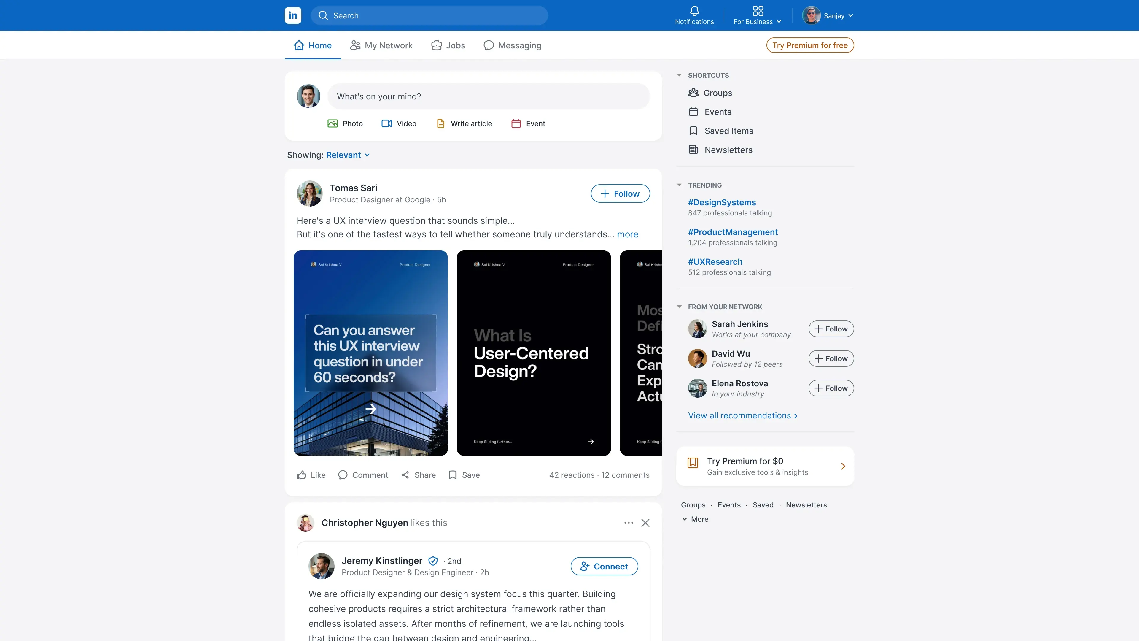
Project Details
My Role
Product Designer. Ran every part of the audit and redesign, solo:
- UX & Accessibility Audit
- Peer Interviews
- WCAG Criteria Review
- Information Architecture
- Interaction & Visual Redesign
- Before/After Usability Testing
Duration
Self-directed, run alongside other work — not tracked to a fixed timeline
Team
- 1 Product Designer (me)
- 5 peers — interviewed before the redesign, tested against both versions after
The Impact
Fourteen documented hierarchy and accessibility issues, traced to one root cause and resolved through four structural decisions. A before/after test with five peers showed faster orientation, fewer misinterpretations of the nearby Premium promotion, and full task success when retrieving right-rail content after scrolling.
Highlights
- Fourteen issues, one root cause. Most of the hierarchy problems and accessibility problems I catalogued were the same failure wearing different clothes.
- Accessibility criteria as a design tool. WCAG success criteria weren't a checklist run at the end — they were how I decided what deserved to be louder and what needed to get out of the way.
- Structural honesty over restyling. The redundant profile summary and its low-frequency metrics weren't solvable with a better label. They needed to come out of the view entirely.
- Tested before and after, not just designed. 5 peers, timed tasks, same tasks on both versions — small sample, but real signal instead of just my own judgment.
Overview
I redesigned LinkedIn's homepage feed on my own, without a client brief, a team, or access to LinkedIn's internal data. I picked a page every reviewer already uses, so they can judge my reasoning against something real instead of taking my word for it.
The feed wasn't broken in one obvious way. It was broken in fourteen small, specific ways that all traced back to the same root cause: nothing on the page had a rule for what deserved visual weight, so a puzzle widget, an ad, and the content a user actually came for competed on equal footing. Auditing against real accessibility criteria showed that most of the hierarchy problems and accessibility problems I found were the same failure wearing different clothes. I rebuilt the page around one consistent rule for what gets attention and why.
- Scope: Solo, self-initiated: no client brief, no LinkedIn internal data or engineering constraints, 5 peers for interviews and testing
- Process: Heuristic evaluation → contextual inquiry → WCAG accessibility audit → information architecture → interaction design & visual design → usability testing
- Finding: 14 documented issues, all tracing back to one root cause
- Fix: One consistent rule for what earns visual weight, applied module by module
- Validation: Moderated before/after usability test with the same 5 peers: task success rate, time-on-task, and a post-task ease rating, not just my own judgment
- Framing: An audit trail and defensible judgment, not a validated production outcome
Context
LinkedIn's homepage feed does a lot on one screen: composer, feed, navigation, network suggestions, trending topics, profile stats, entertainment widgets, and ads, all at once. That density isn't a mistake: most of these modules exist for a real business reason like engagement, retention, or ad revenue.
I picked this page because that tension is real and unavoidable. Deleting everything that isn't the feed isn't judgment, it's scissors. I wanted to see how much clarity I could recover without pretending the commercial pressures behind the clutter don't exist.
The Problem
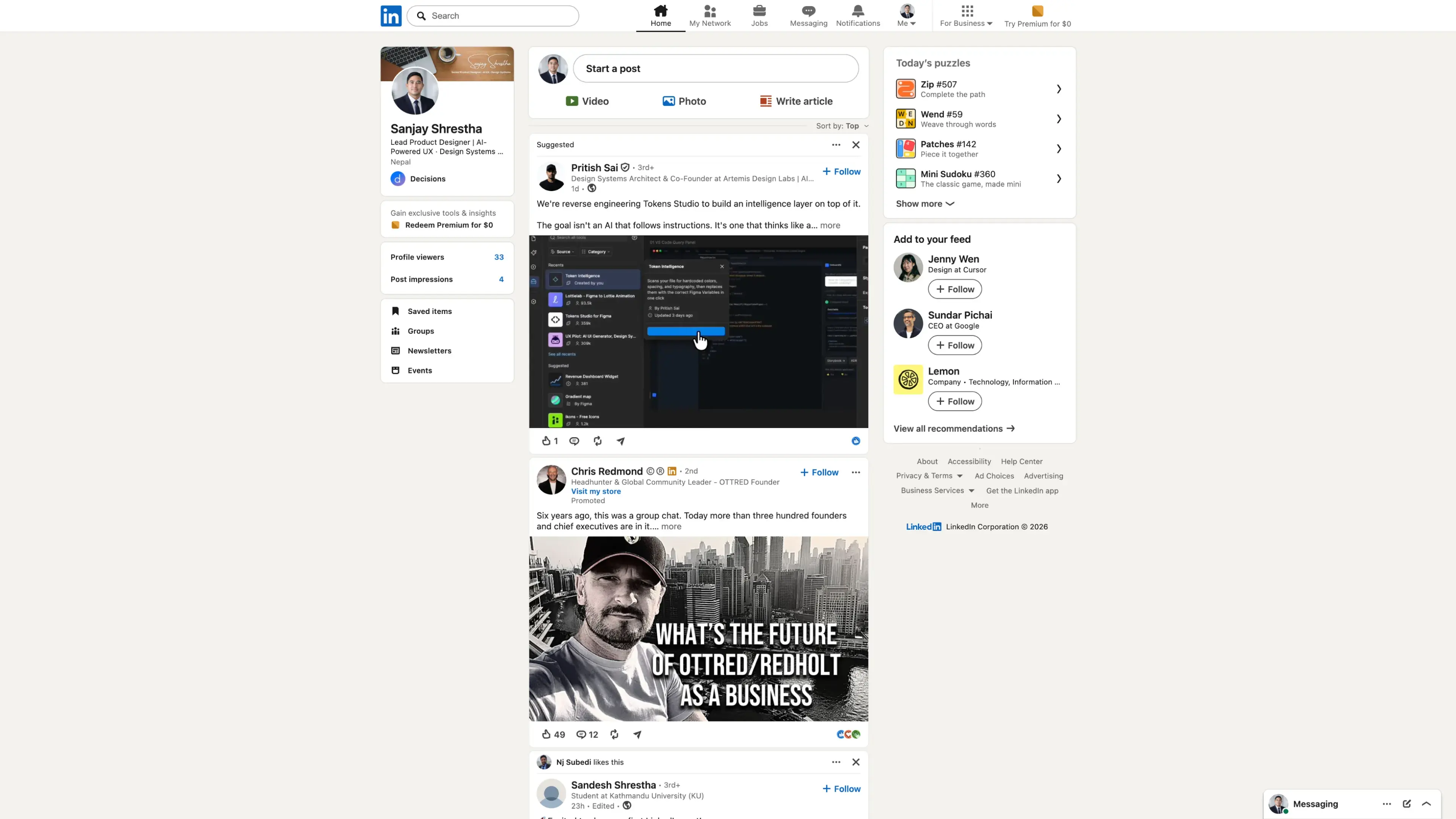
Nothing on the existing feed was catastrophically broken. It was death by a thousand small ambiguities. The full audit documented fourteen findings, several of which repeat the same underlying pattern; the complete inventory is below the graphic.
- Competing visual weight. Composer, feed, profile card, sidebar widgets, ad units, and a nav row whose active destination relied on only subtle gray-on-gray differentiation all carried roughly the same visual hierarchy weight, so nothing told the eye where to start.
- Redundant profile summary. The profile card repeated identity information already available through the global profile control, truncated the professional headline, and used banner text that wasn't exposed as readable page content. A separate Premium promotion and profile-metrics card sat immediately beneath it; some participants interpreted the nearby Premium promotion as account-related information.
- Low-frequency metrics. Profile views and post impressions occupied permanent, high-visibility space despite being something most users don't check every session.
- Low-engagement games. "Today's puzzles" used the most saturated color treatment on the page. None of the five participants engaged with it during observation, making its permanent prominence difficult to justify for this sample.
- Inconsistent icon styles. The same bookmark metaphor appeared as an outline icon for "Save" in the overflow menu and a solid icon for "Saved items" in the sidebar. The post's Like action used an outline icon while "Not interested" used a solid thumbs-down icon, and the overflow menu mixed outline and solid treatments without a visible rule.
- Unlabeled engagement actions. Like, Comment, Share, and Save were presented as icon-only controls without visible text labels. The live accessibility review also found that these controls lacked accessible names.
- Ambiguous engagement totals. Reaction and comment totals relied on small icons and isolated numbers, forcing users to infer what each value represented. The redesign replaces these with explicit text such as "42 reactions · 12 comments."
Left alone, the page would keep asking every user, sighted or not, to do the work of figuring out what mattered, every time they opened it.
All fourteen audit findings
| # | Audit finding | Category | Design response |
|---|---|---|---|
| 1 | Active navigation relied on subtle gray-on-gray differentiation | Navigation state | Used blue icon/text and a blue bottom border for the active destination |
| 2 | Icon treatments were inconsistent across actions and menus | Visual consistency | Standardized the redesigned interface around one outline-icon treatment |
| 3 | Engagement actions lacked visible and accessible text labels | Accessibility | Added visible labels to Like, Comment, Share, and Save |
| 4 | The feed-sort control had insufficient visual prominence | Visual weight | Reframed the control as "Showing: Relevant" for clearer intent |
| 5 | Network suggestions did not explain why they were shown | Content clarity | Added a one-line relevance reason to every suggestion |
| 6 | Post metadata received too much visual weight | Content hierarchy | Compressed post headers into two clearly prioritized lines |
| 7 | Engagement totals relied on icons and bare numbers | Content clarity, Accessibility | Replaced ambiguous totals with explicit text such as "42 reactions · 12 comments" |
| 8 | The Premium promotion's relationship to account status was unclear | Content clarity | Relocated the promotion to a distinct right-rail card with clearer separation |
| 9 | Low-engagement games used the page's loudest color treatment | Visual weight | Replaced puzzles with professionally relevant trending topics |
| 10 | Low-frequency profile metrics occupied permanent space | Content strategy | Removed the metrics from persistent placement |
| 11 | The three-column layout lacked a cohesive shared grid | Layout | Consolidated the page into a two-column system |
| 12 | The profile summary duplicated information without enough feed-level value | Information architecture | Removed the redundant profile summary from the feed |
| 13 | Navigation mixed page destinations and platform utilities in one row | Information architecture | Split navigation into utility and destination rows |
| 14 | Secondary content became unavailable after scrolling | Layout | Combined secondary modules into a sticky utility rail |
Initial Understanding
Going in, my assumption was that this was a visual polish problem: the page "felt busy" and needed calmer styling. What I didn't know yet was how much of that busyness was one page doing two structurally different jobs at once (platform navigation and page navigation, crammed into a single row), and how much was accessibility debt that had nothing to do with color.
My constraint was self-imposed: no internal data, no LinkedIn user base to test against, only 5 peers willing to give me their time. So I held myself to an honest heuristic and accessibility audit, backed by a small peer test, rather than claiming validation at a scale I don't have.
Discovery & Learning
Before the audit, I ran a think-aloud contextual inquiry with 5 peers, regular LinkedIn users, none of them designers, watching them narrate their own feed with no script beyond "show me what you check first, and tell me anything that confuses you."
Two patterns showed up across almost everyone:
- Quick scrollers (3 of 5) skimmed past the entire right rail, puzzle widget included, and couldn't recall what was in their own profile card afterward.
- Careful readers (2 of 5) noticed the Premium promotion beside the profile card, but both assumed, it was account-related information, not a separate ad.
People either ignored the sidebar or misread the Premium promotion as their own data. That's what pointed the audit at the profile card, the right rail, and its games widget specifically, instead of treating every module as equally suspect.
With that steer, I ran a heuristic evaluation paired with a WCAG 2.1 accessibility review, module by module:
- Tools: axe DevTools and WAVE against the live DOM and accessibility tree, Figma's color-contrast checker against the design files, manual keyboard-only navigation for focus order
- Criteria checked: consistency and standards, color contrast, landmark and heading structure, consistent labeling, and focus order
I expected a list of unrelated small bugs. Instead, most of the accessibility failures I found stood in the exact same spot as a hierarchy failure:
- Manual heuristic review surfaced the inconsistent icon treatments; axe and WAVE confirmed the missing accessible names on the engagement controls, and those same controls were also the least scannable part of the page for sighted users
- The profile card's baked-in cover text was invisible to a screen reader and a visual redundancy for sighted users, since the real name already appeared as a heading below it
That pattern held across all fourteen findings I catalogued, from smaller interaction issues (weak feed-sort prominence, unexplained network suggestions, inconsistent icon treatments, ambiguous engagement totals) to structural issues such as the fragmented three-column layout, redundant profile summary, overloaded navigation row, and disappearing secondary content. They were not fourteen unrelated defects; they were recurring examples of the page lacking a consistent rule for what deserved attention.
Defining the Real Problem
That reframed the project. I'd started this framed as "clean up the visual noise." After the audit, I reframed it as "give the page one consistent rule for what earns visual weight, using accessibility criteria as the mechanism for deciding that, not a checklist applied after the layout is done."
In practice, contrast ratios, touch target sizes, and landmark structure weren't things I checked once the redesign was finished. They were the tool I used to decide, module by module, what deserved to be louder and what needed to get out of the way.
Exploring Solutions
A few directions came out of that reframe, and I didn't treat every option as equally worth exploring.
The overloaded nav row (an information architecture problem) crammed platform utilities (search, notifications, profile) and page destinations (Home, Jobs, Messaging) into one line at equal weight. The lighter fix, raising icon contrast in place, wouldn't have fixed the real problem: two different questions competing for one visual treatment.
The profile card (an IA and content-strategy problem) repeated identity info already available through the global profile control, truncated the professional headline, and sat close enough to a separate "Redeem Premium" promotion that peers misread it as their own account data. A stronger divider between the two components would clarify the boundary but still leaves a redundant summary and a truncated headline in place, and doesn't touch the accessibility issue baked into the cover image.
The original three-column layout (profile rail, feed, widget column, a layout grid and responsive design problem) could have just kept its three columns and gotten tighter spacing between them. Once the profile card was gone, though, that left rail had no real reason to stay independent, and tighter spacing alone wouldn't stop the right-side widgets disappearing on scroll, so the redesign collapses down to two columns instead.
Reactions and other engagement actions (an interaction design and accessibility problem) could have kept their icon-only look with better color contrast between icons. That satisfies a contrast checker but gives a screen reader nothing to announce, which was the actual gap.
Design Decisions
These four decisions carried the most weight in the redesign.
1. Splitting one overloaded nav row into two, by function
Discipline: Information Architecture, Interaction Design
The challenge: Eight-plus items doing two different jobs (platform-level utilities and page-level destinations) sat in a single row at equal weight, and the active destination relied on only subtle gray-on-gray differentiation: a slightly darker gray icon and text plus a gray bottom border, staying visually close to the inactive items around it.
Alternatives considered: Keep one row and raise contrast on the active state alone, which fixes legibility but not the real problem: two different questions competing for one visual space.
Why I chose this: Platform-level utilities ("what can I do anywhere") and page-level destinations ("where am I") are genuinely different jobs. Utilities like notifications and business tools moved into the upper header; page destinations moved into a second row, icons and labels arranged side by side. That split also made a clearer active state possible: Home now gets blue iconography, blue text, and a blue bottom border, instead of the previous subtle gray-on-gray treatment.
Expected impact: Faster orientation, since users no longer parse eight equally-weighted icons to find their place.
2. Removing the redundant profile summary and low-frequency metrics
Discipline: Information Architecture, Accessibility (WCAG)
The challenge: Name, title, and a truncated headline duplicated information already available through the global profile control, stacked with low-frequency stats like profile views. The cover photo had the user's own name burned into it, redundant for sighted users and invisible to a screen reader. The nearby "Redeem Premium" promotion was already a separate component, but sitting a hairline away from it, peers read it as part of their own account data.
Alternatives considered: Keep the card, add a stronger divider between the profile summary and the Premium promotion. That clarifies the boundary between the two but leaves the redundant summary, the truncated headline, and the cover-image accessibility issue untouched.
Why I chose this: A profile summary that repeated the global profile control was not earning its permanent space, and its low-frequency metrics did not need to remain continuously visible. Removing these modules simplified the left rail and removed the redundant identity content from the homepage feed. The Premium promotion remained available but moved to a separate right-rail position where its purpose was easier to distinguish.
Expected impact: Reduces redundant identity content, removes this specific issue from the feed view, and frees space for network-relevant content.
3. Collapsing three independent columns into one two-column system, with a persistent right rail
Discipline: Information Architecture, Visual & Layout Design
The challenge: The profile rail, feed, and widget column ran as three separate modules with no shared grid, reading as bolted-together pieces. Right-rail content also vanished the moment a user scrolled.
Alternatives considered: Keep three columns, just tighten the grid. Once the profile card was gone, that column had no reason to stay independent, and tighter spacing alone wouldn't stop content disappearing on scroll.
Why I chose this: With identity content removed, the feed could take the full width it needs, and a sticky rail keeps trending topics, network suggestions, and the quick-access links that used to live under the profile card (Saved items, Groups, Newsletters, Events) all accessible without scrolling back up.
Expected impact: One cohesive layout instead of three independent modules, with secondary content reachable at any scroll depth.
4. Giving every engagement action a visible text label instead of icon-only reactions
Discipline: Interaction Design, Accessibility (WCAG)
The challenge: Two related problems, both traced to relying on icons alone. Like, Comment, Share, and Save were icon-only controls with no accessible name anywhere. Separately, reaction and comment totals relied on small icons and isolated numbers, forcing users to infer what each value represented.
Alternatives considered: Keep icon-only, raise color contrast. That satisfies a contrast checker but gives a screen reader nothing to announce.
Why I chose this: The clearest case in the audit where the accessibility fix and the usability fix were the same fix. Adding the word next to the icon ("Like," "Comment," "Share," "Save") and spelling counts out ("42 reactions · 12 comments") solves both at once.
Expected impact: Every action and count is legible to a screen reader and a fast human scan at the same time.
Iteration
Several moderate refinements followed once the four structural decisions were in place.
Post headers previously gave names, connection-degree indicators, professional descriptions, timestamps, links, and other metadata similar visual priority. I compressed them into two lines: name and connection degree on the first, followed by role and timestamp in quieter text. The information remains available, but it no longer delays the post itself.
Engagement information received a similar treatment. The original interface relied on small icons paired with isolated numbers, forcing users to infer what each value represented. The redesign spells the totals out as "42 reactions · 12 comments," separating the meaning of the count from the action controls below it.
Two changes remained intentionally smaller. Renaming "Sort by: Top" to "Showing: Relevant" improves the control's information scent, although it could still receive more visual emphasis as the only control that changes the feed's content. Network suggestions now include a one-line reason such as "Works at your company," "Followed by 12 peers," or "In your industry," making their relevance explicit.
Finally, "Today's puzzles" was replaced with professionally relevant trending topics. None of the five participants interacted with the games during observation, so this change redirects the rail's strongest visual treatment toward content that better matched the behaviors observed in this sample.
Validating the Redesign
Once the redesign was built, I brought back the same 5 peers and ran a moderated, within-subjects usability test: the same four tasks on both versions, followed by a post-task ease rating, order randomized per person to control for learning effects.
| Task | Metric | Before | After |
|---|---|---|---|
| Time to identify current nav section | Time-on-task | avg 6.4s | avg 2.1s |
| Correctly stated what a reaction icon + count meant, unprompted | Task success rate | 2 of 5 | 5 of 5 |
| Interpreted the nearby Premium promotion as account-related information | Error rate | 3 of 5 | 0 of 5 |
| Found trending topics again after scrolling down the feed | Task success rate | 0 of 5 (all scrolled back up) | 5 of 5 (used the sticky rail) |
| "Easy to tell what matters on this page" (1 to 5) | Single Ease Question | avg 2.4 | avg 4.2 |
One peer who'd read the Premium promotion as "part of my profile" in the first session opened the redesign and said, unprompted, "oh, that's clearly a separate ad now." Another, previously one of the quick scrollers who missed the right rail entirely, found the trending topics without hesitation and asked why the old version didn't just do this.
Five people is a signal, not a sample. I'm treating this as directional support for the four decisions, not proof the redesign works at LinkedIn's actual scale and diversity of users.
Outcome
This project didn't ship and was never going to. It's a self-directed audit, not a production initiative, so what I have is a small, real before/after test on top of the audit, not production telemetry.
What I can stand behind is the audit trail and the test behind it: fourteen findings documented through heuristic and accessibility review, with the relevant accessibility findings checked against WCAG criteria, decisions that trace directly back to those findings, and a before/after test that measured something instead of assuming it, not LinkedIn's own analytics, but a real, small, directional result. The redesigned feed keeps most of the modules the original had a legitimate business reason to include, ads, upsells, suggestions, but restructures which of them get to compete for attention and why.
Reflection
This project, within this audit and this five-person sample, suggests accessibility and visual hierarchy are often the same problem wearing two names. The subtle gray-on-gray navigation state was part of why users took longer to orient, while the icon-only engagement controls were difficult to scan and lacked accessible names. In both cases, strengthening the hierarchy also improved accessibility and comprehension. Fixing one without the other means doing the work twice.
With a larger, more diverse group of real LinkedIn users, I'd want to test whether removing the redundant profile summary and its low-frequency metrics is right for everyone, since all 5 peers in my test skewed toward the "quick scroller" or "careful reader" patterns I saw in the interviews. A wider sample might surface a pattern I didn't catch.
Most of the accessibility failures I catalogued on this page stood in the exact same spot as a hierarchy failure. Fix one without the other and you end up doing the work twice.
Key Takeaways
- This pass touched every core UX discipline, not just visual design: heuristic evaluation, contextual inquiry, information architecture, interaction design, accessibility engineering, and usability testing all fed the same four decisions.
- Fourteen separate-looking issues traced back to one root cause. The page had no consistent rule for what earned visual weight, so ads, games, and real content all competed for attention.
- Accessibility criteria worked as a design tool, not a compliance checklist. Auditing against specific WCAG success criteria, verified with axe DevTools, WAVE, and manual keyboard navigation, is what surfaced that hierarchy and accessibility problems were often the same failure.
- Structural honesty sometimes means deleting a component, not restyling it. The redundant identity information and low-frequency metrics in the profile card weren't solvable with a better label; they needed to come out of this view entirely.
- The clearest wins were the ones that fixed two problems with one change, like adding text labels to reactions, which solved an accessibility gap and a scannability gap simultaneously.
- A 5-person before/after test turned "expected impact" into a measured one, even at a small scale: faster nav orientation, fewer instances of Premium-promotion misinterpretation, full task success on the sticky rail.
- Not every fix in this pass is fully resolved, and I've tried to flag the ones that aren't (like the sort control's visual weight) rather than present the whole audit as a closed case.
Self-directed audit and redesign: heuristic evaluation, peer interviews, WCAG accessibility audit, information architecture, interaction design, visual redesign, and before/after usability testing.
Tools Used
Frequently Asked Questions
Why redesign a product you don't work on, with no client brief?
What was the one root cause behind fourteen separate issues?
How were the results validated, since this wasn't a production launch?
Isn't a 5-person test too small to trust?
More Work
Other Case Studies
Let's build something meaningful together.
Whether you're building a new product, improving an existing experience, or exploring AI-powered workflows, I'd love to hear what you're working on.
Get in Touch