Enterprise · 2020
Avira Antivirus: Redesigning for Trust, Not Just for Looks
A self-initiated redesign of Avira Antivirus Free, diagnosing how visual inconsistency erodes trust in a security product and designing around that specific failure mode.
Project Details
My Role
Lead Product Designer. Owned every part of the redesign, solo:
- User Research & Usability Testing
- Information Architecture
- Design System
- Final UI
Duration
Full UX research + design sprint, self-directed
Team
- 1 Product Designer (me)
- 5 interview & usability participants
The Impact
Reframed a visual-consistency brief into a trust problem, and shipped a full design system and high-fidelity UI addressing it — a self-directed case study, not a commissioned engagement.
Highlights
- Surface problem vs. real problem. Visual inconsistency was the symptom; eroded trust in a category where trust is the entire product was the actual diagnosis.
- Research produced a testable signal. Quick Scan's dominance in both interviews and usability testing directly shaped the dashboard's primary interaction, instead of relying on assumption.
- Conservative upgrade path, on purpose. An information-first approach over a higher-converting interruption model, because it matched what users said they needed and preserved the thing freemium security software can't afford to lose.
- Design system before high-fidelity. Slower up front, but the only way to actually solve the consistency problem rather than relocate it.
Overview
Avira Antivirus Free has over 560 million installs. The app itself was working against its own users.
People couldn't tell what their protection status actually meant. The interface didn't look or feel like one product. And the free-to-paid upgrade path read more like an ad than useful information.
This is a self-initiated case study, not a commissioned redesign. I chose Avira because I wanted to test myself against a real, complex, high-stakes product category: security software, where users have to trust an interface they don't fully understand. I ran the project the way I'd run it as a Lead Product Designer: research first, then a reframed problem statement, then decisions I could defend.
I owned every part of it: user research, interviews, usability testing, information architecture, wireframes, a design system, and final UI.
Context
Avira has been in the antivirus market for more than 30 years. At the time of this project, Avira had recently redesigned parts of its UI and connected the app to Avira Connect, a central platform tying together its various products and services.
That redesign was incomplete. Some screens had been brought into the new visual language. Others, like scanning and configuration, hadn't. The result was an app that looked like it was mid-transition, because it was.
That gap is what pulled me in. A product halfway through a redesign is a more honest test of judgment than a green-field project, because you have to figure out what to preserve, what to fix, and what to leave alone.
I want to be upfront about the constraints. I had no access to Avira's internal user data, analytics, or business goals, so I built my understanding from public reviews, my own analysis, and interviews I ran myself. That means this case study can't claim real business impact. What it can show is how I diagnose a product problem and make decisions when the evidence is incomplete, which is closer to real work than a polished, everything-went-perfectly narrative.
The Problem
On the surface, Avira's UI had been modernized. Underneath, the experience still had real problems that a fresh coat of paint hadn't solved:
- Free users didn't understand what they'd get by upgrading. Paid protection layers existed, but their value wasn't communicated anywhere a free user would naturally see it.
- Large parts of the app (especially scans and configuration) were still running on the old design language, so the app didn't feel like one coherent product.
- No visible feedback channel. What channels existed were slow.
- No design system. Small inconsistencies in icons, spacing, color usage, and button states had accumulated across screens.
If none of this changed, the app would keep bleeding trust in small, hard-to-name ways. Users wouldn't be able to point to one broken thing, but they'd feel like the app was inconsistent and hard to depend on. That's close to the worst possible feeling for a security product.
An antivirus app's entire job is to be trusted while running invisibly in the background. An interface that feels inconsistent undermines that job even if the underlying protection is solid.
Initial Understanding
Going in, my assumptions were mostly about visual and structural debt: inconsistent UI, an unclear upgrade path, an app that hadn't fully absorbed its own redesign.
What I didn't know was how people actually used the app day to day. I didn't know which features mattered enough to protect during a redesign, which ones people ignored, or how people felt about the constant stream of security notifications. I also didn't know whether the usability problems I could see as a designer (contrast issues, inconsistent error states, unclear feedback) were things real users had actually noticed, or just things that bothered me as a trained eye.
The biggest constraint was data. I had no access to Avira's usage analytics, support ticket volume, or churn data, so any research I did would have to come from a small number of interviews and my own hands-on testing. That meant I had to be honest with myself about how far I could generalize, and make decisions that held up even with a limited evidence base.
Discovery & Learning
I started by using the app myself and cataloguing every inconsistency I could find: contrast ratios that failed WCAG 2.1, icons that didn't share a visual language, warnings and errors that looked nearly identical, button states that didn't behave predictably. That gave me a map of the surface-level problems, but not the why behind them.
To get the why, I interviewed five people spanning daily antivirus users to people who barely thought about security software. I wanted to know what actually made someone open an antivirus app, what they expected to see when they did, and what would make them trust or distrust what they saw.
A few things changed my thinking.
Engagement was more passive than I'd assumed. People didn't open the app because they wanted to check on their computer. They opened it because a notification told them to. That reframed the notification system from "a feature to poll periodically" to the actual front door of the product.
Customization and consistency were both non-negotiable. People wanted the app to feel personalized, but they also wanted a small, fixed set of information (virus detections, quarantine status, updates) always visible no matter what they'd customized. I couldn't treat these as a tradeoff: I had to design for both at once.
Quick Scan was the feature people actually trusted. Usability testing with the original five participants plus two brand-new users revealed that Quick Scan was what people reached for. Full Scan and Scheduled Scan were peripheral. That was a concrete, testable signal I could design around, not just an assumption.
Defining the Real Problem
Going in, I'd framed this as a visual consistency problem: fix the leftover old-style screens, unify the icons and colors, and the app would feel whole again.
The research reframed it. The real problem wasn't visual inconsistency on its own. It was that inconsistency was eroding a security product's most important asset: the user's confidence that the app knows what it's doing.
Every mismatched icon, every unclear warning, every screen that looked like it belonged to a different app was a tiny signal to the user that maybe this software wasn't as buttoned-up as it claimed to be. For most apps, that's an annoyance. For an antivirus app, whose entire value proposition rests on "trust us to protect you while you're not looking," it's closer to a core failure.
That reframe changed what "success" meant for the redesign. It wasn't going to be measured by how polished the screens looked. It was going to be measured by whether a user, glancing at any screen in the app, could immediately and correctly understand their protection status, what needed their attention, and what didn't.
The brief wasn't "make it consistent." It was "make it trustworthy." Those are different problems that can look identical in early sketches.
Exploring Solutions
Before deciding on a direction, I ran a competitive analysis against Kaspersky, Bitdefender, Windows Defender, Avast, and AVG, mapping their feature sets, strengths, and weaknesses.
A few patterns stood out. Products with the cleanest reputations (Windows Defender, Bitdefender) won on being automatic and staying out of the way, not on having the most features. That told me the redesign shouldn't compete by adding visible complexity. It should compete by making Avira's existing depth of features easier to find and trust.
With that framing, I built a content taxonomy and sitemap, then mapped user flows for the tasks that mattered most: running a scan, upgrading to a paid tier, scheduling a scan, and reviewing or clearing quarantine.
I considered two structural alternatives for the dashboard:
- A tab-based model treating all scan types equally, rejected because it contradicted the Quick Scan finding by giving equal visual weight to a feature almost nobody used.
- A notification-center-style layout, rejected because it solved for engagement but worked against the "always show me the same core status" need from research.
Design Decisions
Four decisions did the most work in the redesign.
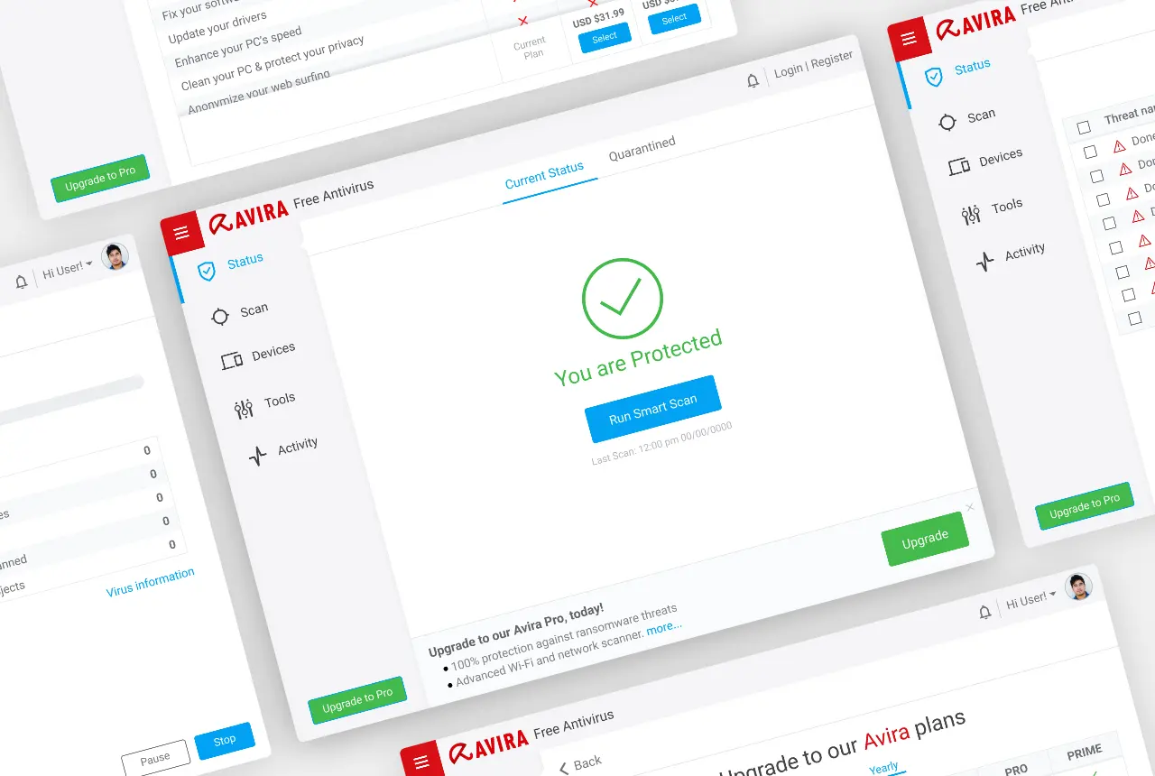
1. Make Quick Scan the Default Primary Action
The challenge: The app treated Quick Scan, Full Scan, and Scheduled Scan as equal options, which matched how the settings were technically structured but not how people actually used the product.
Alternatives considered: A scan selector giving all three scan types equal visual prominence.
Tradeoff: Equal treatment felt "fair" and simpler to build, but it asked users to make a choice most of them had already implicitly made.
Why this approach: Both the interviews and usability testing pointed to the same thing independently. Quick Scan was the feature people trusted and reached for. Making it the default, one-tap action on the dashboard, with Full Scan and Scheduled Scan available but secondary, aligned the interface with actual behavior.
Expected impact: Fewer taps between "I got a notification" and "I know my computer is safe," which was the single most common moment of engagement observed.
2. Build a Design System Before Touching Final Visuals
The challenge: Inconsistent icons, colors, button states, and typography were scattered across old and new screens alike.
Alternatives considered: Redesigning screen-by-screen and letting a visual language emerge organically.
Tradeoff: Screen-by-screen design would have been faster to start. But it risked recreating the exact problem I was trying to solve: a product that looks like it was assembled by different people at different times.
Why this approach: Since the reframed problem was about trust through consistency, I couldn't treat the design system as a nice-to-have. I locked the information architecture and user flows first, then built out a style guide (color usage tied to meaning, a single icon language, defined button and warning/error states) before designing a single high-fidelity screen. Slower up front, but every screen after that point was reusing decisions instead of making new ones.
Expected impact: A UI where warnings, errors, and confirmations are visually distinct and predictable, directly addressing the WCAG contrast and error-differentiation issues flagged during analysis.
3. Treat the Upgrade Path as Information, Not a Pitch
The challenge: Free users didn't understand what Avira Prime actually offered. The existing approach leaned on ad-style placements, which erode trust rather than build it, especially in a security product.
Alternatives considered: More aggressive upsell moments (modals and banners triggered by scan results), similar to what some competitors use.
Tradeoff: Aggressive upsell prompts likely convert better in the short term, but they work against the thing this product depends on: users believing the app is on their side. Research showed users already found excessive notifications annoying. Adding another category of interruption was a real risk.
Why this approach: I designed a plan comparison view that lives where a curious user would naturally look, rather than interrupting their flow, and used it to make Prime's protection layers concrete rather than vague. A more conservative bet commercially, but consistent with what free users said they needed: to understand the product, not be sold to.
Expected impact: Clearer understanding of what's behind the paywall: a prerequisite for conversion even if this approach doesn't optimise for it as directly as an interruption-based one would.
4. Give Warnings, Errors, and Confirmations Distinct Visual Treatment
The challenge: Usability testing participants couldn't always tell whether something needed urgent attention or was just informational. There was no consistent confirmation pattern after completing a task.
Alternatives considered: A single, unified alert style relying on copy alone to communicate severity.
Tradeoff: A single visual style is simpler to design and maintain, but it puts the entire burden of communicating urgency on the words alone, which fails for anyone skimming, which per interviews is most people most of the time.
Why this approach: I defined distinct color, iconography, and placement rules for warnings, errors, and confirmations as part of the design system, so severity is legible at a glance without requiring someone to read the message first.
Expected impact: Faster, more confident task completion, particularly for the "did anything bad happen during my scan" moment that interviews identified as the emotional core of using an antivirus app.
Iteration
Because this was a self-directed project without a live user base, my iteration loop ran through wireframes and the same five usability participants rather than production feedback. A few things I originally assumed turned out to be wrong once I put wireframes in front of people.
Dashboard density. I initially assumed a more feature-rich dashboard surfacing more of Avira's tools would read as "value" to free users. Early feedback suggested the opposite: more visible options made the core status information harder to find at a glance, working directly against the trust-through-clarity goal. I simplified the dashboard and moved secondary tools into a clearly labeled secondary area.
Plan comparison layout. I originally treated the plan comparison screen as a single dense table, similar to the format I'd used in my own competitive analysis. That was useful for me as a researcher but not for someone deciding whether to upgrade. I restructured it around the protection layers people said they cared about during interviews (ransomware, real-time protection, VPN) rather than a flat feature list.
Outcome
This project didn't ship. It was a self-directed case study, not a commissioned engagement with Avira, so there's no real user base, no analytics, and no business metrics, and I want to be direct about that rather than imply otherwise.
What did come out of it:
- Full information architecture and user flows for the app's core tasks
- A design system addressing the accessibility and consistency issues identified in research
- High-fidelity screens for the main dashboard, scanning, quarantine, menu, and plan comparison flows
- An interactive prototype
If I had to estimate impact based on what research told me: clearer scan status would likely reduce the "did something bad happen" uncertainty that came up repeatedly in interviews, and a less interruption-heavy upgrade path would likely take longer to show conversion results but wouldn't cost trust the way the alternative could have. Those are informed hypotheses, not measured outcomes, and I'd want real usage data before trusting them fully.
Reflection
The biggest thing I took away: a redesign built around "make it consistent" is really a redesign built around "make it trustworthy," and those aren't the same brief even though they can look similar in early sketches. Once I named the real problem that way, decisions that had felt like style choices (how a warning looks, where an upgrade prompt lives) became a lot easier to defend or reject.
If I did this again today, I'd push harder on getting real usage or support-ticket data before finalising the problem framing, rather than relying mostly on five interviews and my own product analysis. Five interviews were enough to find a real signal (Quick Scan's dominance, the notification tension) but not enough to be confident I hadn't missed something. I'd also be more disciplined about stating that limitation earlier in the process rather than only in the write-up.
This project also sharpened how I think about freemium products specifically: the instinct to "communicate the value of upgrading" can easily slide into "sell harder," and in a trust-dependent category like security software, that's a real risk, not just a stylistic concern.
The interface's job wasn't to look modern. It was to make an invisible, hard-to-verify service (are you actually protected right now) feel legible enough that people would trust it without having to think about it.
Key Takeaways
- Surface problem vs. real problem. Visual inconsistency was the symptom; eroded trust in a category where trust is the entire product was the actual diagnosis.
- Research produced a testable signal. Quick Scan's dominance in both interviews and usability testing directly shaped the dashboard's primary interaction, instead of relying on assumption.
- Conservative upgrade path, on purpose. An information-first approach over a higher-converting interruption model, because it matched what users said they needed and preserved the thing freemium security software can't afford to lose.
- Design system before high-fidelity. Slower up front, but the only way to actually solve the consistency problem rather than relocate it.
- Honest about limits. Without commissioned access to real usage data, post-hoc impact estimates are hypotheses, and I treated them that way throughout.
Self-directed. User research, user interviews, usability testing, competitive analysis, information architecture, user flows, wireframes, design system, prototyping, and visual design.
Tools Used
More Work
Other Case Studies
Let's build something meaningful together.
Whether you're building a new product, improving an existing experience, or exploring AI-powered workflows, I'd love to hear what you're working on.
Get in Touch