Hosting / SaaS · 2016-2019
Stratus MaaS: One Control Panel, Three Different Depths of Use
Redesigning MageMojo's Magento hosting control panel around how deep each person actually needed to go, not who they were, so a developer living in the infrastructure daily, a support agent triaging tickets, and a store owner dropping in a few times a year to fix one billing permission could all work from the same screen.
Project Details
My Role
Product Designer. Product Designer, owning the redesign end to end:
- User Research & Interviews
- Information Architecture
- Visual & Component System
- Usability Testing (4 rounds)
Duration
12+ months, research to shipped product. Launched month 6.
Team
- Weekly reviews with product and engineering
- Design QA and shared accessibility sign-off
- Full headcount isn't detailed in the source material
The Impact
~40% fewer configuration-confusion tickets, ~30% faster resolutions, and full adoption from the developers and support staff who lived in this interface every day, on the same screen MageMojo's own merchants occasionally used too.
Highlights
- One shared first question, three very different amounts of time spent. Developers and support agents lived in this interface daily; store owners dropped in a few times a year for one specific task. All three wanted "is everything healthy" answered before anything else.
- Status by exception, not by checklist. Instead of restating the same checks on every row regardless of outcome, the redesign only spoke up when something needed attention.
- A component system that carries meaning. Color and typography signaled health and precision, so the same screen worked as a glance and as a deep configuration session.
- Depth without a second product. Advanced settings expanded in place instead of living behind a separate developer mode, and a raw account hash became a name a person could actually recall.
Overview
Stratus MaaS was MageMojo's control panel for Magento hosting infrastructure: DNS, SSL, caching, autoscaling, server configuration. MageMojo marketed it as built for "merchants and developers" alike, and most of what actually shipped was infrastructure-first. A developer or agency managing a merchant's store needed deep, precise access to services like cron jobs, caching, and autoscaling. A MageMojo support agent needed to answer the same questions fast, without years of infrastructure experience, and without escalating every ticket to engineering.
A store owner's real contact with the panel was narrow but genuine: granting MageMojo access to their Google Analytics account, since Stratus priced plans off real session traffic, and checking or adding the domains pointed at their store. Past that one page (DNS, SSH, Cron, Redis, RabbitMQ), the interface was built for someone technical. That's the tension worth being precise about: MageMojo sold this as merchant-friendly, and for one specific page it genuinely was, while the rest of the tool stayed an infrastructure console.
Most hosting panels handle that split by picking a side: exhaustive and technical everywhere, or stripped down enough that support becomes a phone-based translation layer. That compromise was costing MageMojo about 80 support tickets a month and a slow bleed of technical accounts frustrated by a cluttered, inconsistent panel.
I led the research, information architecture, visual system, and testing behind a single panel built to serve all three, at whatever depth each one actually needed.
The Problem
The panel wasn't broken for anyone who'd already learned it. The cost showed up in the numbers around it:
- ~80 support tickets a month traced to configuration confusion (DNS, SSL, deployment settings)
- 20+ minutes per ticket spent re-explaining or re-diagnosing things the interface should have surfaced on its own
- Technical accounts (agencies and in-house developers) frustrated enough by the panel's clutter and inconsistency to start evaluating other hosts
Left alone, MageMojo would keep losing exactly the higher-revenue technical accounts it most needed to retain, and its own support team would keep absorbing tickets a clearer screen could have prevented.
Initial Understanding
The obvious framing was simplicity versus power, the same tradeoff most hosting panels of that era accepted between a stripped-down tier and a fully exposed developer tier. Whether one shared screen could actually serve everyone who touched it, at whatever depth they needed, was the open question.
I didn't know whether developers would tolerate a calmer surface, whether support agents were hitting the same walls customers were, or how much of the existing technical vocabulary could stay intact without alienating support staff who weren't infrastructure engineers themselves. The hard constraint: it had to ship as one interface. No segmented modes, no separate logins per user type.
Discovery & Learning
Five conversations shaped this project: two store owners (~$500K/year and $10M+/year), one CTO managing infrastructure for a merchant account, and two MageMojo support agents.
The store owners' actual contact with the panel was thin but real: mostly the Urls list, granting GA access, checking a domain. Both said that was the one part of the "control panel" they ever touched themselves; everything past it belonged to their developer or an agency. Their conversations were less about that one screen and more about what it cost their business when a confusing DNS issue, something they'd never touch directly, left a storefront degraded for hours.
The CTO and the support agents lived across the rest of the interface daily, and that's where most of the design insight came from.
None of them reasoned in a feature list, including the store owners on the one page that was really theirs. Logging in, all three wanted the same first answer: is everything healthy? The CTO wanted to jump straight from that answer into deep service configuration. Support agents wanted to jump from that answer into whatever plain evidence they needed to close a ticket without paging an engineer. Store owners wanted to see their domain and their GA access both read "fine," then leave.
The surprise wasn't that they wanted different things. It's that all three wanted the exact same thing first, whether they lived in this interface every day or opened it once a quarter, and diverged only on what came after.
Defining the Real Problem
This was never simplicity versus power across three equal audiences. It was sequencing, for people using the same screen at very different depths. The CTO, the support agents, and the store owners on their one page all wanted the same first answer, and diverged only on how much came after it, and how fast.
That reframed the brief: build around the real order everyone needed information in (status, then action, then configuration detail), so a store owner checking on a domain, a support agent triaging a ticket, and a CTO configuring services deep in the stack could all work from the identical screen without any of them feeling like it was built for someone else.
Exploring Solutions
Three concepts, sketched and evaluated against how the CTO, support agents, and store owners each actually used the existing panel, before committing to one:
Guided wizard. Simple to follow, but rigid. Any account with a non-standard setup (and a good share of merchant accounts had at least one) would need to deviate from the happy path, and a wizard has no good answer for deviation.
Everything visible at once. Full transparency, close to what already existed. It's what the CTO said he wanted when asked directly, but it recreated the exact overwhelm that was slowing support down, and would have buried the one flag a store owner actually came to check under a screen of settings that weren't theirs to touch.
Layered disclosure. Status-first, expanding into full technical depth on demand. Selected, but conditionally: it only works if the layers follow the sequence people actually followed, not a basic-versus-advanced guess made at a desk.
Design Decisions
Four decisions carried the redesign.
1. Sequence around "is it working," not the feature list
Problem: Three groups, three depths of information, one shared screen: a developer who wanted to go straight to configuration, a support agent who needed the same starting point but a different next step, and a store owner who needed one answer, then wanted to leave.
Alternatives: Guided wizard (too rigid outside the happy path). Everything visible (overwhelmed support agents and store owners alike, neither of whom needed the full technical surface at once).
Why this approach: The divergence was about speed to the first answer, not the ceiling of what any group needed access to. Status → action → configuration gave everyone an immediate answer and let each group go exactly as deep as their role required, and no deeper.
Impact: Resolved most usability complaints in round-one testing with support agents. The CTO confirmed, unprompted, that status came before configuration in how he actually worked.
2. Replace one monolithic DNS form with scoped, single-purpose actions
Problem: DNS configuration bundles several genuinely different record types (CNAME, TXT, A, MX, nameservers), each needing different fields. Presenting it as one general-purpose form made it easy for a support agent, or even a developer moving fast, to fill in the wrong fields for the wrong record type.
Alternatives: Keep a single unified DNS editor exposing every field for every record type at once. More transparent on paper, but that transparency was exactly what kept generating the misconfiguration tickets.
Why this approach: Split DNS management into distinct, scoped entry points (add a CNAME, add a root record, add an MX record, add other records), each showing only the fields that record type actually needs, sortable and filterable once a list grew long.
Impact: Fewer configuration errors at the single most cited source of support tickets: DNS misconfiguration.
3. A component system where color and type carry meaning, and status speaks only by exception
Problem: Across 25+ screens, developers, support agents, and the occasional store owner all needed to tell health from trouble at a glance. The existing panel instead repeated the same status questions on every row regardless of outcome: the old Urls list asked "DNS pointed to Stratus?", "GA code on URL?", and "GA access granted?" for every entry, every time. That last question mattered more than it looked. Stratus priced plans off real session traffic pulled from a store's Google Analytics account, so a broken GA connection was a billing problem, and often the one thing on this entire screen a store owner, not a developer, was the right person to fix.
Alternatives: Keep restating every check on every row. Thorough, but it makes a healthy account look exactly as busy as a broken one, and a busy screen is slow to scan for anyone, technical or not.
Why this approach: A semantic color system (a colored status border per row, a monospace-adjacent treatment for technical values) paired with only surfacing a text explanation when something needed attention (a flag reading "GA Access restricted" instead of three always-on questions). 30+ components documented against this system.
Impact: Developers described the shipped product as showing "everything without clutter." Support staff could scan a list of accounts and know immediately which ones needed a developer versus a quick nudge to the store owner to re-grant GA access.
4. Read-only by default, expandable to full technical depth
Problem: Support agents and store owners both needed enough visibility to answer a question, or confirm their own account was fine, without risking a change to a live setting. Developers needed the same screen to go all the way down to deep service configuration when they wanted it, though never literal root server access, which Stratus never granted even to developers, to preserve PCI compliance.
Alternatives: A distinct developer mode, functionally a second product. Ruled out for fragmenting the interface and reintroducing the exact split the project was meant to remove.
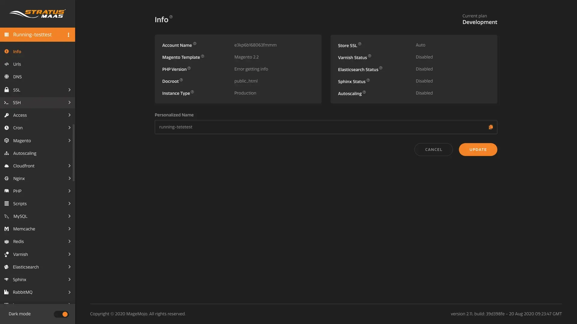
Why this approach: Settings loaded read-only first, expandable in place inside the same navigation, with an editable "Personalized Name" replacing the raw account hash as the one thing everyone, support included, needed to identify an account quickly.
Impact: Developers and support staff both reached full adoption on the same interface, with no separate mode required.
Iteration
Four rounds of testing, each driving a structural change:
- Round 1 (3 users: the CTO and two support agents, wireframes): confirmed both groups lead with "is everything okay." Dashboard restructured around status.
- Round 2 (4 users, visual + copy): field labels like "Docroot" and "Instance Type" weren't self-explanatory even to support agents who used the panel daily. Contextual help added throughout.
- Rounds 3-4 (full review): advanced settings consolidated, change history added, ambiguous icons clarified. The Urls list, the one page store owners actually touched, was checked separately against what the two store owners said they needed to see there.
The clearest before-and-after is the URLs List page: three always-on checklist questions per row, replaced by a color-coded border and a plain-text flag that only appears when something needs attention.
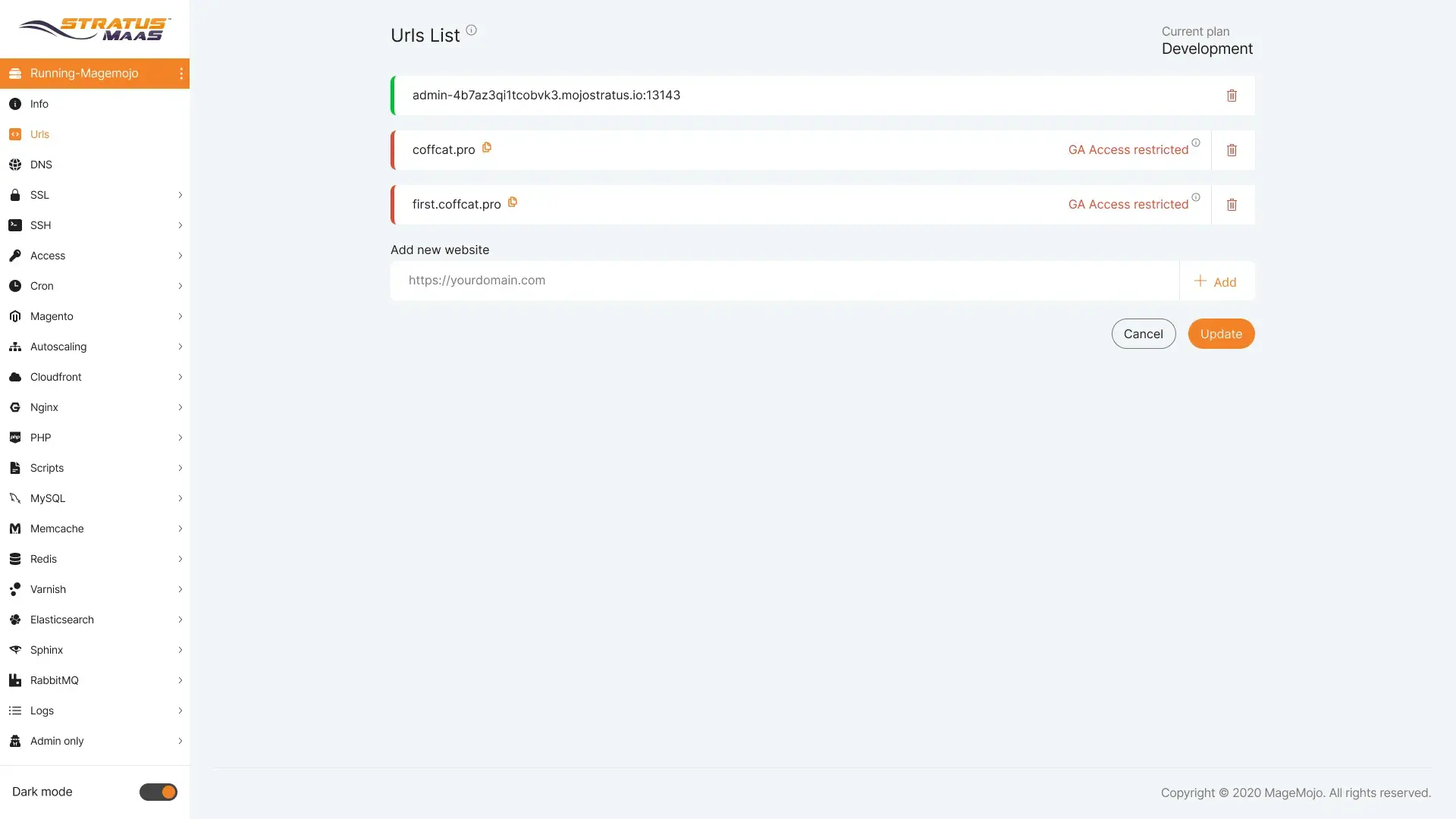
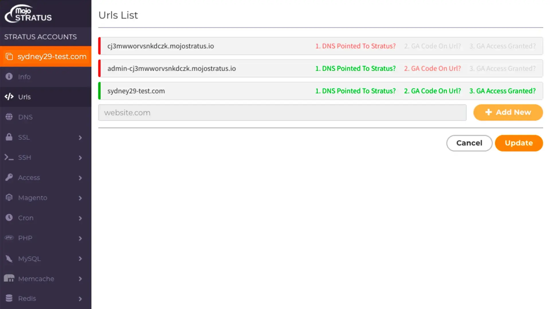
Before: every row restates the same checks regardless of outcome. After: a colored border and a flag only when something's actually wrong.
Outcome
Shipped in month six: desktop-optimized, responsive, WCAG 2.1 AA compliant, 25+ production screens.
| Metric | Before | After |
|---|---|---|
| Configuration-confusion tickets | ~80/month | ~50/month (-40%) |
| Avg. ticket resolution time | 20 min | 14 min (-30%) |
| Support calls prevented (6 months) | n/a | 1,200+ |
| Developer adoption | n/a | 100% |
| Support staff adoption | n/a | 100% |
Reflection
The biggest lesson: a shared first question can hold together very different depths of use, from someone who lives in an interface every day to someone who opens it once a quarter for one task. I started out framing this as simplicity versus power across three equal audiences, then swung the other way while rebuilding this case study and nearly cut the store owner out of the story entirely once the screens made clear how technical most of the interface really was. The accurate answer sat in between: MageMojo's own marketing named merchants as intended users of this panel, and the surviving screens show exactly one page, granting Google Analytics access and checking a domain, that a store owner plausibly touched themselves. Getting that right took going back to the product's actual marketing, not just the screens, and I'd rather show that correction than paper over it.
The second lesson: don't restate a status, flag it. The single highest-leverage change in testing wasn't a new feature. It was refusing to show the same passing checks on every healthy row, and only speaking up when something needed a human's attention, whichever human that was.
If I ran this again, I'd want a larger interview base before committing an entire information architecture to a pattern drawn from five conversations, and I'd map out precisely which screens each person actually touched before writing a word of the brief, not after.
Three people weren't disagreeing about what they wanted first. They were disagreeing about how much of the tool was actually theirs to use.
Key Takeaways
- A shared first question can hold together very different depths of use. Developers and support agents who lived in the tool daily, and store owners who opened one page a few times a year, all wanted "is everything healthy" answered before anything else.
- Flag the exception, don't restate the check. Replacing always-on questions per row with a single flag on the rows that needed attention was the highest-leverage single change in testing.
- A layered interface is only as good as the sequence it's built on. Layered disclosure won because it matched how people actually worked, not a basic-versus-advanced guess.
- Color and type can do functional work. The semantic system let one screen serve a glance and a deep configuration session.
- Know exactly which screens each person touches before you write the brief. Getting the store owner's real role right took checking the product's own marketing against the surviving screens, not assuming from either one alone.
Tools Used: User Interviews · Concept Sketching · Adobe XD · Usability Testing · Design Systems
Tools Used
More Work
Other Case Studies
Let's build something meaningful together.
Whether you're building a new product, improving an existing experience, or exploring AI-powered workflows, I'd love to hear what you're working on.
Get in Touch