Beyond the Chatbot: The AI UX Design Patterns That Actually Work
Most AI features are a sparkle icon nobody uses. The ones that change behavior follow different patterns — pre-fill, visible confidence, graceful failure.
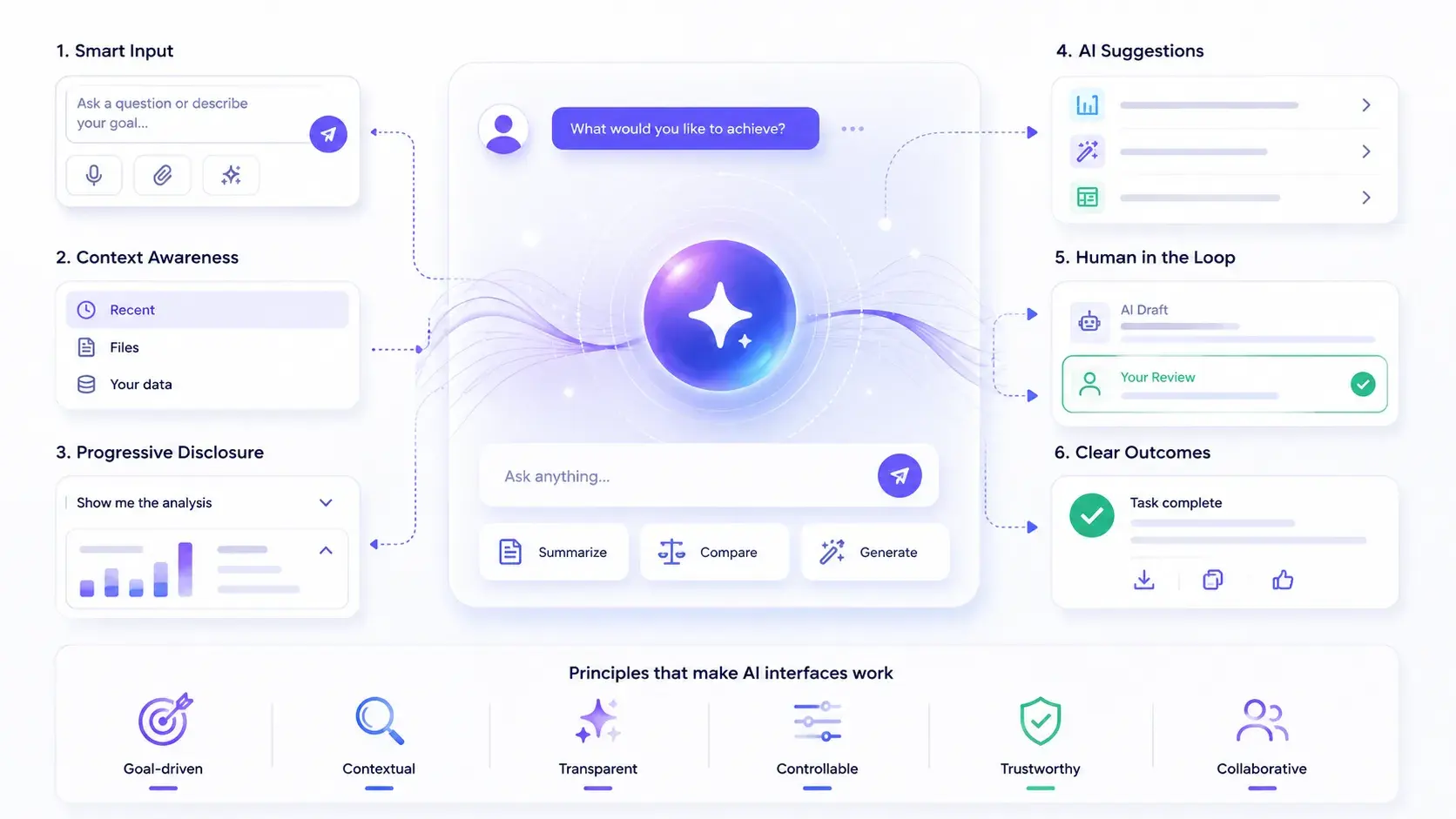
There's a version of AI UX you've seen a hundred times: a little sparkle icon, a panel that slides out from the right, a text field that says "Ask me anything." Most of them go largely unused.
Then there's the kind of AI UX that changes how people work, quietly, without fanfare, in a way that makes the old way feel broken.
The difference isn't the model. It's the design.
That distinction is the whole subject of this article: not which model you're calling, but which interface patterns actually earn a place in someone's daily workflow versus which ones get tried once and abandoned.
Stop asking where the AI goes
Before you design an AI feature, answer a harder question first: what is the user trying to accomplish, and where in that workflow does AI genuinely reduce friction?
Most bad AI UX starts from the wrong question entirely: "Where can we put the AI?" The answer to that question is almost always "in a chatbot," because a chat panel is the fastest way to ship something that visibly uses a language model. But a chatbot is not a neutral default. It's the right interface for open-ended query resolution, when the user's need is genuinely unstructured and a conversation is the most efficient way to narrow it down. For most product workflows, it's the wrong tool: a more opinionated, embedded UI will serve the user better.
Consider someone categorizing 500 support tickets. They don't want to describe their taxonomy to a chat interface, one ticket at a time. They want the AI to suggest categories inline, they want to accept or correct each one with a click, and they want to be done. That's not a conversation. It's a workflow with embedded intelligence, and the difference matters more than it sounds.
| Interface | Works well when… | Fails when… |
|---|---|---|
| Chatbot | The task is genuinely open-ended and the user doesn't know what to ask for until they see an answer | The task is repetitive, structured, or has a known shape (categorizing, drafting, extracting) |
| Embedded suggestion | The workflow already has a clear input and output, and AI can shortcut the middle | The user needs to explore or reason through something novel, not confirm a guess |
Use this as a quick filter before you sketch a single screen: if you can describe the user's task as "do X to each of these Y things," you're looking at an embedded-intelligence problem, not a chatbot problem.
The patterns that separate AI-native UX from AI-as-a-feature
Four patterns show up consistently in AI features people actually keep using. None of them are exotic. All of them are easy to skip under deadline pressure, which is exactly why they're worth naming.
1. Ship AI suggestions as pre-fill, not first-fill
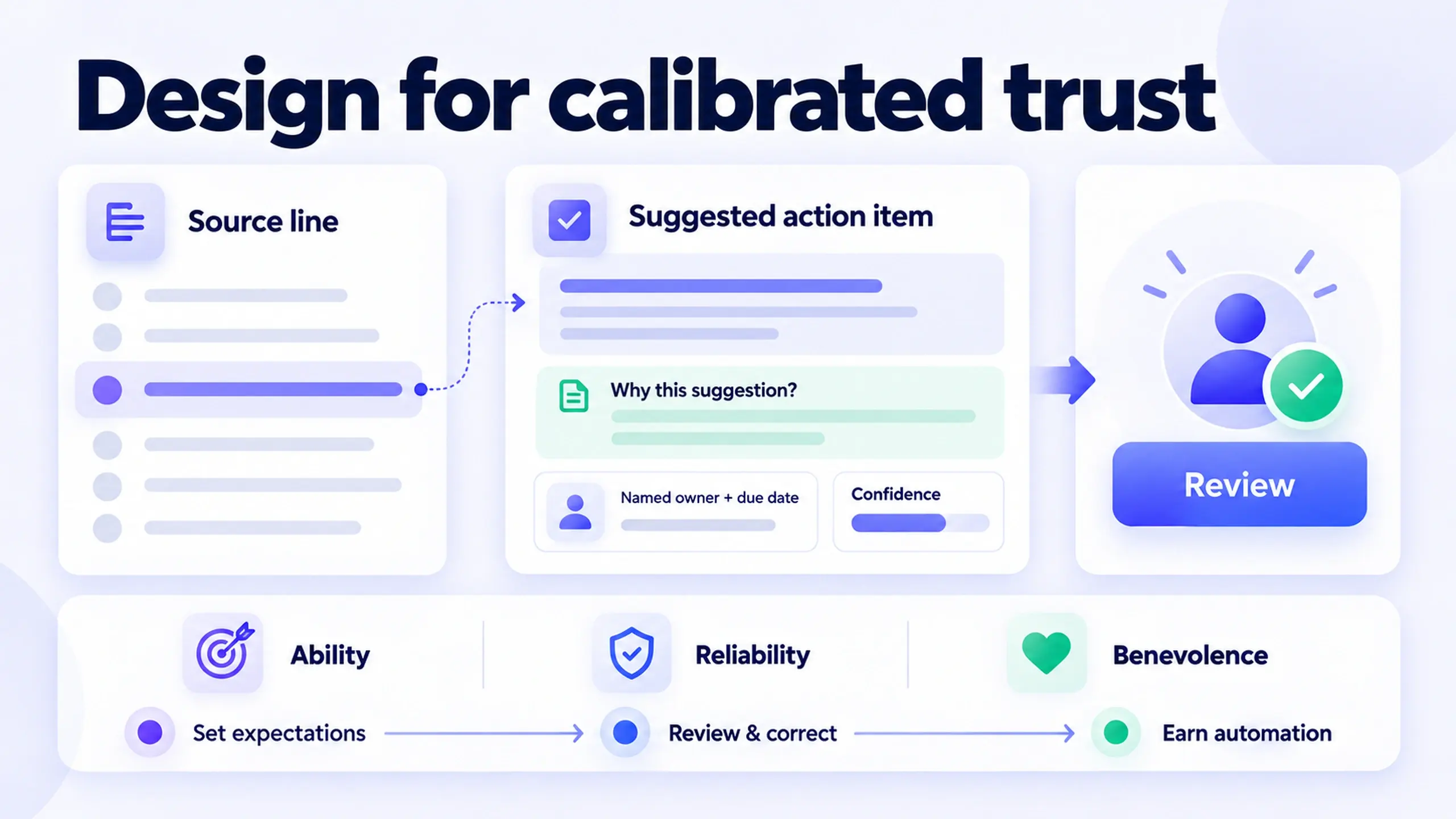
What it means: The AI surfaces a suggestion and asks the user to confirm, correct, or discard it, rather than acting and only telling the user afterward.
Why it matters: Keeping a human in the loop at the point of action, not after it, builds trust incrementally and catches errors before they compound. Microsoft's research-backed Guidelines for Human-AI Interaction make this explicit: systems should make it easy to edit, refine, or recover when the AI is wrong, and that's much easier to do when the AI's output is a draft the user is already reviewing rather than an action already taken.
The tradeoff: Pre-fill is slower than full automation, and slower is a real cost, not a minor one. It's worth paying early, because users who catch and correct a few AI mistakes early on develop calibrated trust in the system. Users who never see the AI be wrong, because it acted before they could check, don't develop trust. They develop a false sense of reliability that breaks badly the first time the AI actually is wrong.
2. Treat confidence as a first-class signal, not a caveat
What it means: When the AI is uncertain, the interface says so visibly, in the moment, not in a disclaimer buried in a tooltip.
Why it matters: A low-confidence suggestion should look different from a high-confidence one, not just carry a smaller font size somewhere nearby. This isn't decoration. It changes what the user does next.
| Confidence signal | What it should prompt the user to do |
|---|---|
| High confidence (visually default, minimal friction) | Accept quickly, spot-check occasionally |
| Medium confidence (subtle visual distinction: muted color, a small indicator) | Review before accepting |
| Low confidence (explicit, can't-miss treatment) | Treat as a starting point, not an answer |
A confidence signal that looks identical at every confidence level isn't a signal. It's decoration that happens to be attached to a number.
3. Design the failure state as carefully as the happy path
What it means: When the AI can't help, the user isn't stranded. There's a fallback, and it's usually just the manual flow that existed before the AI feature did.
Why it matters: The worst AI features leave users with no suggestion, no fallback, and no way to proceed. Graceful degradation should be treated as a first-class design requirement, not an edge case handled by whatever the engineering team defaults to. Microsoft's guidelines put this plainly: when a system is uncertain about a user's goal, it should scope its services or gracefully degrade rather than guess with false confidence.
In practice: If your AI drafts email replies, the fallback when it has nothing useful to suggest is the same blank compose box the user had before your feature existed, not an error message or a dead end.
4. Earn high-stakes AI actions through progressive trust
What it means: Don't ask users to trust a high-stakes, low-visibility AI action before they've seen the system succeed on smaller, reviewable ones.
Why it matters: If your AI writes email responses, start with drafts sitting in a review queue. Move to one-click send only after users have seen enough good outputs to extend that trust themselves, not because a release note told them to.
The limitation: This pattern takes longer to reach full automation than shipping the automated version on day one. That's the point, not a flaw. Trust built this way survives the AI's first visible mistake. Trust that was never actually earned doesn't.
Why editable outputs and real explanations aren't optional
AI outputs can be wrong. That's not a bug to be patched away eventually; it's an inherent characteristic of a probabilistic system, and the design obligation that follows from it is straightforward: make it easy for users to see what the AI did and to correct it.
Concretely, that means:
- Editable outputs, not read-only ones. If the user can't fix what the AI got wrong, you've shipped a suggestion engine with no undo button.
- Explanations users can interrogate. "Why did you suggest this?" needs an answer, even an imperfect one.
- Undo for consequential actions. Anything the AI does that's hard to reverse needs an easy way to reverse it anyway.
- Audit logs for teams, so a decision an AI made last month is still traceable today.
Nielsen Norman Group's research on explainable AI in chat interfaces backs this up directly: explaining how an AI system reached a particular output helps users "form accurate mental models, prevents the spread of misinformation, and helps users decide whether to trust an AI output." Skip the explanation, and users don't become more skeptical, they become less. Confident-sounding output without a visible reason tends to earn unwarranted trust, which is the opposite of what a probabilistic system deserves.
These features cost real engineering effort. They're not a polish pass you add if there's time left in the sprint. If your AI feature has real consequences for the people using it, they're part of the feature, not an enhancement to it.
Why explainability is a buying criterion in enterprise AI
Enterprise users are a specific case worth designing for separately. They're often required to produce auditable outputs. They work inside compliance constraints that a consumer product never has to think about. They cannot simply trust a black box, and telling them to isn't a design decision, it's a decision to lose the deal.
For enterprise AI, explainability isn't a nice-to-have layered on top of the "real" feature. It's a purchasing criterion. Nielsen Norman Group's guidance on crafting AI explanations for enterprise roles frames it directly: in enterprise contexts, trust functions as a prerequisite for adoption, not a byproduct of it. When the reasoning behind an AI decision feels too opaque and the stakes are too high, the realistic outcome isn't cautious use. It's the stakeholder overriding the system, ignoring it, or abandoning it outright.
"Why did it say this?" needs an answer. Not a perfect one, but a coherent one that a compliance reviewer, not just the end user, can follow. Design for that question from the start, not as a retrofit once legal asks for it.
Where these patterns run into limits
None of this is a universal rulebook, and treating it as one would undercut the whole argument.
Pre-fill isn't worth it for genuinely low-stakes, high-volume actions. If a wrong AI guess costs nothing to fix and happens a thousand times a day, full automation with a lightweight review sample can beat a review-every-item workflow that nobody has time to actually use.
Progressive trust-building slows adoption in a way that's easy to mistake for a design failure. It isn't one. It's the cost of trust that survives contact with an actual mistake, paid upfront instead of after a user gets burned.
Confidence signals can be gamed by decision fatigue. If every suggestion in a busy interface carries a confidence badge, users stop reading them within a week. Reserve visible confidence signals for decisions that are actually worth pausing on.
Frequently asked questions
Is a chatbot ever the right interface for an AI feature? Yes, specifically for open-ended query resolution, where the user doesn't know what to ask for until they see a response and a conversation is genuinely the most efficient way to narrow down their need. It's the wrong default for repetitive, structured tasks with a known shape, which describes most product workflows better than most teams initially assume.
How do you show AI confidence without cluttering the interface? Reserve explicit confidence treatment for suggestions where the cost of a wrong guess is meaningful enough to justify a second look. High-confidence suggestions can stay visually quiet; low-confidence ones need to be impossible to miss. A confidence badge on every single element trains users to ignore all of them.
Does progressive trust-building really slow down adoption, or does it help it? Both, depending on the time horizon. It slows the path to full automation in the first weeks. It's also what makes automation survive the AI's first visible mistake later, because users who've already seen the system succeed on smaller, reviewable actions extend trust instead of revoking it.
What's the actual difference between pre-fill and full automation? Pre-fill puts a human decision between the AI's suggestion and any consequence. Full automation removes that step. Both are legitimate design choices; the mistake is defaulting to full automation because it's faster to build, without deciding that the removed review step is actually safe to remove.
Where this is going
The products that will win over the next few years probably won't be the ones with the most visible AI. They'll be the ones that make AI feel less like a feature and more like the product got quieter and got better at the same time; not invisible in the sense that users don't know it's there, but invisible in the sense that it stopped feeling like a bolted-on panel and started feeling like part of how the product works.
That's harder to design than a chatbot. It's also the work worth doing, one pattern at a time: pre-fill before automation, visible confidence before silence, a real fallback before a dead end, and trust earned in stages before it's assumed.
This post was edited with AI assistance for clarity and formatting.

Sanjay Shrestha
Senior Product Designer · CUA™ Certified
15+ years designing enterprise SaaS, B2B, and government digital products. Currently at Decisions.
Keep Reading