Jakob's Law: Why Your Users Already Expect Your Product to Work Like Every Other One
Users spend most of their time on other products and bring those habits with them. What Jakob's Law means, when it applies, and the three places it stops being true.
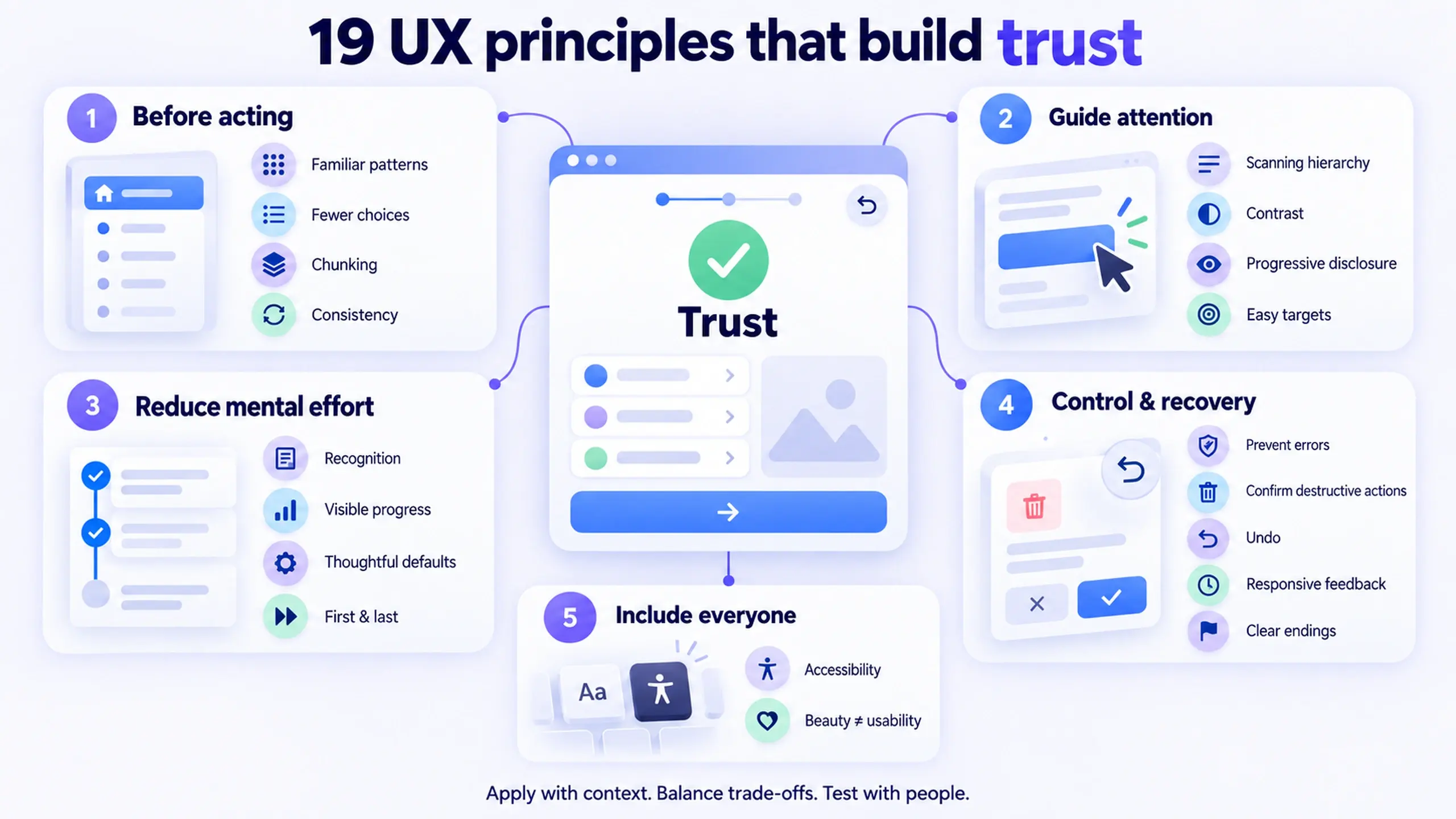
This is Part 1 of The Product Designer's Playbook, a series working through the day-to-day craft of product design one topic at a time: UX laws, accessibility, stakeholder management, communication, career, components, and more. For a broader map of UX principles, see 19 UX Principles That Quietly Decide Whether People Trust Your Product. This piece is a full reference on one of them: Jakob's Law, written so it works whether you're new to UX or you've been shipping products for years.
The law in one sentence
Jakob's Law: Users spend most of their time on products other than yours, so they prefer yours to work the way those other products already work.
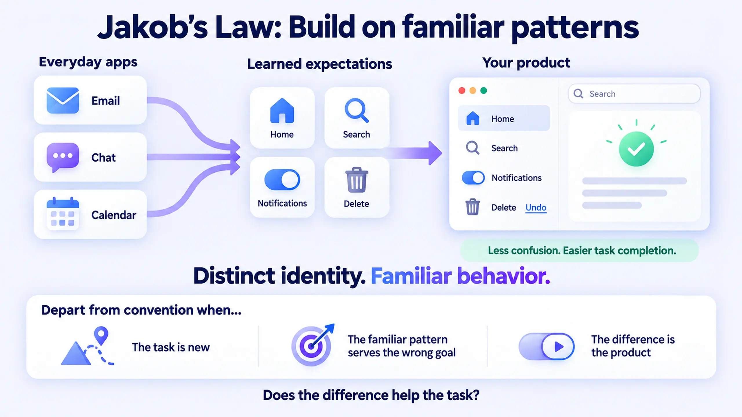
Named after usability pioneer Jakob Nielsen, it's less a clever insight and more a statement of the obvious, stated plainly enough that it's easy to forget in practice. Users arrive at your product carrying every habit that email, chat apps, social feeds, and whatever they used thirty seconds ago already taught them. Every place your product breaks from that is a small tax on their attention.
What it means, plainly
Jakob's Law is not an argument for making your product look like every other product. It's an argument about interaction patterns and mental models: the small, structural expectations users bring with them about how a control behaves once they touch it.
It applies to things like:
- Where search lives (near the top, usually top-right or as a persistent bar)
- What a trash or delete icon does (removes something, doesn't silently archive it)
- What clicking a logo does (returns you home)
- The difference between a toggle (binary, reversible) and a button (commits to an action)
- What blue, underlined text means (a link, regardless of your brand's accent color)
It does not apply to your visual identity, brand, or the parts of your product that are genuinely novel. A product can look and feel completely distinctive while still putting navigation where people expect it, because the law operates one layer below aesthetics: at the level of "what does this control do when I interact with it," not "what does this screen look like."
When to apply it
Reach for Jakob's Law any time you're deciding how a common interaction should work and there's already a convention for it elsewhere. That covers most day-to-day design decisions: navigation, forms, search, settings, notifications, destructive actions, sorting and filtering.
It matters most in two situations:
- The interaction is common, not novel. If ten other products already solve this exact interaction the same way, that's a strong signal, not a coincidence to ignore.
- The user is task-focused, not exploring. Someone trying to finish an expense report or find a setting is running on muscle memory. Someone browsing a portfolio site for inspiration has more tolerance for the unexpected.
Do
- Default to the pattern your users already know from the products they use daily, not just from your direct competitors.
- Ask what platform your users are coming from. A tool embedded in Microsoft 365 or Slack inherits very specific, very current expectations from that host platform.
- Treat a "confusing" first session as a signal that a mental model was violated, not that the feature needs more explaining.
- Test novel patterns against the familiar alternative, not in isolation. "Do people prefer this?" is a different question from "do people finish the task faster with this?"
Don't
- Don't invent a new pattern for an interaction that already has a well-established convention, just because it feels more "designed" or more on-brand.
- Don't defend a novel pattern in a design review with "it's more interesting" or "nobody else does this." Neither is evidence it works better for the user.
- Don't assume familiarity is free. A pattern can be familiar and still wrong for your product if it was built to optimize for something you don't want (see the exceptions below).
- Don't apply the law to visual style. Matching a competitor's layout pixel-for-pixel is not what this law is asking for.
Where this shows up hardest: enterprise software
Consumer apps get most of the write-ups on this law, but it's arguably sharper in enterprise software, because enterprise users don't just compare your product to your competitors. They compare it to whatever they were using thirty seconds ago: Outlook, Teams, Slack, their calendar. A meeting-management tool that lives inside Microsoft 365 and Teams inherits an unusually specific version of this problem, since users arrive with strong, very current expectations about how a panel behaves, how a modal closes, and how a list of items sorts, formed in the exact platform the product is embedded in.
Ignore that context and the cost isn't abstract. It shows up as support tickets asking how to do something the product already does, as a training deck that shouldn't need to exist, and as a first session where someone decides the tool is confusing before they've actually used the feature that would have solved their problem. None of that is a failure of the feature. It's a failure to borrow a mental model that was sitting right there, free, in the platform the product already lives inside.
The cost of violating Jakob's Law rarely shows up as a complaint. It shows up as a slightly higher bounce rate, a slightly longer time-to-value, and a slightly lower adoption number that nobody traces back to the one screen that didn't behave the way every other screen in the user's day already does.
Examples
| Situation | Follows Jakob's Law | Violates it |
|---|---|---|
| Deleting an item | Trash icon removes it, with undo | Trash icon silently archives it elsewhere |
| Site navigation | Logo click returns to home | Logo click opens a settings panel |
| Enabling a feature | Toggle switch, reversible | Toggle switch that actually commits irreversibly |
| Link styling | Blue, underlined text reads as clickable | A brand color with no underline, indistinguishable from body text |
| Search placement | Top of screen, persistent | Buried three menus deep |
The three exceptions
Treating Jakob's Law as universal is its own mistake. It stops applying in three specific situations:
- The task itself is genuinely new. If no existing product does the thing you're building, there's no convention to borrow, and inventing one is the actual job. Early file-sharing links, the first pull-to-refresh gesture, the first AI chat interface: each had no precedent to be consistent with. The law applies to established patterns; it has nothing to say about problems that haven't been solved before.
- The familiar pattern was optimized for a different goal than yours. Infinite scroll is familiar because consumer feeds are built to maximize time-on-app. Importing it into a workflow tool where the actual goal is helping someone finish and leave borrows a pattern built for the opposite outcome. Familiarity isn't a neutral good; it's worth asking what the familiar pattern was built to optimize for before reusing it.
- The deviation is the product. If your product's entire value proposition is a fundamentally different way of doing something, a new input method, a new way of structuring information, then the unfamiliar pattern isn't a UX cost to minimize. It's the reason the product exists. The law is a reason to default to convention, not a reason to never break from it when breaking from it is the point.
The practical test
Before defending a novel interaction pattern in a design review, ask one question honestly: is this different because it's better for the task, or because it's different? "More on-brand," "more interesting," and "nobody else does this" are not the same claim as "this helps the user finish faster or with less confusion than the pattern they already know." Only the second one earns an exception to Jakob's Law. The first two are usually just novelty wearing the costume of a design decision.
Things to remember
- Jakob's Law is about behavior, not visual style. Your brand identity is untouched by it.
- The comparison set is every product your user has ever used, not just your direct competitors.
- Familiarity is a starting default, not a rule with no exceptions. Break it when the task is new, when the familiar pattern optimizes for the wrong outcome, or when the deviation is the actual product.
- If you can't say why a novel pattern helps the user finish faster or with less confusion, it's probably not an exception. It's just novelty.
Part 1 of 30 · The Product Designer's Playbook
This post was edited with AI assistance for clarity and formatting.

Sanjay Shrestha
Senior Product Designer · CUA™ Certified
15+ years designing enterprise SaaS, B2B, and government digital products. Currently at Decisions.
Keep Reading