19 UX Principles That Quietly Decide Whether People Trust Your Product
Nineteen UX principles grouped by the moment they actually matter — from Hick's Law to accessibility to the Aesthetic-Usability Effect — with plain-language examples and where each one stops applying.
Most lists of "good UX rules" read like a poster: familiar patterns, fewer choices, clear hierarchy, each one true and each one abstract enough to be useless the moment you sit down to actually design something. The principles behind good UX aren't a style preference. Most of them describe a specific limit in how people think, decide, remember, and perceive, and each one was measured before it was ever turned into a guideline.
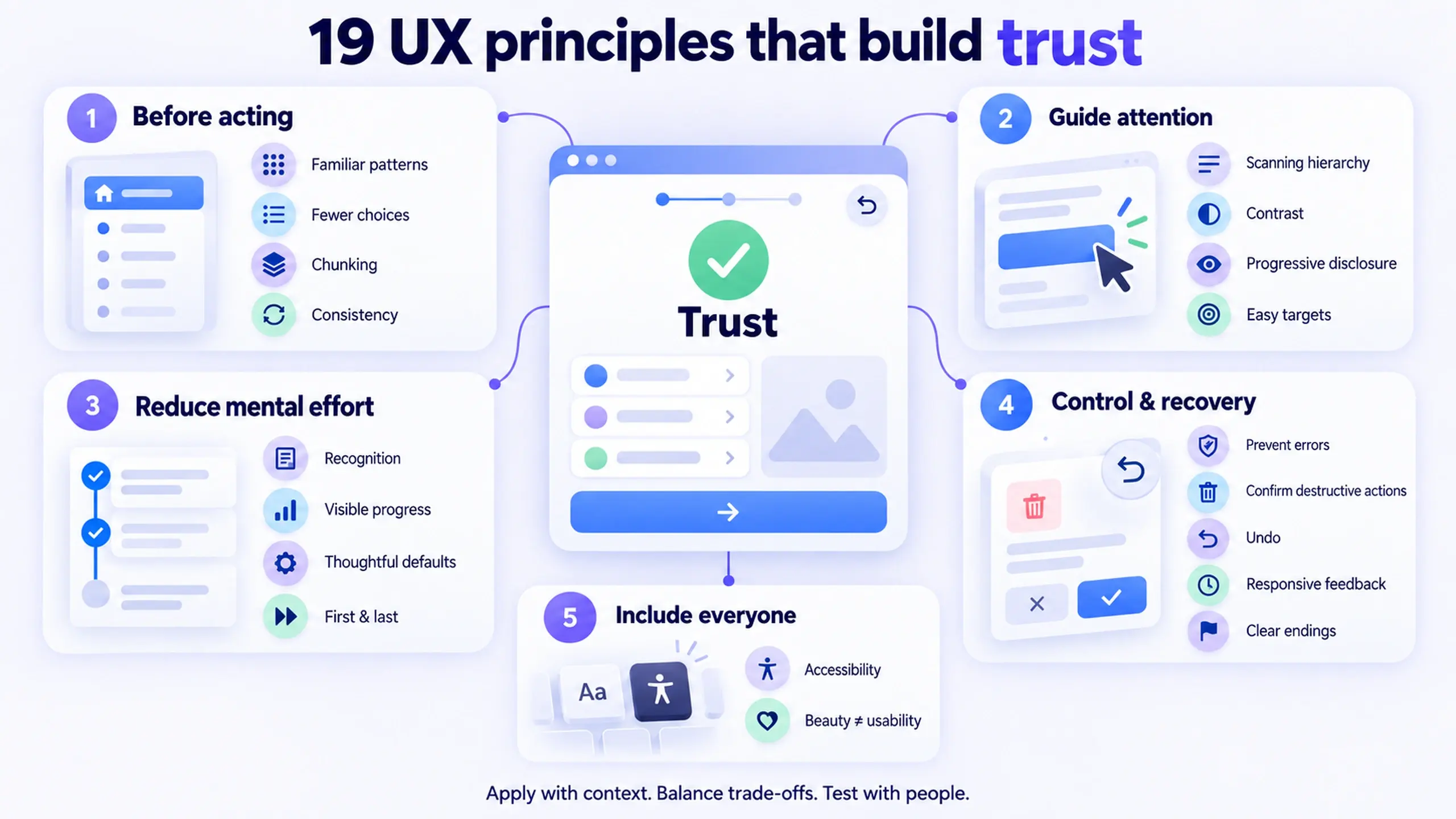
This article covers nineteen of them, grouped by the point in someone's journey through a product where each principle actually does its work:
- Before they act
- While their attention is being directed
- While they're carrying information in their head
- When something could go wrong or needs undoing
- Whether the product works for people who don't share the designer's abilities, devices, or context (a category most "rules of UX" lists skip entirely)
Knowing which stage a principle governs is what makes it usable instead of decorative.
What "good UX" is actually built on
Most of what gets called a "UX rule" traces back to one of three sources:
- Jakob Nielsen's ten usability heuristics, first published in 1994 and still the standard framework for heuristic evaluation, a rule of thumb meant to help catch usability problems in an interface design
- A set of findings from cognitive and behavioral psychology that designer Jon Yablonski later compiled into the "Laws of UX"
- The Web Content Accessibility Guidelines (WCAG), the standard most accessibility requirements are actually measured against
None of these three sources were invented for design in the abstract. Each describes a limit, in attention, memory, perception, or physical ability, that shows up whether or not a designer accounts for it.
That distinction matters for how you use these principles: they aren't taste, and they aren't universal law either. Each one has a domain it applies to and a point where it stops applying, which is why every principle below includes both.
The nineteen principles at a glance
| Principle | Governs | Named research |
|---|---|---|
| Match existing mental models | Before someone acts | Jakob's Law |
| Limit the choices in view | Before someone acts | Hick's Law |
| Chunk information into small groups | Before someone acts | Miller's Law |
| Keep patterns consistent within your own product | Before someone acts | Consistency and standards |
| Design hierarchy for scanning | Guiding attention | F-shaped reading pattern |
| Use contrast to mark what matters | Guiding attention | Visual hierarchy |
| Defer complexity until it's needed | Guiding attention | Progressive disclosure |
| Make targets easy to hit | Guiding attention | Fitts's Law |
| Show options instead of demanding recall | Memory and effort | Recognition over recall |
| Make progress visible | Memory and effort | Goal-gradient effect |
| Choose defaults deliberately | Memory and effort | Default effect |
| Put the important items first or last, not buried | Memory and effort | Serial Position Effect |
| Prevent errors before they happen | Control and recovery | Error prevention |
| Confirm before anything destructive | Control and recovery | Error prevention |
| Always leave a way back | Control and recovery | User control and freedom |
| Keep the system responsive, or explain the wait | Control and recovery | Doherty Threshold |
| End on an unmistakable, clear state | Control and recovery | Peak-End Rule |
| Design for people who aren't like you | Inclusion | WCAG |
| Don't mistake beautiful for usable | Inclusion / caution | Aesthetic-Usability Effect |
Reduce how much someone has to think before they act
The first four principles all target the same moment: before a person has done anything, while they're still orienting to the screen.
1. Match what people already know
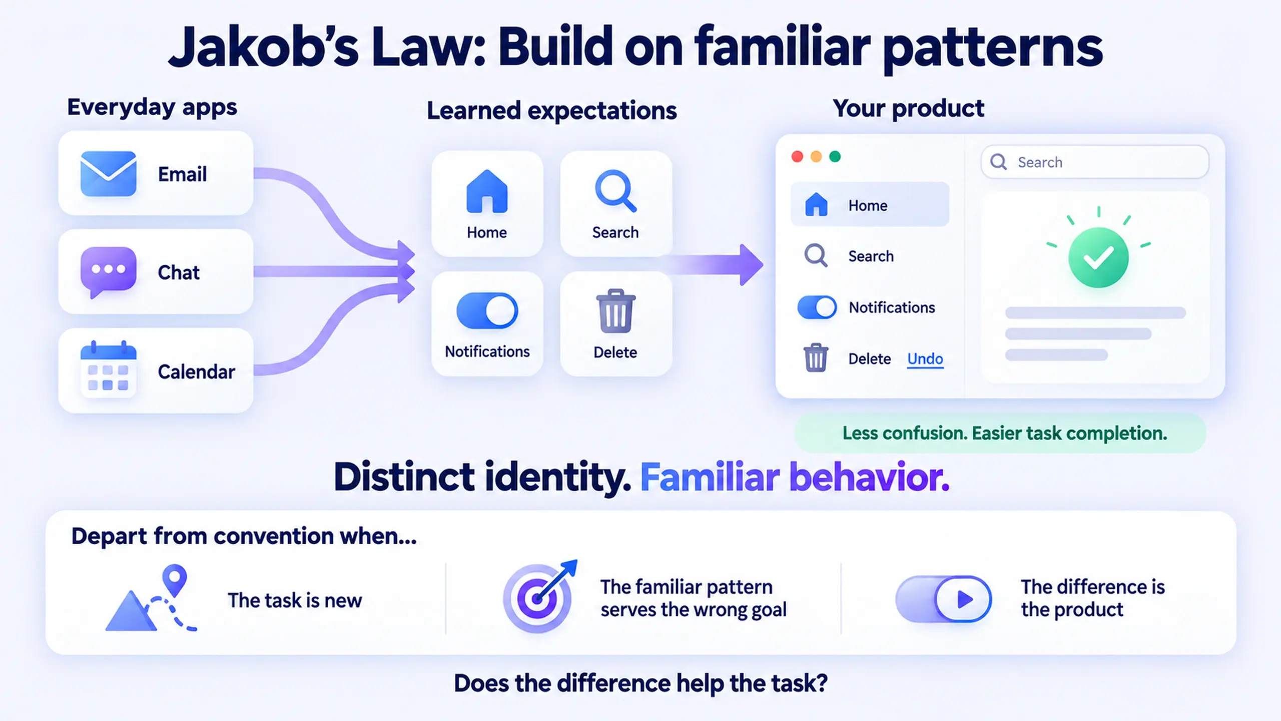
People don't approach your product as a blank slate. They arrive with expectations built from every other app they've used, and a mismatch between what they expect and what they find creates friction, the kind that comes from having to unlearn one mental model to build another. This is Jakob's Law: design against the model people already carry, not the one that would be most original.
In practice, that means putting primary navigation where people expect it, using a shopping cart icon for a cart, keeping destructive actions in red. None of that is unimaginative. It's the reason a first-time visitor can use your product without a tutorial.
Where it doesn't apply: if your product does something genuinely new that no existing pattern covers, forcing it into a familiar shape can be more confusing than inventing a new one, as long as the new pattern is introduced clearly and stays consistent from that point forward.
2. Limit the choices in view
Research from the 1950s on the relationship between the number of choices and reaction time established what's now called Hick's Law: the more options in front of someone, and the more those options differ from each other, the longer it takes to decide.
A settings screen with 40 toggles in one long list is the weak version. Group the same 40 settings into five labeled sections, with the three most-used settings surfaced at the top, and it gets a lot easier to use.
Where it doesn't apply: Hick's Law describes fast, low-stakes decisions well. It says little about decisions that genuinely require research or deliberation, like choosing a health insurance plan; reducing the visible options there can just as easily hide the information someone needs.
3. Chunk information into small groups
In 1956, psychologist George Miller proposed that a person's immediate memory and judgment are both limited to roughly seven pieces of information at a time. That's Miller's Law. The practical takeaway isn't the number seven specifically; it's that working memory has a hard ceiling, and grouping related items ("chunking") raises how much a person can effectively hold.
Break a 16-digit card number into four groups of four. Break a long form into three labeled sections instead of one continuous scroll.
4. Keep patterns consistent within your own product
This is easy to confuse with Jakob's Law, but it's a different problem. Jakob's Law is about matching other products people already know. Internal consistency is about matching your own product to itself: the same button style meaning the same thing everywhere, the same spacing rules, the same terminology for the same concept across every screen.
A "delete" action that's a red button on one screen and a gray text link on another is a common mistake. Both work in isolation. Together, they force people to relearn what "delete" looks like every time they land somewhere new, which is exactly the cost Jakob's Law warns about, just self-inflicted rather than imported from a competitor.
Guide attention and make the right action easy to take
Once someone is oriented, the next job is directing where they look, and making sure the action they land on is easy to actually perform.
5. Design hierarchy for scanning, not reading
People don't read interfaces top to bottom the way they read a paragraph. They scan for the piece that answers their immediate question, then read more closely only if that piece isn't obvious.
Concretely, that means:
- Put the answer or primary action first, not at the end of an explanation
- Use heading text that states the point of a section, not a generic label like "Overview"
- Break long blocks into shorter ones with visual separation between them
6. Use contrast to mark what matters
If every button on a screen is styled the same way, none of them communicate priority, and people either freeze or click the first one they see. The primary action on any screen should be visually unmistakable: larger, higher contrast, positioned where the eye naturally lands, while secondary and tertiary actions recede.
A screen with five buttons that all look equally important is a screen with no primary action at all.
7. Defer complexity until it's needed
Progressive disclosure means showing users only a handful of the most important options at first, and offering a larger set of specialized options only on request. The macOS print dialog is the standard example: a simple set of choices by default, with a "Show Details" toggle that reveals everything else for people who need it.
A common mistake is treating "Advanced settings" as a dumping ground for anything the team didn't want to think through, rather than a deliberate second layer for features most people genuinely don't need on their first pass.
8. Make targets easy to hit
Fitts's Law describes something almost mechanical: the time it takes to move to and select a target depends on the target's size and its distance from the starting point. Small buttons far from where someone's attention naturally sits take measurably longer to hit accurately, and cause more mis-taps, especially on touchscreens.
In practice, primary mobile actions belong within easy thumb reach, not tucked in a far corner. A "confirm" button should be large enough to hit reliably, not styled small because it looks tidier.
Fitts's Law is about physical distance and size, so it has little to say about decisions that are hard for cognitive reasons rather than motor ones. A tiny checkbox that's easy to reach but confusing to interpret isn't a Fitts's Law problem, it's a clarity problem.
Lighten the memory and decision load
These four principles reduce how much someone has to remember or decide unaided while actually doing the task.
9. Show options instead of demanding recall
Recognizing something in a list is faster and less effortful than recalling it from memory. A dropdown of previous addresses beats a blank field asking someone to retype an address they entered three screens ago.
10. Make progress visible
A visible sequence, three filled dots and one empty one, a progress bar moving forward, gives people a reason to keep going that an unmarked, open-ended task doesn't. This relates to the goal-gradient effect: motivation to finish increases as the visible distance to the end decreases.
Where it backfires: a progress indicator that lies (jumping to 90% and stalling) does more damage to trust than no progress indicator at all.
11. Choose defaults deliberately
Most people accept whatever is preselected rather than actively evaluating every option. That makes a default a decision the designer is making on the user's behalf, whether or not it's treated that way.
| Situation | No default | Deliberate default |
|---|---|---|
| Notification frequency | Blank until chosen | Preselect the setting most users actually want, editable |
| Country field | Empty dropdown | Inferred from IP or locale, editable |
| Subscription tier on a form | Unselected | The plan genuinely typical for a new user, clearly labeled as a suggestion |
This same mechanism turns into a dark pattern when the default quietly benefits the business over the user, a pre-checked upsell, a default set to the most expensive plan, used against the person it should be serving.
12. Put the important items first or last, not buried
People recall items at the beginning and end of a list far better than items in the middle, the Serial Position Effect. A navigation menu, a pricing table, or a list of plan features that buries the option you most want someone to notice in position four of seven is fighting against how attention naturally distributes across a list.
In a list of plan tiers, the recommended plan usually belongs first or last, not centered by size alone. In a settings menu, the most-used items belong at the top, not alphabetized into the middle.
Give people control, and a way to recover
These five principles matter less during the smooth middle of a task and more at its edges: when a mistake is possible, when it happens anyway, or when the task is ending.
13. Prevent errors before they happen
The best error message is the one that was never needed. Constrain input formats where you can (a date picker instead of a free-text date field), disable a submit button until required fields are valid, and show format expectations before someone types the wrong thing rather than after.
This principle is about stopping the mistake from being possible in the first place. Confirmation (below) is about catching it right before it becomes permanent. Products need both, at different points.
14. Confirm before anything destructive happens
Interrupt with a confirmation before any action that can't be easily undone: deleting an account, discarding unsaved changes, removing a payment method. The cost of a false-positive confirmation (a half-second of friction) is far smaller than the cost of an accidental, unrecoverable action.
Low-stakes, easily reversible actions (archiving an email) don't need the same friction. Adding a confirmation there just trains people to click through every dialog without reading it.
15. Always leave a way back
Beyond preventing and confirming errors, people need a genuine exit from a state they didn't mean to enter: an undo option after a delete, a "back" path out of a multi-step flow, a way to cancel a subscription that doesn't require calling someone. Nielsen's usability heuristics call this user control and freedom, and it matters most in exactly the moments people are already anxious: mid-transaction, mid-signup, mid-deletion.
A common mistake is offering "undo" as a toast notification that disappears in three seconds, which technically satisfies the principle while failing almost everyone who needed it.
16. Keep the system responsive, or explain the wait
A tenth-of-a-second response feels instantaneous and needs no extra feedback. A response within about a second keeps a person's train of thought unbroken even though they'll notice the delay, a finding often referred to as the Doherty Threshold. Past roughly a second, people benefit from an explicit signal that something is happening: a skeleton screen, a moving progress indicator, a status message.
You can't always make something load in under a second. What you can always do is acknowledge the wait honestly instead of leaving a blank screen.
17. End on an unmistakable, clear state
How an experience ends shapes how it's remembered, often more than the smooth middle of it does, the Peak-End Rule. A vague or ambiguous ending, like "your request has been submitted" with no indication of what happens next, leaves people uncertain whether the task actually succeeded.
A completed purchase should look and read differently from a pending one. A saved document should confirm it saved.
Design for people who aren't like you
This is the category most "good UX" lists skip, and it's not a minor one: the principles above assume a user who can see the screen clearly, use a mouse or a precise touch, and process information at a typical pace. A meaningful share of every product's audience doesn't fit all three assumptions, and the Web Content Accessibility Guidelines (WCAG) 2.2 exist specifically to define what "usable" means when you stop assuming a single kind of user.
18. Design for people who aren't like you
Concretely, that means:
- Every interactive element reachable and operable by keyboard alone, not just mouse or touch
- Color never used as the only signal for meaning (a red border alone doesn't communicate "error" to someone who can't distinguish red from green)
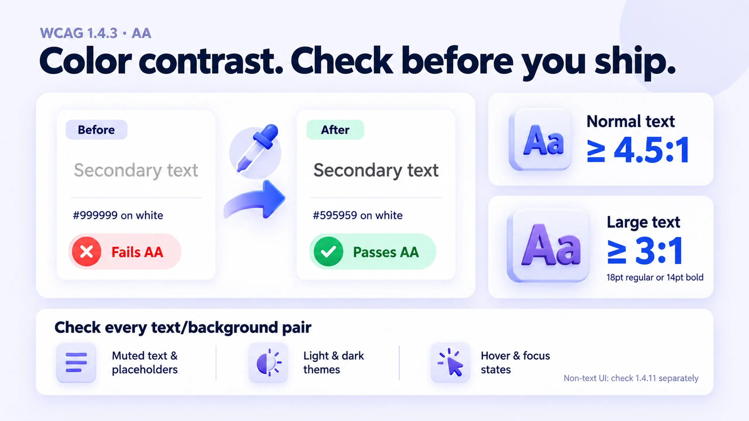
- Text and interactive elements meeting minimum contrast ratios against their background
- Meaningful labels on icons and images for screen readers, not decorative-only markup
- Motion and autoplay that can be reduced or disabled, for people sensitive to it
This belongs on the list and not in a separate compliance checklist because most accessibility failures are usability failures that happen to be invisible to whoever didn't personally hit them. A button that only works with a mouse isn't a niche edge case; it's a Fitts's Law failure and a keyboard-navigation failure at the same time, for a different set of users.
19. Don't mistake beautiful for usable
This one is a caution rather than an instruction. The Aesthetic-Usability Effect describes a real, measured bias: people perceive more attractive designs as easier to use, even when the underlying usability is identical or worse. That's genuinely useful to know, and genuinely dangerous if it's the only thing you know about it.
A well-designed, polished interface earns real patience from users during minor friction that an ugly one wouldn't get. But the same bias means a beautiful interface can hide real usability problems from a design team during internal review, because everyone in the room is subject to the same effect. Aesthetic polish isn't evidence that something works. Usability testing with actual users is the only way to tell the difference.
Where these principles compete with each other
None of these nineteen exist in isolation, and several of them pull in opposite directions depending on the situation:
- Fewer choices (Hick's Law) vs. showing all the options (recognition over recall). Reducing choices helps for fast, low-stakes decisions. Showing more options helps when someone needs to compare before deciding.
- Familiar patterns (Jakob's Law) vs. a genuinely better new pattern. Novelty has a real cost in learnability. It's worth paying only when the new pattern solves a problem the familiar one can't.
- Deliberate defaults vs. user control. A well-chosen default speeds most people up. The same default, if it can't be easily changed, becomes a trap for the people it doesn't fit.
- Aesthetic polish vs. verified usability. A design can pass every visual review and still fail its first real usability test, precisely because reviewers are as subject to the Aesthetic-Usability Effect as anyone else.
None of these tensions have a universal answer. They're the actual judgment calls that separate a designer applying a checklist from one making a real decision.
Frequently asked questions
Are these principles the same as Nielsen's usability heuristics?
Related but not identical. Nielsen's ten heuristics are broad rules of thumb, developed to catch usability problems during an interface review. The "laws of UX" referenced throughout this article (Hick's Law, Miller's Law, Fitts's Law) are individual psychological findings that explain why certain heuristics hold. Accessibility principles come from a third source, WCAG, which is a formal standard rather than a heuristic or a psychological finding.
Do I need to apply all nineteen principles to every screen?
No. Most screens will be governed by three or four of these at once, not all nineteen. Treat this as a reference to check a specific design decision against, not a checklist every screen must satisfy in full.
Which of these should never be skipped, even under deadline pressure?
Accessibility and error prevention for destructive actions are the two categories with the highest real cost when skipped: one excludes real users outright, the other causes irreversible harm. The remaining principles trade off against each other situationally; those two are closer to non-negotiable minimums.
Use these as a working reference, not a poster
The value in these nineteen principles isn't in memorizing them. It's in having language for what's actually going wrong when a screen feels harder to use than it should, or when it works fine for you and fails for someone else entirely.
Keep this as a reference the next time a design review stalls on "something feels off but I can't say what." Most of the time, one of these nineteen names it.
If you're applying these inside a broader design process, how user flows, prioritization, and design trade-offs work together in practice covers the decision-making habits that sit around individual UX principles like these. And if the friction you're diagnosing shows up specifically in conversion-critical flows, nine UX fixes that boost conversion applies several of these same principles to specific, shippable changes.
This post was edited with AI assistance for clarity and formatting.

Sanjay Shrestha
Senior Product Designer · CUA™ Certified
15+ years designing enterprise SaaS, B2B, and government digital products. Currently at Decisions.
Keep Reading