Design Process: 5 Habits That Separate Real Process From Theater
A strong process brings structure to messy problems. Here's how flows, IA, prioritization, and critique work together to guide real decisions.
This is Part 3 of a 5-part series that explores the concepts, frameworks, and decision-making behind great digital products. Each article goes beyond definitions to explain when these concepts matter, why they matter, and how experienced product designers apply them in real-world work. Part 1 covered User Research and Part 2 covered Product Thinking. This post covers Design Process.
Process is the part of design that sounds the most rehearsable, and is the hardest to fake. Anyone can recite a double diamond. What separates a real process from a framework put on slides is whether it's a tool you actually use to make decisions.
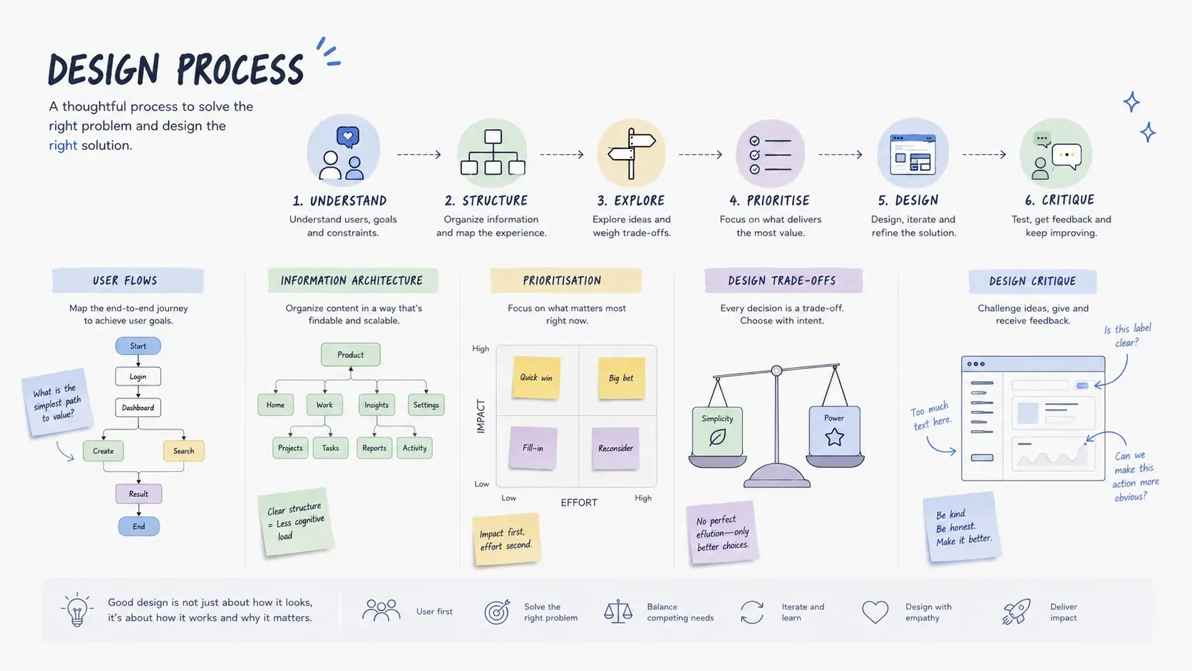
Five concepts show that distinction most clearly: user flows, information architecture, prioritization, design trade-offs, and design critique. None of them are exotic, and none of them require a certification. What they require is the discipline to actually use them under deadline pressure, with incomplete information, which is exactly where most "process" quietly turns into theater.
Key takeaway: A design process isn't the diagram, the framework name, or the number of stages on a slide. It's whether these five habits show up in how you actually make decisions.
The five concepts at a glance
| Concept | What it actually forces you to do | Most common failure | What experience looks like |
|---|---|---|---|
| User flows | Confront every decision point, error state, and re-entry point before opening a design tool | Drawing only the happy path | Catching a hidden dependency before it reaches a prototype |
| Information architecture | Match structure to how users think, not how the organization is structured | Letting internal department names become nav labels | Validating structure with card sorting or tree testing before it ships |
| Prioritization | Make an honest call under incomplete information and competing stakeholders | Letting engineering effort or the loudest user set the agenda | Naming the metric that actually matters before ranking anything |
| Design trade-offs | Make the cost of a decision visible instead of pretending it doesn't exist | Refusing to name what was traded away | "We chose X, which costs Y, because Z," stated explicitly, then tracked |
| Design critique | Build the feedback loop that improves everything else | Critiquing taste instead of decisions | Feedback structured as observation → principle → direction |
User Flows: Mapping How Users Complete a Task
What most people say: "A diagram showing the steps a user takes to complete a task."
What shows experience: User flows are a thinking tool, not a deliverable. Their value isn't the diagram. It's what the act of drawing it forces you to confront: every decision point, every error state, every assumption about what a user knows at each step.
The failure mode is drawing the happy path and calling it a flow. Real flows include:
- Decision branches: what happens when a user says no, or doesn't have what's needed
- Error states: what the system does when input is wrong or a step fails
- Re-entry points: where does a user land if they leave and come back?
A flow that only shows success is a wishful thinking diagram, not a design tool.
On a complex multi-step enterprise form, I drew the user flow before touching Figma. The flow revealed a step where users needed information from a different system they had to open in a separate tab. We'd have designed the entire middle section around a context-switch that could have been avoided by pulling the data via API. The flow, not the prototype, caught that.
Where this shows up: During product discovery, drawing the flow before touching a design tool is often what surfaces the edge case or dependency that changes the design approach entirely.
Editorial note (not for publish): visual suggestion, a side-by-side flow diagram: a linear happy-path flow on one side, and the same flow on the other with decision branches, error states, and a re-entry point added. Suggested caption: "The happy path is one line. A real flow is a map of everywhere that line can break." Suggested alt text: "Side-by-side comparison of a linear happy-path user flow and a complete flow showing decision branches, error states, and re-entry points."
Information Architecture: Organizing Content So Users Can Find What They Need
What most people say: "The structure and organization of content within a product."
What shows experience: IA is invisible when it works and infuriating when it doesn't. The skill is designing a structure that matches how users think about content, not how the organization thinks about it.
The most common IA failure: internal org structure leaking into product navigation. Teams build nav that mirrors their departments ("HR," "Finance," "Operations") when users think in tasks ("request time off," "submit an expense," "book a room"). These are different mental models and they produce completely different structures.
Methods that actually surface the right structure:
- Card sorting: users group and label content themselves, which reveals their mental models rather than the org chart's
- Tree testing: tests whether users can find things in a proposed structure without visual design interference, using first-click behavior as one of the clearest signals of whether it's working
- First-click testing: where users click first is almost always more telling than where they eventually land
On a large intranet redesign for a government department, the existing navigation had 11 top-level categories built around internal teams. Card sorting with 24 employees produced 5 natural clusters, none of which matched the existing structure. We rebuilt the IA around those clusters. Task-completion rate in tree testing went from 41% to 79% before a single screen was designed.
In real product work: The research method matters less than the discipline of validating or challenging an IA decision with data before it ships, rather than defending it after the fact.
Prioritization: Deciding What Matters Most
What most people say: "Deciding which features or problems to tackle first."
What shows experience: Prioritization isn't a framework choice. It's a judgment call made under incomplete information, usually with competing stakeholders. The frameworks (RICE, MoSCoW, effort/impact) are useful scaffolding, but the real skill is knowing which inputs to trust and which to push back on.
Common prioritization mistakes designers make:
- Letting engineering effort dominate (easy things get built, not important things)
- Treating all user feedback equally (the loudest users are rarely the most representative)
- Optimizing for what's measurable rather than what matters
The most useful prioritization question I've used: "If we could only ship one thing this quarter, what would move the metric we care about most?" It bypasses negotiation about relative priority and forces clarity on the actual goal.
Prioritization is a political act as much as a rational one. Pretending otherwise leads to bad decisions disguised as frameworks.
On a product with a 60-item backlog and one designer, I facilitated a prioritization session using effort/impact mapping. After initial sorting, we had 12 items in the high-impact/low-effort quadrant. Then I asked a second question: "Which of these do users actually block on right now?" That cut the list to 4. We shipped those 4 in six weeks. Support tickets in those areas dropped 55%.
Where this shows up: In real product teams, the decisions that hold up are the ones where the criteria and the trade-off were made explicit at the time, not reconstructed after the fact.
Design Trade-offs: Balancing User, Business, and Technical Constraints
What most people say: "Balancing competing needs when designing a solution."
What shows experience: Every design decision is a trade-off. Designers who can't name what they traded away can't defend their decisions, and can't learn from them when something goes wrong.
The three-way tension is always present:
- User needs: what makes the experience better for the person using it
- Business needs: what moves the metric the organization cares about
- Technical constraints: what's feasible within time, stack, and resources
The most honest design conversations name the trade-off explicitly instead of pretending it doesn't exist. "We chose X, which is better for the user but costs Y in engineering time, and we accepted that because Z."
Refusing to name a trade-off doesn't make it disappear. It just means someone else decides it implicitly.
On a mobile checkout flow, the ideal UX required a 4-step form. Engineering flagged that it would take 3 sprints to build the validation logic. Business wanted it shipped in 4 weeks. The trade-off we named explicitly: reduce to 2 steps, accept higher error rate on the address field, add a correction screen post-submission. We measured the error rate. It was 4%. We fixed the validation in the following sprint. Naming the trade-off meant we had a plan, not a compromise we'd forgotten by the time the data came in.
In real product work: Naming what was traded away, and then tracking whether the trade paid off, is what separates a deliberate decision from a compromise nobody remembers making.
Design Critique: Evaluating Decisions with Clear Reasoning
What most people say: "Giving and receiving feedback on designs."
What shows experience: Critique is the highest-leverage skill in a design team and the one most often done badly. Bad critique is: "I don't like this," "this doesn't feel right," "can we try it the other way?" Good critique is: "This pattern breaks user expectation X because Y, which will likely cause Z."
The structure that makes critique useful:
- Name the observation: what you see, not what you feel
- Connect it to a principle: why it matters (user expectation, accessibility, consistency)
- Propose or invite a direction: not a solution, but a path
What makes critique fail:
- Critiquing taste instead of decisions
- Skipping the "why" and going straight to the "what instead"
- Running critique as a status meeting where everyone says the work looks good
The best critique sessions I've run start with the designer framing their own decisions: "Here's the problem I was solving, here's what I tried, here's where I'm uncertain." That briefing changes everything: reviewers respond to the stated problem, not their personal preference.
A critique that makes a designer defensive has failed, regardless of whether the feedback was correct.
On a junior designer's work, I introduced a critique framework where every piece of feedback had to follow: "I notice [observation] which might cause [consequence] because [principle]." Within two weeks, the quality of feedback in sessions changed visibly, and more importantly, the junior designer started applying the same framework to their own self-critique before bringing work to review.
Where this shows up: In how a team structures critique, in the feedback that actually changes a design's direction, and in the deliberate work of making critique psychologically safe.
Editorial note (not for publish): visual suggestion, a copyable three-step critique template: name the observation, connect it to a principle, propose or invite a direction. Suggested caption: "Good critique follows a structure. Bad critique follows a mood." Suggested alt text: "Three-step critique framework diagram: name the observation, connect it to a principle, propose or invite a direction."
Frequently Asked Questions
Is a design process the same thing as a framework like Double Diamond?
Which of these five matters most if I'm working alone, without a design team?
Do these five concepts apply outside enterprise or B2B product work?
The Through-Line
User flows surface hidden dependencies. IA aligns structure to mental models. Prioritization forces honest decisions about what matters. Trade-offs make constraints visible instead of invisible. Critique builds the feedback loop that makes everything else improve.
These aren't five separate process steps. They're the habits that separate designers who execute from designers who think.The real test of a design process isn't which steps you follow. It's whether you've built these habits deeply enough to use them under pressure, with imperfect information, and with stakeholders who don't always agree.
That's what a strong design process actually delivers.
Part 3 of 5 · Product Design Concepts Explained
This post was edited with AI assistance for clarity and formatting.

Sanjay Shrestha
Senior Product Designer · CUA™ Certified
15+ years designing enterprise SaaS, B2B, and government digital products. Currently at Decisions.
Keep Reading