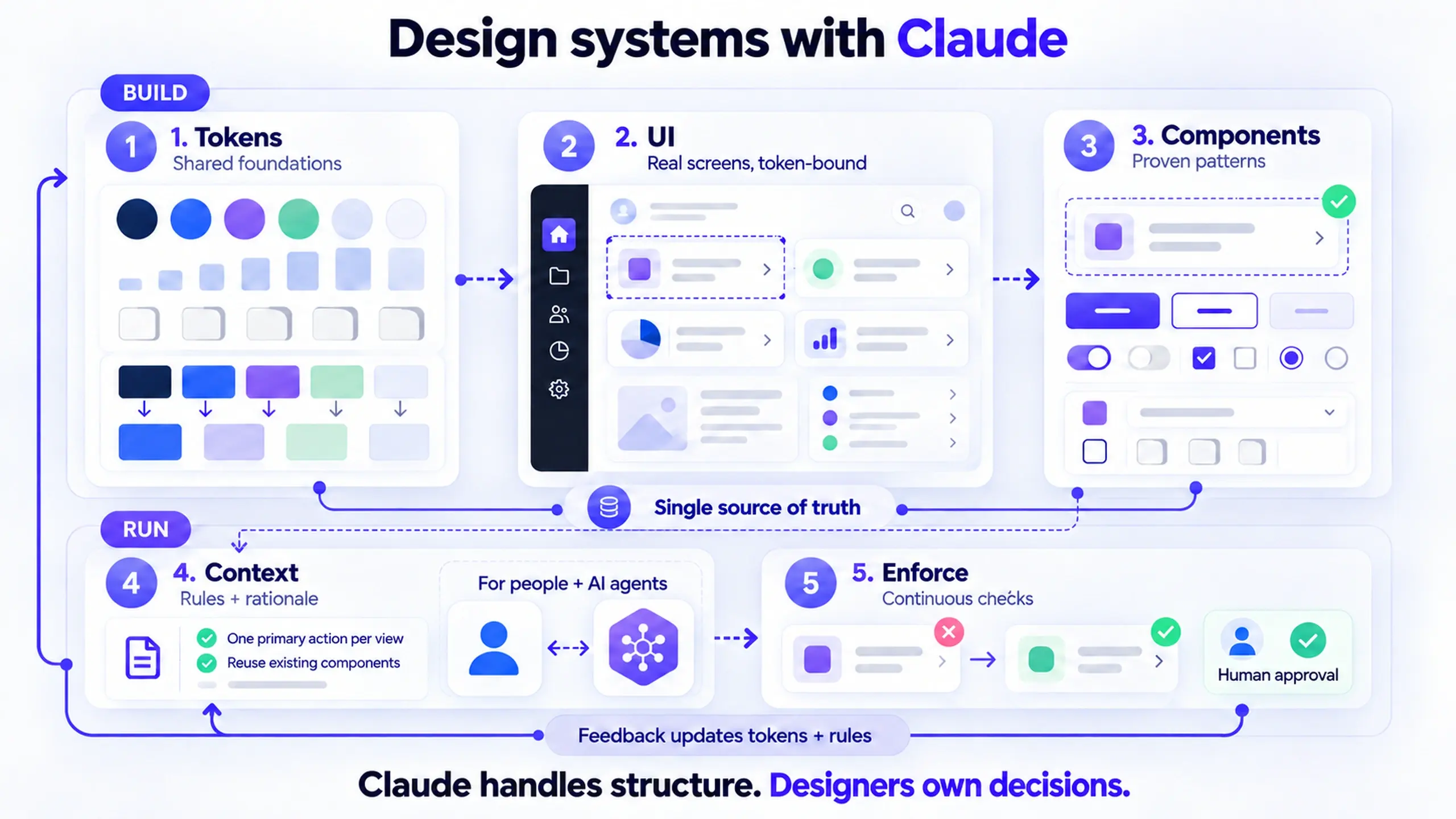
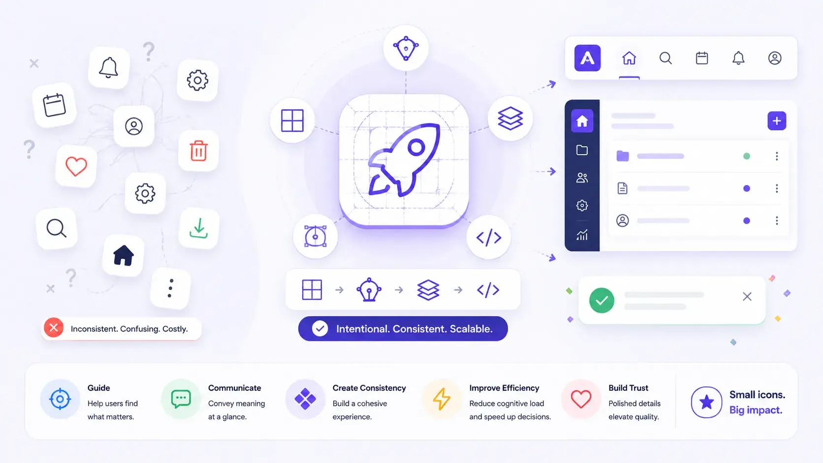
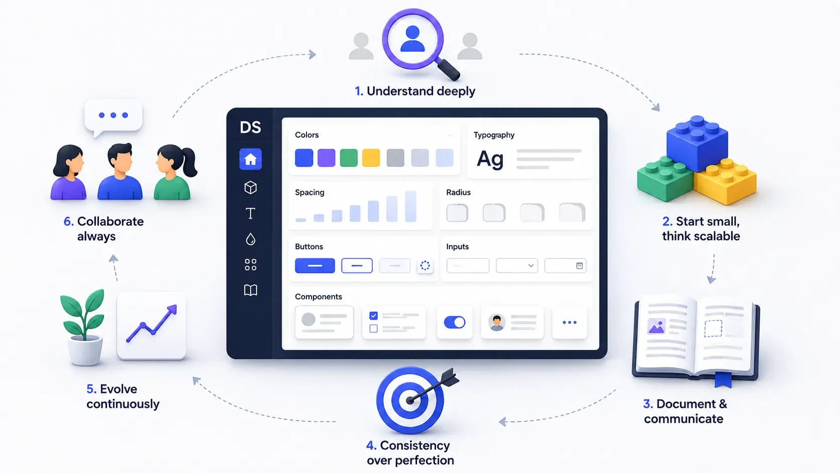
Design Systems
Part of Design Systems →Design Systems: What Real Design System Experience Actually Looks Like
Design systems create consistency and speed at scale. Real experience means knowing tokens, debt, documentation, and handoff — not just component libraries.
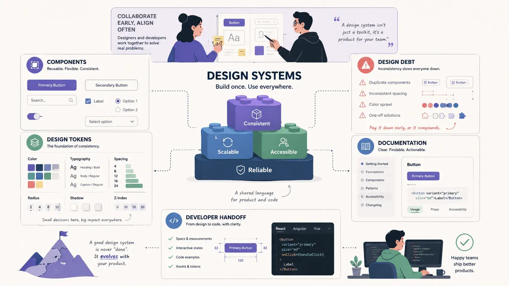
This is Part 4 of a 5-part series that explores the concepts, frameworks, and decision-making behind great digital products. Each article goes beyond definitions to explain when these concepts matter, why they matter, and how experienced product designers apply them in real-world work. Part 1 covered User Research, Part 2 Product Thinking, and Part 3 Design Process. This post covers Design Systems.
Design systems are the topic where design maturity becomes easiest to fake, and hardest to hide.
Anyone can say they've "worked with a design system." The question that cuts through is: "Tell me about a system decision you made, and what problem it solved." A vague answer means the experience is shallow. A specific one, naming a component, a constraint, a trade-off, means it's real.
That gap between using a design system and thinking in one shows up in five concepts: components, design tokens, design debt, documentation, and developer handoff. Each looks simple from the outside. Each has a version that only shows up once you've actually owned the consequences of a system-level decision.
What separates surface knowledge from real design system experience
Before going concept by concept, here's the short version of what follows. It's the difference between the answer most people give and the answer that signals someone has actually done the work.
| Concept | The surface-level answer | The signal of real experience |
|---|---|---|
| Components | "Reusable UI elements like buttons and cards" | A documented contract: every state, every constraint, and what the component explicitly does not do |
| Design tokens | "Named variables for color and spacing" | A naming hierarchy built around intent, not a palette dressed up in code |
| Design debt | "Inconsistencies that need cleaning up" | A scored prioritization method, and an explicit decision about what not to fix yet |
| Documentation | "Guidelines for using the system" | Usage guidance that explains when a pattern doesn't apply, not just what it looks like |
| Developer handoff | "Sharing design files with engineers" | An ongoing conversation, tracked through the questions it prevents |
The rest of this article walks through why each row on the right is harder to fake, and what it looks like in practice.
Components are a contract, not just a UI element
What most people say: "Reusable UI elements like buttons, inputs, and cards that maintain consistency."
What shows experience: A component is a contract between design and engineering. It defines not just what something looks like, but what variants it supports, what states it handles, and what it explicitly does not do. The boundary is as important as the content, an idea that traces back to Brad Frost's atomic design methodology, which framed components as composable, rule-bound building blocks rather than one-off visual assets.
The common failure: components built for the happy path that fall apart at the edges. A card component designed for a two-line title breaks when the title runs eight words. A button component that doesn't account for loading, disabled, or destructive states becomes a problem the first time someone needs one of those states and improvises.
Good component thinking asks three questions:
- What are all the states? Default, hover, focus, active, disabled, loading, error.
- What are the content constraints? Minimum and maximum characters, whether an image is required or optional.
- What does this component not do? Explicit non-scope prevents scope creep at the component level.
A component without documented constraints is a ticking inconsistency machine.
In practice: On a B2B dashboard, we had 14 variations of "card" that had evolved independently across four product areas. Rather than unifying them into one mega-component, I categorized them into data cards, action cards, and status cards. Each got its own component with strict constraints. The consolidation cut the Figma component count by 60% and reduced the time to build new screens by roughly a third, because designers stopped making decisions that should have been made at the system level.
Where this shows up in real work: a component decision, the constraints defined for it, and the specific problem that decision prevented down the line.
Design tokens are decisions, not color variables
What most people say: "Named values for colors, spacing, and typography that keep design consistent."
What shows experience: Tokens aren't color variables. Tokens are decisions about intent, and the naming is the design. The difference between color-blue-500 and color-action-primary is the difference between a palette and a system, a distinction the W3C Design Tokens Community Group has spent years working to standardize precisely because naming and structure, not just values, are what make tokens portable across tools and teams.
A naming hierarchy that actually scales has three tiers:
| Tier | Purpose | Example |
|---|---|---|
| Global tokens | Raw values, no meaning attached | blue-500: #3B82F6 |
| Semantic tokens | Intent, mapped to a global value | action-primary: blue-500 |
| Component tokens | Specific usage, mapped to a semantic value | button-background: action-primary |
Why the hierarchy matters: when you rebrand or introduce dark mode, you change the global token, and everything downstream updates automatically. When a component uses blue-500 directly, you change hundreds of instances by hand.
The token is the policy. The value is just what the policy says today.
In practice: On a product that introduced dark mode 18 months after launch, the engineering cost was enormous, because the original Figma file used raw hex values instead of tokens. Every color decision had to be traced and replaced manually across 200+ screens. When I rebuilt the system afterward around a three-tier token architecture, the next theming change, a white-label variant for an enterprise client, took two days instead of two months. (For a full walkthrough of setting up a token structure from zero, see what I learned building a design system from scratch.)
Where this shows up in real work: a token naming decision, the hierarchy chosen, and a downstream change that proved the structure right, or taught the team to change it.
Design debt is a tax on every future decision
What most people say: "Accumulated inconsistencies in the design that need to be cleaned up."
What shows experience: Design debt isn't a mess to clean up. It's a tax you pay on every future decision. The real cost isn't the inconsistency itself, it's the cognitive overhead of every designer who encounters it and has to decide: use the existing pattern, or introduce a new one? Made hundreds of times across a team, that decision compounds.
Design debt tends to come from three sources:
- Speed debt: shortcuts taken under deadline pressure, with every intention of returning to fix them.
- Growth debt: patterns that worked at 10 screens but break at 100.
- Knowledge debt: decisions made by people who've since left, with no documentation of why.
The hardest part of managing debt isn't identifying it, it's prioritizing which debt to pay down. Not all inconsistencies carry equal weight. A color mismatch in a footer is cosmetic. An inconsistent interaction pattern across a core workflow is functional debt that actively costs users time and trust.
You don't pay down all design debt. You pay down the debt that's blocking the next thing you need to build.
In practice: On a mature SaaS product, I ran a debt audit that surfaced 34 inconsistencies across the UI. We scored each one by frequency of user exposure, engineering cost to fix, and design-system leverage, whether fixing it would establish a pattern reusable in 10 or more other places. That scoring narrowed the actionable list to 8. We fixed those 8 in one focused sprint. The remaining 26 went into a backlog with explicit "not now" reasoning. Naming the "not now" was as important as naming the "now."
Where this shows up in real work: during product discovery and roadmap planning, this looks like a debt audit, a clear prioritization method, and explicit criteria for deciding what not to fix yet.
Documentation should explain judgment, not just appearance
What most people say: "Writing guidelines that explain how to use the design system."
What shows experience: Most design-system documentation fails because it describes what components look like instead of explaining when and why to use them. Usage guidance is more valuable than visual specs. Engineers can read specs. Judgment requires context, which is also why accessibility guidance (keyboard behavior, focus order, ARIA usage) belongs in the same documentation rather than a separate afterthought; the W3C ARIA Authoring Practices Guide is a good reference point for what that guidance should actually cover.
Documentation that scales answers four questions:
- When to use this component: the specific problem it solves.
- When not to use it: the adjacent use case it wasn't designed for.
- What to do when it doesn't fit: an escalation path, not just "don't improvise."
- The decision behind the decision: why this variant, and not another.
The format matters less than the habit. Storybook, Notion, Figma annotations, a README: the tool that gets maintained is the right tool. The one that requires a separate workflow from the design process is the one that goes stale.
Documentation written after the fact is archaeology. Documentation written during the decision is institutional memory.
In practice: On a design system I built for a 12-person product team, I introduced a decision log, a simple table in Notion: component name, decision made, alternatives considered, reason for choice, date. Within six months it had 40 entries. When a new designer joined, instead of a tribal-knowledge handoff, they read the log. Their first component contribution referenced two prior decisions correctly, without being told to. The documentation had done its job.
Where this shows up in real work: a documentation practice, how it changed onboarding or consistency, and which format proved most durable over time.
Developer handoff is a relationship, not a delivery
What most people say: "Sharing design files with engineers so they can build the feature."
What shows experience: Handoff is not a moment, it's a relationship. The designer who throws a Figma link over the fence and considers the job done is the designer whose work gets built wrong, and who never understands why. This distinction matters enough that it's worth treating as its own discipline; Nielsen Norman Group's overview of design systems makes a similar point about systems failing at the handoff and adoption stage even when the underlying components are well built.
Good handoff actually involves four things:
- Specs that anticipate questions: padding, spacing, responsive behavior, and state transitions documented before engineering has to ask.
- Annotations for intent, not just appearance: "this button disables until all required fields are complete" is more useful than the button's hex code.
- Edge-case coverage: empty states, error states, loading states, long-content behavior.
- A conversation, not a delivery: walking engineers through the design; the questions they ask reveal the gaps.
The most expensive handoff failure is ambiguity about interactive behavior. Static screens don't show animation timing, transition direction, or state-change logic. Left undocumented, those decisions get made by engineers under time pressure, and the result is a product that behaves differently from what was designed.
The gap between design and implementation is almost never a technology problem. It's a communication problem.
In practice: On a complex data-table feature, I introduced a handoff annotation layer in Figma, a separate page documenting interaction states, sort and filter logic, responsive breakpoint behavior, and empty and error states. Engineering time spent on clarification questions dropped by roughly half. More importantly, the feature launched matching the designed behavior on the first QA pass, which had never happened before for a feature of that complexity.
Where this shows up in real work: a handoff practice that reduced back-and-forth, a miscommunication that taught the team to document something specific, or how the design-engineering relationship was built beyond file delivery.
What design systems experience actually signals
Design-system experience isn't about whether someone can use Figma components. It's about whether a designer thinks systemically: whether they see the pattern behind the specific instance and design for it.
Components, tokens, debt, documentation, handoff: these are five angles on the same underlying skill, the ability to make a decision once and let it scale.That's the skill that makes a design system worth having. Not taste. Not craft. The leverage.
Frequently asked questions about design system experience
Is knowing Figma's component and variant features the same as having design system experience?
What's the difference between a design system and a component library?
How is design debt different from technical debt?
How do I build real design system experience if my company doesn't have one?
Part 4 of 5 · Product Design Concepts Explained
This post was edited with AI assistance for clarity and formatting.

Sanjay Shrestha
Senior Product Designer · CUA™ Certified
15+ years designing enterprise SaaS, B2B, and government digital products. Currently at Decisions.
Keep Reading