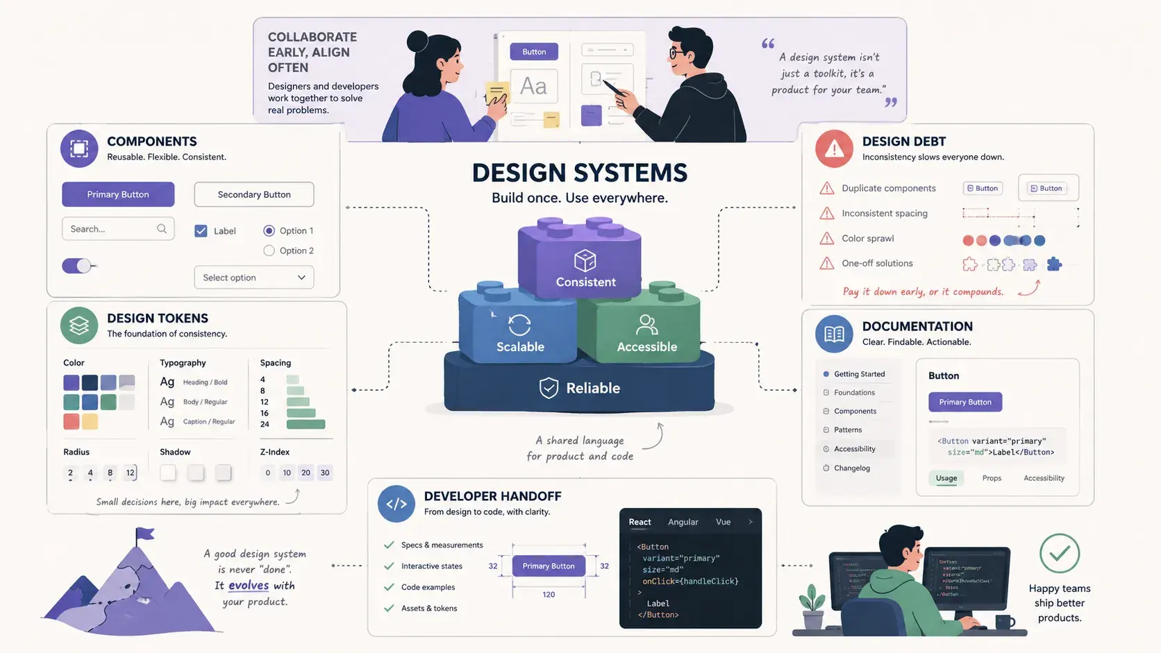
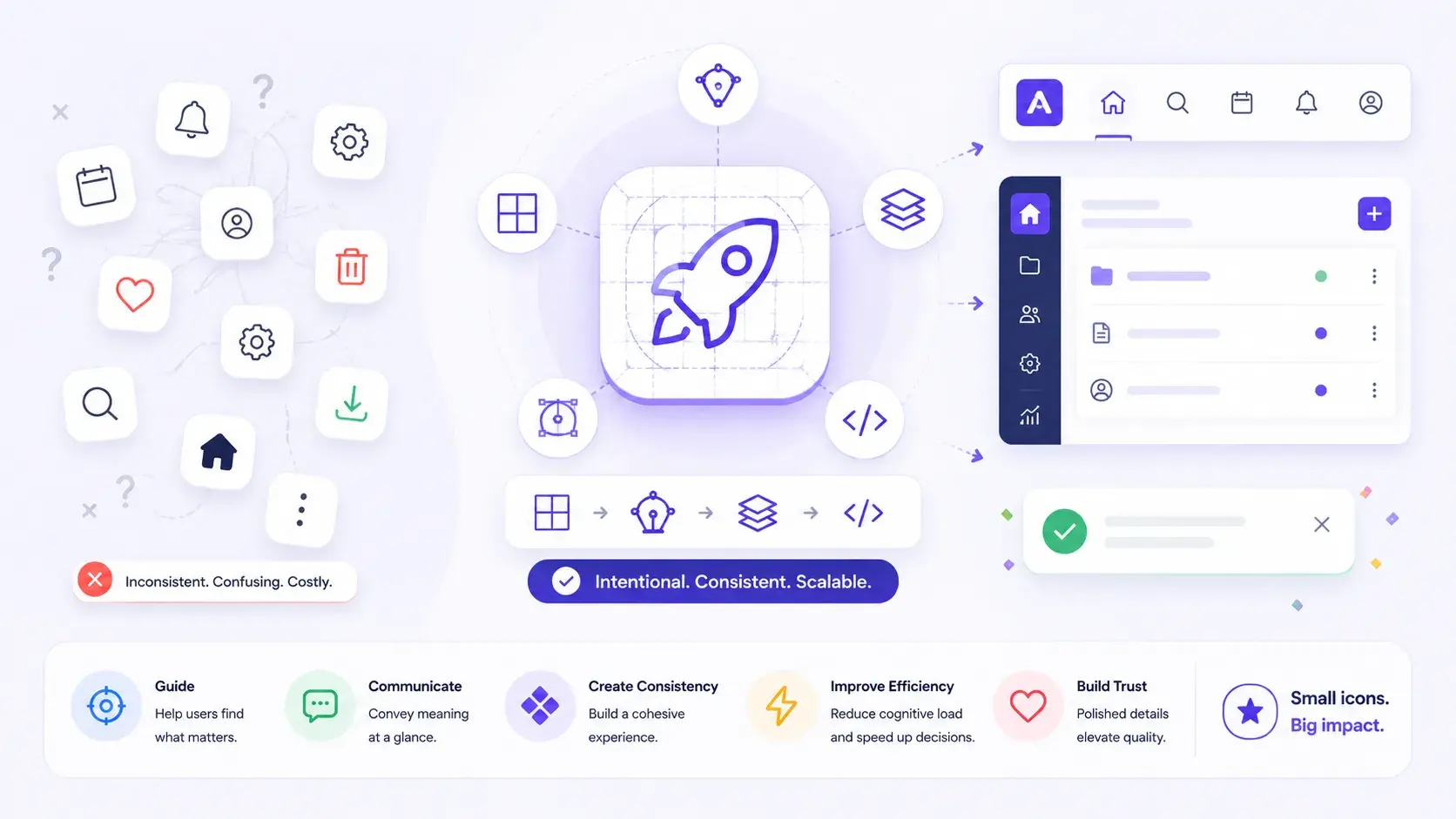
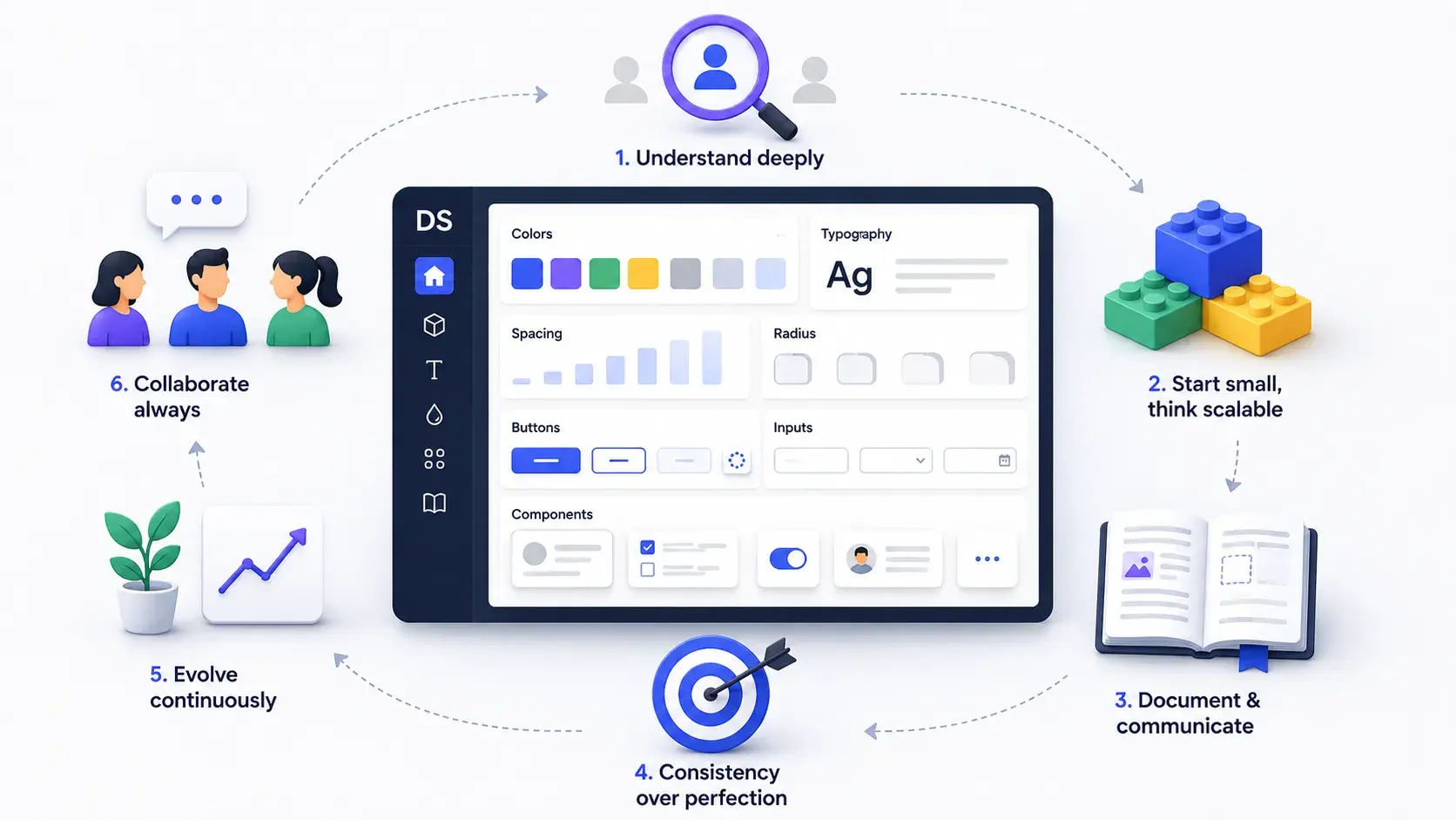
Design Systems
Part of Design Systems →Tokens, UI, Components, Context, Enforce: How I Build a Design System With Claude
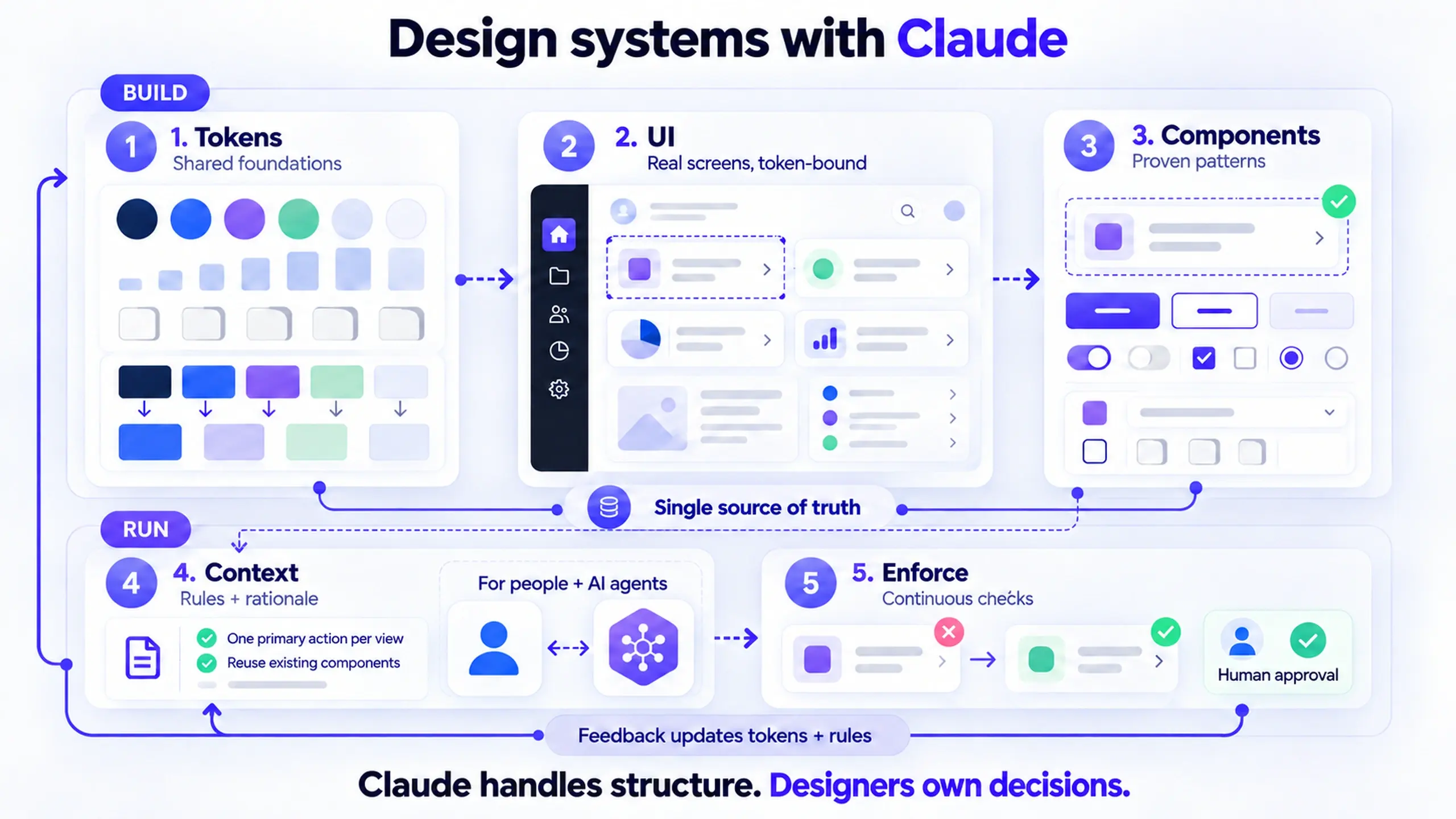
Most design systems start with components and hope screens fit. With Claude, I build in five steps: tokens, real UI, components, agent context, enforcement.
Most design systems are built in the wrong order. Designers usually know the better order. The manual work just made it too expensive to follow.
The order I use now fits on a sticky note:
Tokens → UI → Components → Context → Enforce
The first three steps build the system. Claude writes the tokens, I design real screens with a mix of AI prompts and hands-on editing, all wired to those tokens, and Claude turns the patterns that survive those screens into components.
The last two steps keep it working, and they exist because of something that changed in the last year: a design system now has two audiences, people and AI agents. The system has to be readable by the agents that generate UI from it, and it has to stay consistent as those agents produce more screens than any team could audit by hand. (If the idea of agents as users is new, what is agent UX covers the background.)
Below I compare the traditional way with this five-step workflow, what Claude does and doesn't do at each step, and where the approach breaks down. It builds on an earlier piece, what I learned building a design system from scratch, where the core lesson was start with tokens, not components. I still believe that. What changed is how cheap it became to follow, and how much further the system has to go once it exists.
I build this in Figma, because that's where my source of truth lives. The workflow doesn't depend on Figma, though. If you're prototyping in Claude or keeping your system in code, the same five steps apply, and there's a section on whether you still need Figma further down.
New to terms like semantic tokens, MCP, or drift? There's a short glossary at the end.
The traditional way: components first, tokens by hand
If you've built a design system in Figma before AI tooling, this sequence will look familiar. It's roughly how I worked across several systems over the years.
- Build a color palette by hand. Pick brand colors, generate tints and shades, name each swatch, and type every hex value into a variable or style.
- Create the variables one at a time. Primitives, then semantic aliases on top of them, then a dark mode, each linked manually in the variables panel.
- Design the component library in isolation. Buttons, inputs, cards, and modals on a dedicated page, with every variant built before any real screen needs them.
- Design screens from the library. This is where the gaps show up. A card needs a slightly different padding. A button needs a state nobody planned for.
- Detach, patch, and hard-code. Under deadline, designers detach instances and type raw values. Magic numbers like
13pxor#3A3A3Acreep in. - Audit manually. Someone goes screen by screen with the inspect panel, hunting for values that don't point at a token.
- Write specs and redlines. Developers re-create the same tokens in code, by hand, from documentation that's already drifting.
Every step was manual, and every manual step was a place for the system to drift away from itself.
The effort hurt, but the order hurt more. Components were designed before the screens that would use them, so the library encoded guesses about what the product needed. The screens then had to bend to fit those guesses, or quietly break the system. And once the library shipped, keeping it consistent depended on someone having time for step 6.
The new way: five steps, two phases
| Phase | Step | Who leads | What it produces |
|---|---|---|---|
| Build | 1. Tokens | Claude, reviewed by me | The single source of truth for every value |
| Build | 2. UI | Me, prompting AI and editing by hand | Real screens where every value points at a token |
| Build | 3. Components | Claude, reviewed by me | Library components extracted from proven patterns |
| Run | 4. Context | Me, drafted with Claude | Rules agents can read, not just values |
| Run | 5. Enforce | Claude and agents, approved by me | Continuous checks that keep screens on-token |
Claude does the structural, repetitive work. I make the design decisions. That split holds across all five steps.
Step 1: Claude writes the design tokens first
Before a single screen exists, I describe the system's foundations in one prompt, and Claude creates the token architecture wherever the source of truth lives. For me, that's Figma, as variables:
- Primitives: the raw palette, spacing scale, radius scale, and type sizes
- Semantic tokens: aliases that describe intent, such as
color/text/primaryorspace/inset/md, each pointing at a primitive - Colors, spacing, radius, and fonts: scoped to the properties they belong to, so a spacing token can't be applied as a fill
That collection becomes the single source of truth, and everything downstream points back to it.
Example (simplified prompt)
Create a Figma variable collection for a B2B SaaS product. Primitives: a neutral scale and one brand hue, a 4px spacing scale, a radius scale of 0, 4, 8, 12 and full. Semantic layer: text, surface, border, and action colors aliased to primitives, with light and dark modes. Scope spacing tokens to gap and padding, radius tokens to corner radius. Use slash-separated names.
Claude didn't invent the aliasing and scoping in that prompt. Both are native Figma variable features: a variable can reference another variable, and scoping limits which properties a variable can be applied to. What used to take an afternoon of clicking through the variables panel is now a prompt and a review. Claude does this through the Figma MCP server, which lets it write directly into a Figma file.
What I still own: the values. Claude can propose a spacing scale, but I decide whether the product needs a dense or a relaxed rhythm, which brand color carries the primary action, and whether the radius should feel sharp or soft. Claude handles the structure. I handle the taste.
Step 2: I design real UI with AI and by hand, wired to the tokens
This step is half prompting, half hands-on design work. AI gets me to a first draft of a real screen in minutes. My own hands get it from "plausible" to "right." Neither half works well without the other.
The screens are actual product UI: the dashboard, the settings page, the empty state, the form with twelve fields, rather than a component library page. Whichever half produces a layer, the same rule applies: every gap, radius, and color points at a token, with no magic numbers.
A typical screen moves back and forth like this:
- Prompt a first draft. I describe the screen's job, its content, and its states, and ask Claude to build it in my Figma file using only the variables from step 1.
- Explore alternatives fast. When I'm unsure about a flow or an interaction, I prompt a couple of quick interactive versions instead of drawing them.
- Take over by hand. I fix hierarchy, tighten the spacing rhythm, rewrite placeholder copy, and push the layout with real content: long names, empty values, error states.
- Hand the repetition back. Once I've made a decision on one screen, I prompt the AI to apply it across the others, or to produce the dark mode version.
- Check every binding. Before a screen counts, every fill, gap, and radius resolves to a token, whether AI or I put it there.
Example (simplified prompt)
Design a team settings screen in this file. Sections: team name, members list with roles, and a danger zone for deleting the team. Use only the existing variables. Include an empty state for a team with no members.
The draft that comes back is usually structurally right and visually generic. That's the point where I stop prompting and start designing.
| AI handles well | I do by hand |
|---|---|
| First drafts of layouts from a written description | Visual hierarchy: what the eye lands on first |
| Quick variations of a flow to compare | Choosing which variation actually serves the user |
| Applying a decision across many screens | Making the decision in the first place |
| Dark mode and other bulk changes | Spacing and alignment that feel right, not just measure right |
| Filling screens with plausible content | Stress-testing with real, messy content and edge cases |
I split the work by how much judgment it needs. AI is fast at producing options. Deciding between them, and noticing when all of them are slightly off, is still design work.
When a screen needs a value the token set doesn't have, I treat that as information. Either the token set is missing something real, and I add it, or I'm reaching for a one-off that the system shouldn't absorb. In both cases the decision stays visible instead of getting buried in a detached instance.
Three tools cover the AI half of this step, each for a different job:
| Tool | What I use it for | What I still check |
|---|---|---|
| Claude with the Figma MCP server | Drafting and editing screens directly in my Figma file, using the variables from step 1 | Every fill, gap, and radius is bound to a token, not a raw value |
| Claude Design | Quick interactive prototypes to test a flow or an interaction before I commit to it, built from the same token-wired Figma file as its design system | The prototype uses my tokens and components, not lookalike values. The direction that wins still gets finalized in Figma |
| Figma's agent | Screen drafts and bulk edits on the canvas, steered toward specific tokens and variables | Generated layers use the library, with no detached instances or hard-coded values |
Whatever produces the layer, a prompt or my own hands, the rule stays the same: it only counts once every value points at a token. And the decisions stay mine: which flow to keep, what the hierarchy is, and what this screen is for.
Note on these tools (October 2026): Both are moving fast.
- Figma's agent left beta and became generally available on October 6, 2026, and it now uses AI credits.
- Claude Design is moving into Claude as artifacts, and the standalone version closes on December 14, 2026. If you use Claude Design with a design system, migrate the design system before then.
None of this workflow depends on what either product is called or how it's packaged. What matters is whether the tool reads your tokens.
Components come later on purpose. I pull them out of real screens instead of guessing them in advance. When the same card structure shows up on three screens with the same spacing and the same states, it has earned a place in the library. When it shows up once, it stays a local pattern.
A component designed before the screens is a hypothesis. A component extracted from the screens is evidence.
Step 3: Claude turns patterns into components
Once a pattern has proven itself across real screens, I point Claude at it and ask it to build the component:
- Variants for the states and sizes the screens actually use
- Component properties for text, icons, and boolean toggles
- Token bindings on every fill, stroke, gap, padding, and radius, carried over from the source frames
Then it goes into the library. Figma's documentation says the MCP server can create frames, components, variants, variables, and auto layout as editable Figma content, not screenshots.
Because the source screens were already wired to tokens in step 2, the component inherits clean bindings. Nobody has to clean up a pile of raw values later.
The traditional process stopped here: once a library existed, the job counted as done. The next two steps are what make the library useful to the agents that now build with it, and what stop it from decaying.
Step 4: Context, so AI agents know how to use the system
The tools in step 2 only work because they can read the system. But a variable collection tells an agent what exists, not when to use it. color/action/primary is a value. "Use it for one action per view" is a rule, and an agent can't infer that rule from the value alone.
Context is the layer of rules and rationale that sits on top of tokens and components, written so an agent can follow it. Think of it as documentation with a second reader.
Example (illustrative rules)
- One primary action per view. Other actions use the secondary style.
- Destructive actions always ask for confirmation, and never use the brand color.
- Cards in a list use
space/stack/lgbetween them. Don't mix spacing scales in one container. - If an existing component covers the need with a variant, don't create a new component.
Where that context lives depends on where your system lives:
- In design tools. Claude Design builds a design system from your codebase and design files, and checks its output against that system. Figma's agent draws on your library and can be steered by @-mentioning specific tokens and components.
- In a portable file. DESIGN.md, an open format from Google, pairs machine-readable tokens with written design rationale in one markdown file that coding agents can read.
- Next to coded components. Storybook's MCP server, currently in preview, lets agents read your components and documented usage guidelines before generating UI.
What I still own: the rules. Claude can draft context from the library, but the rationale behind a rule is a design decision. A rule an agent follows without understanding why is exactly the kind of rule it will apply in the wrong place.
Common mistake: writing context once and treating it as finished. Context goes stale the same way documentation does. When a token or component changes, its rules change with it.
Step 5: Enforce, so the system stays the system
Every design system drifts. New designers join, deadlines arrive, and now agents generate screens faster than anyone can review them by eye. The traditional answer was a manual audit every few months. Enforcement replaces the occasional audit with a continuous check.
In practice, that looks like:
- Finding and fixing raw values. Figma's own documentation uses this as an example prompt for the MCP server: convert raw values to variables and update the surrounding components to use them.
- Bulk corrections. Figma's agent can make bulk edits across screens, such as updating typography or switching screens to dark mode, instead of someone fixing each frame.
- Checking at generation time. Claude Design checks its output against your design system before you see it, and Storybook's MCP server describes a self-healing loop where agents test their own generated UI.
The approval stays with me. An agent can find a hard-coded 13px gap, but it can't tell whether that gap is a mistake or a sign the token set is missing something. That's the same question from step 2, and it gets the same answer: either add the token or remove the one-off.
That's also why the sequence is a loop rather than a line. What enforcement finds feeds back into step 1. A raw value that keeps showing up is a missing token. A rule that keeps getting broken is a rule that needs rewriting in step 4.
Traditional vs. AI-assisted design system workflow, side by side
| Traditional workflow | With Claude | |
|---|---|---|
| Order | Tokens (partial) → components → screens | Tokens → UI → components → context → enforce |
| Token setup | Manual, one variable at a time | One prompt, then human review |
| Where components come from | Designed in isolation, upfront | Extracted from real, repeated patterns |
| Who reads the system | Designers and developers | Designers, developers, and AI agents |
| Magic numbers | Found later, in manual audits | Blocked at design time, caught continuously after |
| When it's "done" | When the library ships | Never; it runs as a loop |
| Who makes design decisions | The designer | Still the designer |
The last row matters most. Claude made the work cheaper. The designer still owns it.
How I review what Claude builds
I treat Claude's output as a first draft. Before anything from steps 1, 3, or 4 is published, I check:
- Every semantic token aliases a primitive rather than holding a raw value
- Token names follow one convention, with no near-duplicates like
space-mdandspacing/medium - Scopes are set, so spacing tokens can't appear as colors and vice versa
- Light and dark modes both resolve, with no empty values
- Every variant in a new component maps to a state a real screen uses
- No fill, gap, padding, or radius in the component is a raw value
- Text and background token pairs meet WCAG contrast requirements
- Every context rule names the tokens or components it applies to, and says why
Common mistake: treating a fast result as a finished result. Claude produces a convincing variable collection in seconds, which makes it tempting to skip the review. Mistakes in the token layer are the most expensive mistakes in the system, because everything inherits them, including every agent that reads it.
Do you still need Figma for this?
Not necessarily. The five steps work wherever your design system's source of truth lives. Figma is where mine lives, but it isn't a requirement.
I'm asking because the tools are changing fast. Claude Design now lives inside Claude, where new designs and design systems are created as artifacts, and more designers are prototyping there directly instead of drawing screens first. At the same time, Figma is adding agents rather than moving away from designers: its agent is generally available, and its MCP server lets Claude write straight into Figma files.
Every step still happens in each setup. Only the place changes:
| Step | In Figma (my setup) | In Claude only | In code |
|---|---|---|---|
| 1. Tokens | Figma variables | The design system you give Claude | Token files, for example in the Design Tokens format |
| 2. UI | Frames, drafted with AI and refined by hand | Interactive prototypes as artifacts | Coded screens |
| 3. Components | Library components | Components defined in your Claude design system | Coded components, often documented in Storybook |
| 4. Context | Library descriptions, agent prompts, a DESIGN.md file | Rules written into the design system | DESIGN.md or Storybook usage docs |
| 5. Enforce | Claude and Figma's agent rebinding raw values | Claude checking output against the design system | Agents and lint rules that flag raw values |
When Claude-only is enough: you're a solo designer or a very small team, the work is mostly exploration and prototypes, and you're comfortable reviewing running UI instead of static frames.
When a shared canvas still earns its place: several designers work on the same product, stakeholders review and comment on design work in one place, or developers rely on the design file for handoff.
In my setup, the Figma file is the source and the other tools read from it: Claude Design builds its prototypes from the token-wired file, and Figma's agent works inside it. If that source moved into Claude or into code tomorrow, the order and the rules would stay the same.
Common mistake: going Claude-only and skipping step 2's hand pass because the prototype runs. A working prototype can still have weak hierarchy and generic spacing.
Where this workflow doesn't fit
Some situations call for something different:
- You're migrating an existing system. If a product already has hundreds of screens built on legacy styles, start with an audit of what's already shipped and extract tokens from it. The order still helps, but step 2 becomes "rewire existing screens" rather than "design new ones."
- Your tokens live in code first. The five steps still apply, as the table above shows, but Claude would write tokens in a format like the Design Tokens specification, which reached its first stable version in October 2025, and you'd review them in code rather than in a design file.
- You can't extract components from screens that don't exist yet. If engineering needs a button on day one, you'll build a few core components early. That's fine. The principle is to let real screens confirm them, not to forbid them.
- You're a team of one or two. Steps 4 and 5 earn their cost once agents or several people generate UI from the system. A solo designer with a small product can keep context in their head and enforce by review for a while.
- Tool limits apply. At the time of writing, Figma's documentation lists limits on MCP writes, including no image or asset support and no custom font support yet, and writing requires a Full seat with edit access to the file. Storybook's AI features are in preview, and DESIGN.md is a young format. Recheck what each tool supports before you build a process around it.
This order also sits in some tension with established thinking. Brad Frost's atomic design describes building up from atoms to pages, but he says plainly that atomic design is not a linear process: it's a mental model for working on the UI and the system at the same time. This workflow is closer to that spirit than the "build the whole library first" habit many teams fell into. Frost has also written about agentic design systems, where AI is deliberately constrained to a system's materials, which is the idea steps 4 and 5 put into practice.
Frequently asked questions
Does Claude design the system for you?
Why not let Claude generate the components first, since it's fast?
Isn't "context" just documentation?
Do I need to write code to build a design system with Claude?
Do I need Figma to follow this workflow?
What's the smallest version of this workflow I can try?
Glossary
| Term | Definition |
|---|---|
| Agent | An AI tool that takes actions, such as creating or editing a design, rather than only answering questions. Figma's agent and Claude with the Figma MCP server are both examples. |
| Alias | A token whose value is a reference to another token instead of a raw value. If color/text/primary aliases neutral/900, changing neutral/900 updates both. |
| Artifact | In Claude, a standalone piece of work, such as a prototype, document, or design system, that you can open, edit, and share outside the chat. |
| Auto layout | Figma's way of laying out frames with defined gaps and padding, similar to flexbox in CSS. Gap and padding values can be bound to spacing tokens. |
| Component property | A setting on a Figma component that can be changed per instance, such as label text, an icon swap, or a show/hide toggle. |
| Context | In this article, the rules and rationale that tell an agent how and when to use tokens and components, not just what they are. |
| Design token | A named design decision, such as a color, spacing value, or radius, stored in one place and referenced everywhere else. |
| Design Tokens specification | A vendor-neutral format for storing tokens so different tools can share them, published by the W3C Design Tokens Community Group. |
| DESIGN.md | An open file format from Google that combines machine-readable tokens with written design guidance in a single markdown file for coding agents. |
| Detach | Breaking a Figma instance's link to its main component. A detached element no longer receives library updates, which is a common source of drift. |
| Drift | The gradual gap between what the design system defines and what's actually in screens or code. |
| Magic number | A hard-coded value, such as 13px or #3A3A3A, that doesn't point at a token. |
| MCP (Model Context Protocol) | An open standard that lets AI tools connect to other software. The Figma MCP server is what lets Claude read and write Figma files. |
| Mode | An alternate set of values for the same variables, such as light and dark themes. |
| Primitive token | A token that holds a raw value, such as blue/500 or space/4. Primitives describe what a value is. |
| Scope | A Figma setting that limits which properties a variable can be applied to, such as restricting spacing tokens to gap and padding. |
| Semantic token | A token named for its purpose, such as color/action/primary, that aliases a primitive. Semantic tokens describe where and why a value is used. |
| Source of truth | The one place a value is defined. Every other tool and file reads from it rather than keeping its own copy. |
| Token binding | The link between a property in a design, such as a fill or padding, and the token that controls it. |
| Variant | One version of a component within a component set, such as a button's primary, secondary, and disabled states. |
The order is the system
The tools changed, but the principle underneath didn't. A design system holds together when:
- every decision traces back to one source of truth, and
- the library reflects what the product actually needs, rather than what someone predicted it would need.
What's new is who else depends on that source of truth. When agents generate UI, a system that only people understand isn't enough, and a system nobody checks won't stay a system for long.
You could always do all of this by hand. It was just slow enough that most teams cut corners, usually by building components first and skipping everything after. With Claude handling the structural work, the right order is finally the cheap order.
If you're starting a system this quarter, try it on one screen first: tokens, UI, components, then three written rules and one enforcement pass. Then decide whether to go back.
For more on what separates real design system experience from a component library, see design systems applied. For a related piece on what belongs in a library, see icons in design systems.
This post was edited with AI assistance for clarity and formatting.

Sanjay Shrestha
Senior Product Designer · CUA™ Certified
15+ years designing enterprise SaaS, B2B, and government digital products. Currently at Decisions.
Keep Reading