Design Systems
Part of Design Systems →Icons Are the Most Underestimated Part of Your Design System
Choosing an icon style isn't aesthetic — it's a commitment to a visual language that has to hold up at 20 icons or 2,000, across every product you ship.
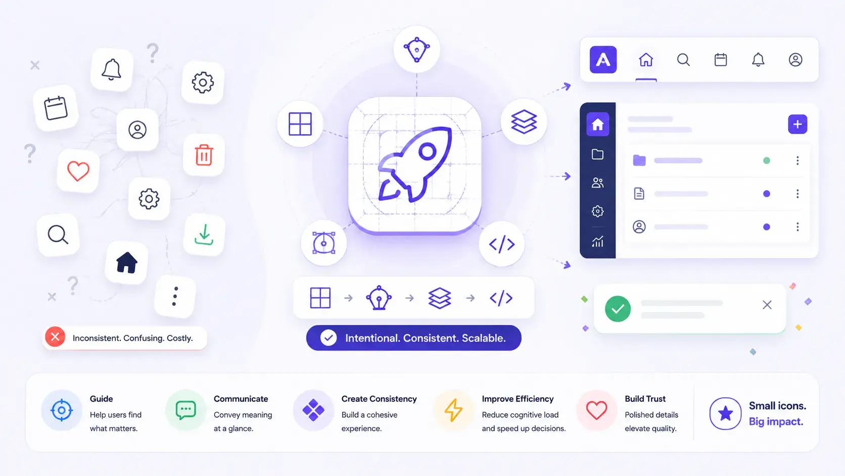
If you're picking an icon style for a design system, here's the direct answer: choose for coherence at scale, not for how good the icon looks in isolation. The style that wins a Dribbble shot and the style that survives 2,000 icons across three products are rarely the same one.
Most design system conversations start with tokens, typography, or components. Icons get treated as an afterthought, a quick library swap in Figma, a "we'll figure it out later" decision made by whoever is free that afternoon.
That's a mistake, and it's one that shows up in the product months later, in ways nobody can quite name.
Why icon style is a system decision, not a design taste
Icon style isn't just an aesthetic choice. It's a decision about your product's visual language, one that either quietly earns user trust or slowly erodes it, one interaction at a time.
Finding a beautiful icon is easy. The open-source ecosystem is genuinely excellent right now: Phosphor, Heroicons, Lucide, and Iconoir all ship polished, well-maintained sets. Picking icon number one is never the hard part.
Icon number 200 is the hard part. So is icon number 2,000.
The real question to ask before you commit to a style is: does this icon system remain coherent when it scales across multiple products, platforms, and teams?
When the answer is no, users feel it even when they can't name it. Something just feels off. An outlined icon sits next to a filled one. A 3D asset lands in a UI that's otherwise flat. Stroke weights drift between screens built six months apart. The visual language quietly breaks down, and cognitive load climbs without a single obvious cause.
Five principles worth caring about before you pick a style
When you're evaluating an icon style for a design system, these are the questions that actually predict whether it survives contact with a real product:
- Consistency in stroke weight and visual density. Icons from the same family need to feel like they belong together. Mixed densities read as visual noise, and users process that noise as disorder even when every individual icon is well drawn.
- Clear recognition at small sizes. An icon that reads beautifully at 48px but turns to mud at 16px isn't a design system icon, it's a decoration. Recognition at 16 to 20px is non-negotiable for anything that will appear in a toolbar, a table row, or a mobile nav bar.
- Accessibility and readability across devices. High-contrast environments, low-vision users, dark mode, OLED screens: your icon style has to hold up across all of it. Heavily detailed styles like Illustrated or Skeuomorphic tend to fail here first, since fine detail is exactly what disappears at small sizes and low contrast. The W3C's guidance on non-text contrast is a useful baseline to test against, even for icons that aren't strictly "controls."
- Alignment with product personality. A Glassy or Clay icon set communicates something very different from a clean Outline style. Neither is wrong on its own, but a mismatch between icon personality and product personality is always a problem, no matter how well either one is executed individually.
- Scalability across hundreds of use cases. Can the style accommodate navigation, status indicators, data visualization, actions, and empty states without feeling forced? The styles that fail at scale are usually the ones that look stunning in a showcase and break the moment they hit an edge case nobody designed for.
An icon style that only works for your homepage isn't a design system icon style. It's a marketing asset that escaped.
The one rule icons should never break
An icon should never make a user stop and think.
That's the entire job description. The best icons are invisible in the best possible way: they confirm what someone already expects, reduce decision fatigue, and let people move through a complex interface with confidence. The moment an icon creates a question in a user's head, "wait, what does this mean?", it has failed its one responsibility.
This is also why icon choice is a coherence problem before it's a taste problem. A single gorgeous icon can still fail this test if it doesn't match the visual grammar the rest of the interface has already taught the user.
Matching icon style to product context
There's no universal right answer here, but there is a reasonably reliable pattern for where each style tends to earn its place.
| Icon style | Best suited for | Watch for |
|---|---|---|
| Outline | Lightweight, clean enterprise or productivity tools | Can feel thin or hard to spot at very small sizes without a heavier stroke |
| Bold | High-contrast needs, accessibility-first products | Can look heavy-handed in dense, information-rich UIs |
| Two-Tone | Mid-weight systems that need subtle hierarchy | Extra color logic adds a maintenance layer to keep consistent |
| Bulk / Filled | Mobile apps, touch-first surfaces | Loses definition fast at very small sizes |
| Broken | Modern SaaS with a distinct, editorial personality | Reads as unfinished or buggy to some users if not established quickly |
| 3D / Clay | Marketing pages, landing pages, low-density UIs | Rarely holds up as a functional, high-frequency UI icon |
| Illustrated | Onboarding, empty states, storytelling moments | Not built for repeated, small-scale use in navigation or tables |
| Glassy | Brand moments, hero sections | Rarely sustainable across a full product without heavy performance and consistency cost |
The styles toward the bottom of that table get the attention in portfolios and case studies. The styles toward the top do the actual work in production, day after day, at sizes nobody screenshots for a showcase.
In practice: if you're building a system that has to serve navigation, tables, forms, and status indicators across a growing product, start your evaluation at Outline, Bold, or Two-Tone. Treat 3D, Illustrated, and Glassy as supporting players for specific moments, not as your primary system.
A worked example: outline versus bold for an accessibility-first product
The following is a simplified, hypothetical scenario meant to illustrate the decision process, not a documented case study.
Imagine a B2B SaaS product with a meaningful share of users on high-contrast display settings, and a product team torn between a trendy Two-Tone icon set and a plainer Bold set.
Two-Tone looks more refined in the design file. But run it against the five principles: at 16px in a dense data table, the secondary tone frequently drops out entirely, leaving what looks like a broken or half-rendered icon. Bold, by contrast, holds its shape at every size the product actually ships, even if it reads as less "premium" in isolation.
What to do: choose Bold for the functional, high-frequency icon set, and reserve a Two-Tone or Illustrated treatment for marketing pages and onboarding, where size and contrast constraints are far looser.
Why it matters: the system's job is to work everywhere it's deployed, not to look best in the one screenshot everyone shows in a deck.
When it doesn't apply: a product with a smaller, tightly controlled screen inventory and no high-contrast accessibility requirement has more room to prioritize personality over pure legibility.
Common mistakes teams make when choosing icon styles
- Choosing a style from a homepage or showcase image, then discovering it can't cover status icons, empty states, or dense data tables once real product work begins.
- Mixing icon libraries mid-project because one library was missing a specific icon, which quietly reintroduces the stroke-weight and density inconsistency the whole system was meant to prevent.
- Skipping the 16px test. An icon style should be evaluated at its smallest realistic size first, not its largest.
- Treating icon choice as purely a designer's call, without checking it against accessibility requirements or the platforms (native mobile, web, embedded widgets) the product actually ships to.
- Never revisiting the decision. A style chosen for a 20-icon MVP doesn't automatically remain correct at 500 icons; it's worth a deliberate check-in, not an assumption.
Frequently asked questions
Can I mix icon libraries in one design system? It's possible, but it comes at a real cost. Different libraries rarely share identical stroke weights, corner radii, or grid systems, so mixing them tends to reintroduce the exact visual inconsistency a design system exists to prevent. If you must pull from a second source for a missing icon, redraw it to match your primary library's construction rules rather than dropping it in as-is.
How many icons does a typical design system actually need? This varies enormously by product surface area, so there's no fixed number that applies universally. A more useful question than "how many" is whether your current set can express navigation, status, actions, and empty states without repeatedly forcing an icon to mean something it wasn't designed to mean.
What's the minimum size an icon needs to stay legible at? Sixteen to twenty pixels is a reasonable working standard for anything appearing in navigation, toolbars, or table rows, since that's the size band where detail-heavy styles typically start to lose definition. Always test the actual icon set at that size rather than relying on how it looks in a component showcase at 48px or larger.
Is SVG or an icon font the better technical choice? That's a separate, largely technical decision from the style question this article focuses on, and the right answer depends on your build tooling, accessibility requirements, and how much per-icon styling control you need. SVG generally offers more flexibility for color, scaling, and accessibility attributes, which is part of why most modern icon libraries, including the ones linked above, ship SVG as the primary format.
Pick icons the way you'd pick a typeface
Pick an icon style the same way you'd pick a typeface: not for how it looks in isolation, but for how it performs under real conditions.
- Evaluate the candidate style at 16px, not 48px
- Test it in dark mode and under high-contrast display settings
- Confirm it can express navigation, status, actions, and empty states without being forced
- Check stroke weight and density consistency across the full family, not just your favorite icons
- Decide, in writing, what happens when the library is missing an icon you need
Icons are one of the highest-frequency touchpoints in any digital product. A user encounters far more icons than headlines in a single session. They deserve more than an afternoon of decision-making, and a system built on the right five questions will still be coherent at icon number 2,000.
What icon style does your design system use, and how did you make the call?
This post was edited with AI assistance for clarity and formatting.

Sanjay Shrestha
Senior Product Designer · CUA™ Certified
15+ years designing enterprise SaaS, B2B, and government digital products. Currently at Decisions.
Keep Reading