Color Contrast (1.4.3): The 30-Second Check Most Screens Skip Before They Ship
Low contrast text is the most common accessibility failure on the web. The exact WCAG 1.4.3 ratios, what's exempt, and a 30-second check before you ship.
This is Part 3 of The Product Designer's Playbook, a series working through the day-to-day craft of product design one topic at a time: UX laws, accessibility, stakeholder management, communication, career, components, and more. Part 2 covered empty states, the first screen of a feature. This piece is a full reference on WCAG 1.4.3, written so it works whether you're new to accessibility or you've been shipping products for years.
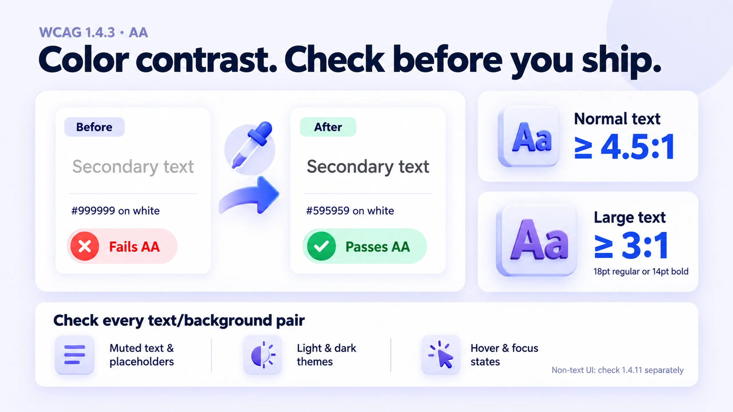
Body text needs a contrast ratio of at least 4.5:1 against its background, and large text needs at least 3:1. That's WCAG Success Criterion 1.4.3, Contrast (Minimum), a Level AA requirement, the bar most organizations commit to meeting.
It's also the single most commonly failed accessibility check on the web. The 2026 WebAIM Million report, an annual scan of the top one million home pages, found low contrast text on 83.9% of home pages, up from 79.1% the year before. It has been the most common WCAG failure of any kind for eight straight years of that report. Missing image alt text, the next most common failure, showed up on 53.1% of pages, well behind it.
That gap is worth sitting with. Contrast isn't an edge case or a niche accessibility concern. It's the most ordinary design decision on every screen, and most teams are still getting it wrong at ship time.
What the ratio requires
A contrast ratio compares the relative luminance (perceived brightness) of two colors, not their hue. The formula is (L1 + 0.05) / (L2 + 0.05), where L1 and L2 are the lighter and darker luminance values. You don't need to run that math by hand, a checker tool does it, but it's worth knowing the result is unforgiving: the spec doesn't round. A ratio of 4.499:1 fails a 4.5:1 requirement.
The requirement splits by text size:
- Normal text: 4.5:1 minimum. This covers standard body copy, labels, and most UI text.
- Large text: 3:1 minimum. WCAG defines "large" as 18 point (roughly 24px) or larger, or 14 point bold (roughly 19px bold) or larger. Big, bold headings get a lower bar because larger strokes stay legible at lower contrast.
Three categories are explicitly exempt from 1.4.3:
- Logos and brand marks. A wordmark doesn't have to pass a contrast check.
- Incidental text. Purely decorative text, text that's part of an inactive component, or text baked into a photo with other significant visual content.
- Disabled controls. A genuinely inactive button or field is allowed to look muted, since its reduced contrast is itself the signal that it can't be used right now.
What this isn't: non-text contrast is a separate rule
It's easy to fold every contrast question into 1.4.3, but icons, borders, form field outlines, and other non-text UI elements fall under a different criterion, 1.4.11 Non-Text Contrast, which sets its own 3:1 minimum for anything a user needs to perceive to operate the interface. A gray outline on an input field or a disabled-looking icon button can pass 1.4.3 (there's no text involved) and still fail 1.4.11. If you're auditing a screen, check both. They're related but not interchangeable.
The 30-second check
You don't need a full audit to catch most contrast problems before you ship. The WebAIM Contrast Checker is free, has no login, and takes less time to run than this paragraph takes to read.
- Grab the two hex values. Use the tool's built-in eyedropper (or your browser's DevTools color picker) to pull the exact foreground text color and the background color behind it.
- Paste both into the checker. It returns a ratio instantly, along with pass or fail for AA and AAA, at both normal and large text sizes.
- Check the row that matches your text size. A heading set in 24px bold only needs to clear 3:1. Body copy at 16px needs the full 4.5:1.
- Repeat for every distinct text-and-background pairing on the screen, not just the darkest and lightest. Placeholder text, helper text, and secondary labels are usually styled lighter than body copy on purpose, and that's exactly where failures hide.
Run this on your muted or secondary text style first. It's the color most design systems set once, early, without a contrast check, and then reuse everywhere.
Where contrast fails in real interfaces
| Pattern | Why it fails | What to check |
|---|---|---|
| Secondary or "muted" body text | Chosen to look calm and low-emphasis, often a light gray that reads fine on a bright monitor but fails the math | Test the exact gray against its exact background, not just against pure white |
| Placeholder text in form fields | Frequently styled even lighter than secondary text, on the assumption it's "just a hint" | Placeholder text still has to meet 4.5:1 if it conveys instructional content |
| Text over photography or gradients | Contrast varies across the image; a check at one point can pass while another point fails | Test against the lightest and darkest regions the text can sit over, or add a scrim |
| Links inside body copy | Designed to stand out from surrounding text by color alone, at the same small size as the text around them | Links need to meet 4.5:1 against the background and be distinguishable from adjacent text by more than color alone |
| Disabled-looking text that's actually interactive | Styled to match the visual language of a disabled control, but the element still responds to clicks | If it's operable, it isn't exempt. Style truly disabled and merely secondary states differently |
A worked example: one gray, two outcomes
The following ratios were calculated directly from the WCAG relative luminance formula, applied to two representative hex values. It's a simplified illustration, not a documented case study.
Secondary text set in #999999 on a white (#FFFFFF) background measures 2.85:1, well under the 4.5:1 requirement for normal text. It looks calm and unobtrusive in a design file, and it fails for a meaningful share of users before anyone's opened it on a dim phone screen outdoors.
Darken that same secondary text to #595959 on the same white background and it measures 7.00:1, clearing not just AA (4.5:1) but AAA (7:1) with room to spare.
Nothing else about the design changed: no new component, no layout shift. The only difference is a few points of darkness in one hex value, and it's the difference between a screen that works for people with low vision, older eyes, or a phone in direct sunlight, and one that doesn't.
A lighter gray isn't automatically wrong, though. If that same #999999 were set at 24px or larger, or made bold at 19px or larger, it would only need to clear 3:1. But #999999 on white measures roughly 2.85:1, which still falls short even at the lower large-text bar. The color itself, not just the size, has to move.
A contrast check takes less time than deciding what to name the component. Most teams skip it anyway, because it feels like a legal checkbox rather than a design decision.
Frequently asked questions
Does WCAG color contrast apply to dark mode too?
What about text on hover or focus states?
Is 4.5:1 enough, or should I aim for AAA's 7:1?
Can I just run one automated scan and trust the result?
Before you ship the next screen
- Test every distinct text-and-background color pairing, not only the ones that look risky
- Check secondary, muted, and placeholder text specifically, they're where failures concentrate
- Confirm which ratio applies: 4.5:1 for normal text, 3:1 for text at or above 18pt (24px) or 14pt bold (19px bold)
- Check hover, focus, and active states, not just the resting state
- Remember 1.4.11 separately for icons, borders, and non-text UI elements
A contrast check takes less time than writing this checklist did. Jakob's Law is about the interaction patterns users already expect; this is about the more basic requirement that they can actually read what's on the screen. If you're auditing a component for accessibility, the non-text contrast tradeoff covered in icons in design systems is a natural next check.
When did you last actually run a contrast checker on your own product, instead of assuming the design system already handled it?
Part 3 of 30 · The Product Designer's Playbook
This post was edited with AI assistance for clarity and formatting.

Sanjay Shrestha
Senior Product Designer · CUA™ Certified
15+ years designing enterprise SaaS, B2B, and government digital products. Currently at Decisions.
Keep Reading