The Empty State Is Not Empty: Designing What Happens Next
An empty state is the first impression of a feature with nothing in it yet. A framework for showing what to do next, not just that nothing exists.
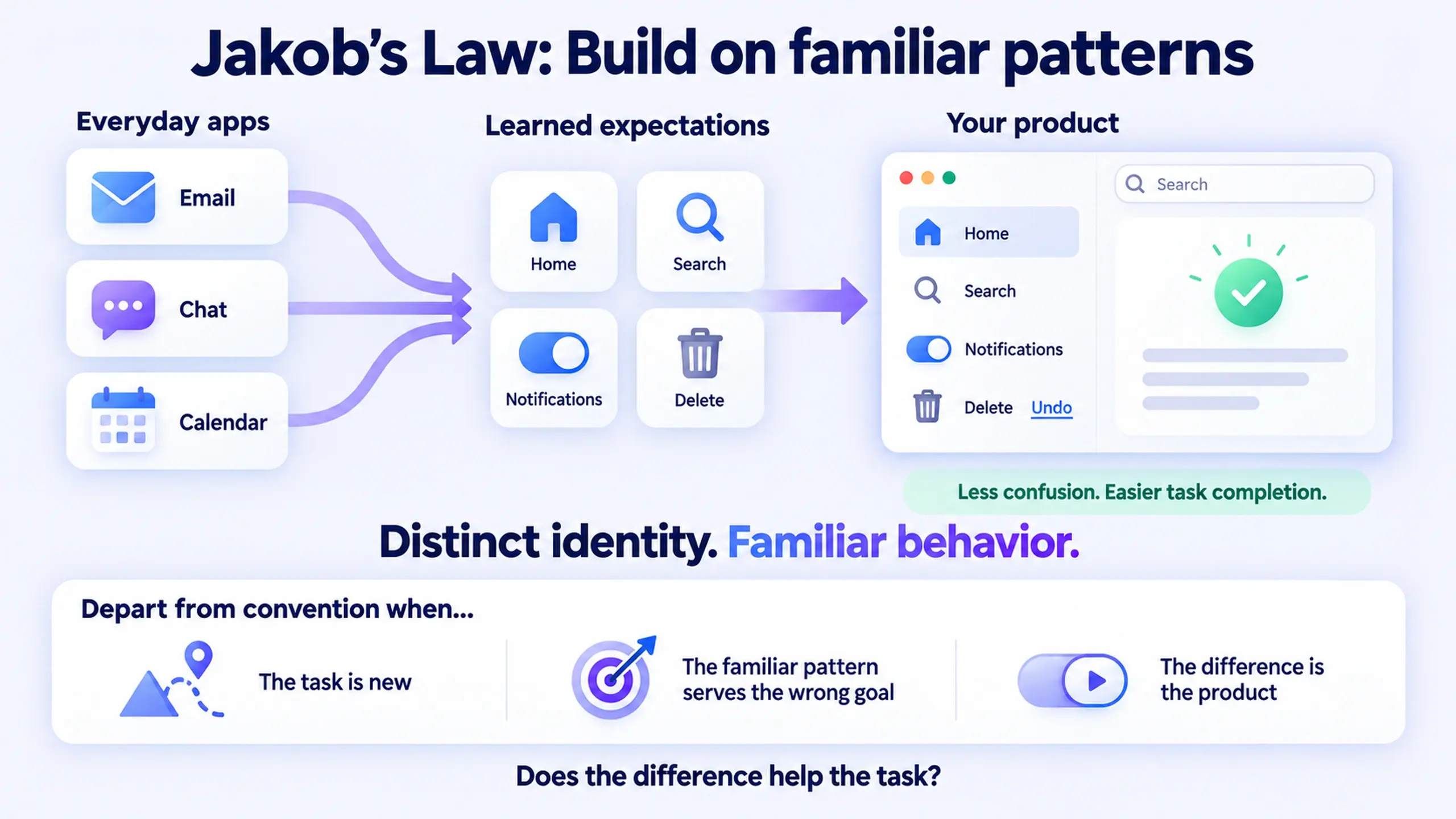
This is Part 2 of The Product Designer's Playbook, a series working through the day-to-day craft of product design one topic at a time: UX laws, accessibility, stakeholder management, communication, career, components, and more. Part 1 covered Jakob's Law, the expectations users already bring with them. Empty states are where that expectation gets tested earliest, often before a user has clicked anything at all.
If a screen has nothing on it, here's the direct answer: that's not the absence of a design, it's a design decision you already made, just not on purpose. An empty state is the first thing a new user sees the moment they open a feature, and the only thing a returning user sees the moment there's nothing left to show. Treat it like a blank slate and it reads like one: confusing, unfinished, or broken. Treat it like the first screen of the feature, because that's what it actually is, and it starts doing real work.
What counts as an "empty state"
Most teams treat "empty state" as one category: the screen you show when there's no data. In practice, at least four different situations get lumped under that name, and they don't call for the same design.
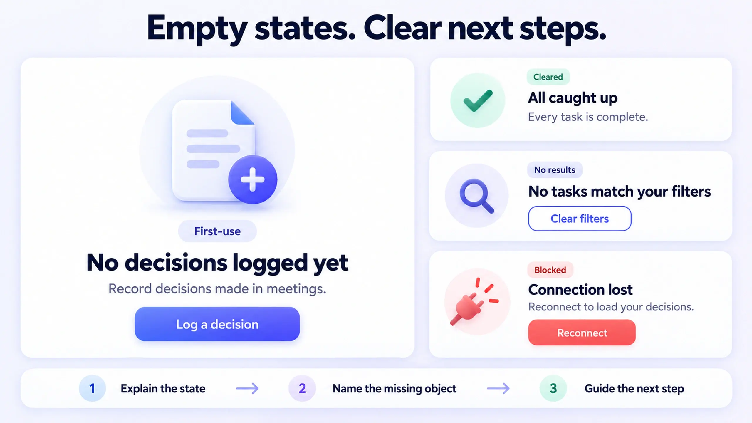
- First-use. The feature exists, but this account, team, or user hasn't created anything in it yet. Nobody has done anything wrong. There's simply nothing here yet.
- Cleared. Every item has been resolved: inbox zero, all tasks complete, every notification read. This is a state worth celebrating, not apologizing for.
- No results. A search or filter returned nothing. The content exists elsewhere in the product; it's just not matching the current criteria.
- Blocked. A permission is missing, a connection failed, or a sync hasn't run. There's a reason the data isn't there, and it isn't "there is no data."
Design all four the same way (a centered illustration and a single generic sentence) and you've solved none of them. A first-time user and a user who just hit an empty search result need almost opposite messages.
The three things every empty state has to do
Nielsen Norman Group's research on empty states in complex applications lands on three guidelines that hold up across all four situations above: communicate system status, provide learning cues, and offer a direct path to the next task (Kaplan, NN/g). In practice, that breaks down into three questions a good empty state has to answer, in order.
- What's actually going on here? Is this loading, broken, filtered, or genuinely new? Say which one it is. "No records match your filter" and "Nothing has synced yet" are different problems, and a user should never have to guess which one they're looking at.
- What was I expecting to see here? Name the object, not the abstraction. "No decisions logged yet" tells a user something. "No data available" tells them nothing, and reads as though the product might be broken rather than simply new.
- What do I do about it, right now, from this screen? A specific action beats a vague one. "Log your first decision" with a button beats "Get started" with a link to a help article three clicks away.
Skip the third question and you've built a wall, not a doorway. An empty state that explains the absence but offers no way out of it is still a dead end, just a politely worded one.
An empty state that only tells a user what's missing has done half its job. The other half is telling them what to do about it.
Matching the response to the situation
| Situation | What the user needs to hear | What belongs on screen |
|---|---|---|
| First-use | This is new, here's what it's for, here's how to start | A short explanation, one primary action, optionally a preview or sample of what "full" looks like |
| Cleared | You're caught up, and that's the point | A positive, brief acknowledgment; avoid burying it under unnecessary detail |
| No results | Nothing matched, here's why, here's how to broaden it | The active filter or query restated, a clear way to reset or adjust it |
| Blocked | Something specific is missing or wrong | The exact cause if known, and the fix: reconnect, grant permission, retry |
Google's Material Design guidance makes a related point for the first-use case specifically: rather than a fully blank screen, consider starter content (sample material a new user can explore immediately) or a brief educational card, since a completely empty screen with no context reads as confusing regardless of how well-designed the illustration is.
A worked example: "no decisions yet" versus "no data available"
The following is a simplified, hypothetical example meant to illustrate the difference, not a documented case study.
Picture a workspace feature that logs decisions made in meetings. A brand-new team opens it for the first time, and there's nothing in it yet.
Weak version: A gray icon, centered, with the text "No data available." No button. No explanation of what the feature does or how a decision gets logged.
Improved version: "No decisions logged yet. Decisions get added automatically when your team marks one in a meeting, or you can log one manually below." A single button: "Log a decision." Optionally, one muted example row showing what a logged decision looks like once there is one.
Why it matters: the improved version answers all three questions at once. It names what's missing (decisions, not "data"), explains why it's empty (nothing's been logged yet, this isn't a bug), and gives one obvious next step. A first-time user who lands here has enough information to either act immediately or understand exactly what has to happen before this screen changes.
When the weak version is closer to fine: a no-results state after a narrow filter search doesn't need the full onboarding treatment. It needs the filter restated and a way to clear it, nothing more elaborate.
Common mistakes worth checking for
- Writing one empty state and shipping it everywhere. The same screen gets reused for first-use, no-results, and error states, even though each needs a different message and a different action.
- Naming the abstraction instead of the object. "No data available," "Nothing here," and "Empty" describe the screen's own condition, not what the user was looking for. Name the thing that's missing.
- Explaining without offering a path. A well-written sentence that ends with no button, no link, and no next step still leaves the user exactly where they started.
- Treating illustration as the whole solution. A beautiful illustration paired with vague copy is still a dead end, just a nicely decorated one. The image can support the message; it can't replace it.
- Forgetting empty states in QA. They get designed once, early, and then never revisited as filters, permissions, and edge cases get added later in the build.
Does every empty state need an illustration?
No. An illustration earns its place when it clarifies what the feature does or adds warmth to a first-use moment. It doesn't earn its place just because the screen looks bare without one. Illustrated, storytelling-style icon sets are a reasonable fit for onboarding and first-use empty states specifically, but the same heavy, detailed style that reads well here usually can't double as your everyday functional icon set. Icons are the most underestimated part of your design system covers that tradeoff in more detail, if you're choosing a style that has to do both jobs.
Before you ship the next one
- Identify which of the four situations this empty state is handling (first-use, cleared, no results, blocked)
- Name the specific object that's missing, not the word "data"
- State why it's empty, in one sentence a first-time user would understand
- Give one clear, specific next action, not a link to documentation
- Check whether this screen gets reused for a situation it wasn't written for
Most empty states fail for the same reason a form with a vague error message fails: they describe a condition without helping anyone do anything about it. If you're auditing the rest of your interface for exactly that pattern, 9 Simple UX Fixes That Boost Conversion covers several more places it shows up.
What's the empty state in your product that nobody's revisited since the day it shipped?
Part 2 of 30 · The Product Designer's Playbook
This post was edited with AI assistance for clarity and formatting.

Sanjay Shrestha
Senior Product Designer · CUA™ Certified
15+ years designing enterprise SaaS, B2B, and government digital products. Currently at Decisions.
Keep Reading