Presenting to Non-Designers: A Framework for Defending a Design Decision
Stakeholders don't speak design. A five-part framework for presenting and defending design decisions so the room debates your reasoning, not your taste.
This is Part 5 of The Product Designer's Playbook, a series working through the day-to-day craft of product design one topic at a time: UX laws, accessibility, stakeholder management, communication, career, components, and more. Part 4 covered designing trust into AI features, and why explainability beats accuracy. This piece is a full reference on presenting and defending a design decision to people who don't speak design, written to work whether it's your first design review or your five-hundredth.
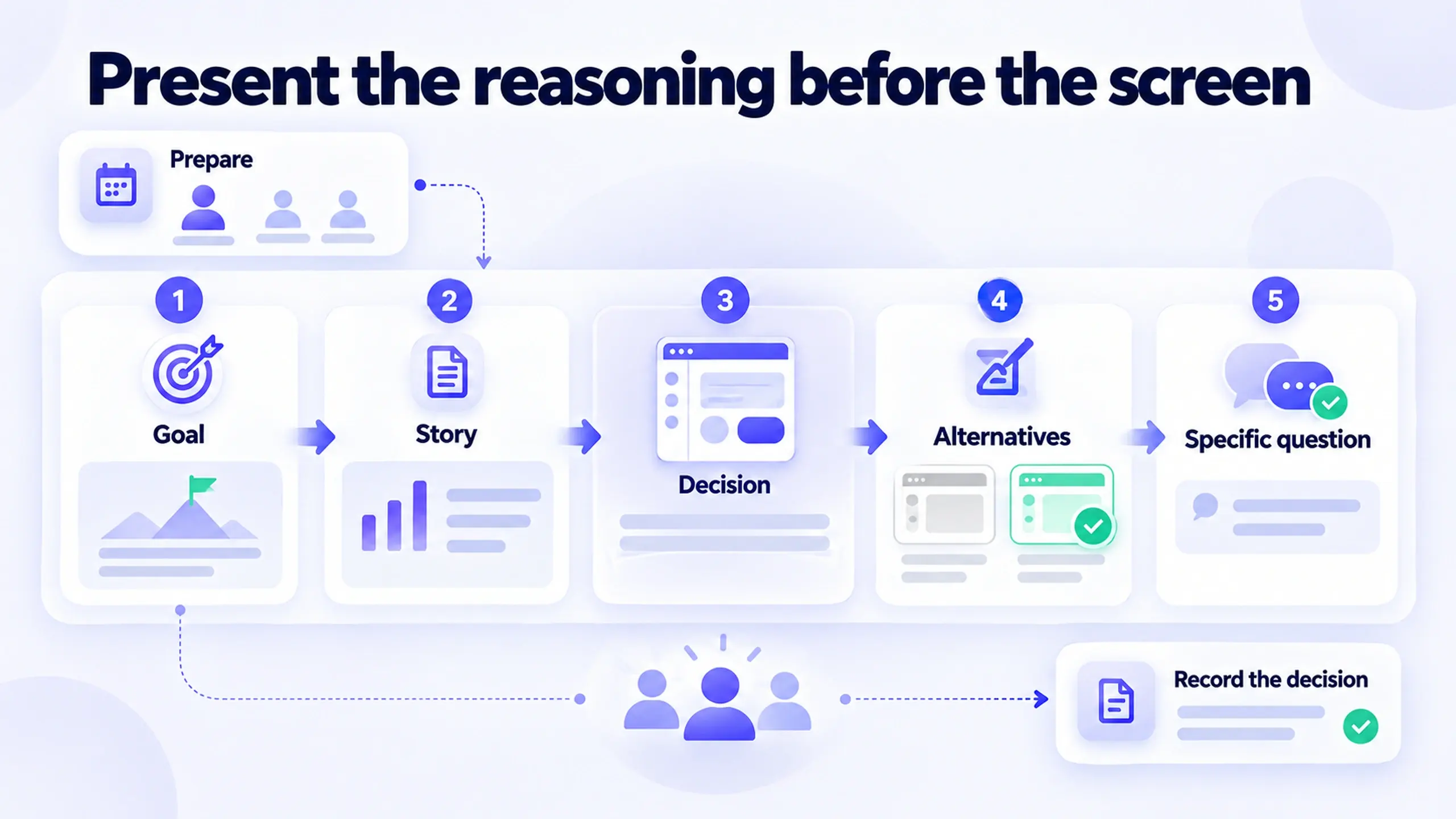
A room of non-designers isn't disagreeing with your taste. They're reacting to a decision without having seen the reasoning behind it. If you walk in showing only the final screen, the only thing they can evaluate is how it looks to them personally. The fix isn't a better screen. It's a better sequence: goal, story, decision, alternatives, then an explicit invitation to disagree on specifics.
The framework draws on two sources:
- Tom Greever's Articulating Design Decisions (O'Reilly) argues that the problem in these meetings is defensiveness, not disagreement. Once you're defending yourself instead of the goal, you've lost track of the thing the room cares about.
- Nielsen Norman Group's guidance on presenting UX design ideas, from NN/g's Sarah Gibbons, makes a related point about structure: first give the background needed to understand the design, then walk through visuals that tell the whole story. Don't open with the finished interface and hope it speaks for itself.
Why "just show the design" doesn't work on this audience
A designer reviewing your work already has the context: the constraints, the process, the rejected directions. A non-designer stakeholder starts with none of that. If the first thing they see is the finished screen, they react to it the way anyone reacts to an image: do I like it, does it match what I pictured, does it look "designed enough." None of those questions touch whether the decision solves the problem.
Being more articulate about typography won't fix that, because it isn't a knowledge gap. It's a sequencing problem:
- Show the reasoning before the result, and the room evaluates the reasoning.
- Show the result before the reasoning, and the room compares their taste to yours. Design can't win that debate, because the debate was never about the work.
There's also an old name for why visuals attract so much of the room's attention. C. Northcote Parkinson's law of triviality (usually called bikeshedding) describes how a committee will spend minutes on a nuclear reactor it doesn't understand and an hour on the bike shed, because everyone feels qualified to judge the bike shed. Color, spacing, and copy are design's bike shed. Everyone has an opinion on them, so an unframed screen pulls the conversation straight to them.
The screen is the most discussable part of a design decision and usually the least important. Frame the decision first, or the room will talk about the bike shed.
Before the room: preparation that decides the meeting
Most design reviews are won or lost before anyone opens the file. By the time you present, the work below should already be done.
Know who decides
Not everyone in the room has the same role, and treating them as if they do is how you end up designing by committee. Before the meeting, sort attendees into three groups:
- The decider. The one person (sometimes two) whose "yes" makes this ship. If you can't name them, find out before the meeting, not during it.
- Advisors. People whose input shapes the decision: engineering on feasibility, sales on revenue impact, legal on risk. Their concerns deserve real answers, but they don't hold the pen.
- Informed. People who need to know the outcome but aren't there to weigh in. They can sit out the debate.
Map what each person is listening for
Every stakeholder hears your presentation through their own goal. Prepare for that ahead of time:
| Stakeholder | What they're listening for | What to have ready |
|---|---|---|
| Executive | Does this move the metric we committed to? | The goal, the expected impact, and the risk if it's wrong |
| Product manager | Does this fit scope, timeline, and the roadmap? | What's in this release versus later, and why |
| Engineering | Can we build it, and what does it cost? | Known edge cases, component reuse, and what's truly new |
| Sales / CS | Will this break a workflow customers rely on? | How existing users are affected and how the change is shown |
| Marketing | Is this on-brand, and can we talk about it? | The user-facing benefit in one sentence |
| Legal / compliance | Does this create exposure? | Consent, data, and accessibility implications |
You won't need every row in every meeting, but most "surprise" objections were predictable, and the stakeholder who raises one is usually telling you their job, not attacking yours.
Pre-wire the most likely objection
If you know who is most likely to push back, show them the decision one-on-one before the meeting. Hearing a concern in private gives you time to answer it properly. Hearing it for the first time in front of the decider leaves you improvising. It also gives that stakeholder a chance to shape the work, which often turns an opponent into someone who helped build it.
In practice: a fifteen-minute preview with the engineering lead or the sales director is usually the best-value prep you can do. If their concern changes the design, better now than after the review.
Decide what's open for discussion, and what isn't
Walk in knowing which parts of the design are settled (validated in testing, required by a constraint) and which are open (reasonable either way, happy to take input). Say so out loud. A room that knows the button hierarchy is settled but the empty-state copy is open will spend its energy on the open part.
Translate design language into the room's language
Design vocabulary is precise, but to most stakeholders it sounds like opinion wearing a lab coat. Translate the principle into the outcome it produces:
| Designer says | What the room often hears | Say instead |
|---|---|---|
| "It's cleaner" | "I like it more" | "Removing the secondary links cut the number of choices on this step from nine to four" |
| "Better visual hierarchy" | Jargon | "People see the primary action first, which is the action we're measured on" |
| "It's a UX best practice" | "Trust me" | "Most tools your users already know work this way, so there's less to learn" |
| "Users will be confused" | A guess | "In five of eight test sessions, people clicked the wrong option here" |
| "It's more accessible" | A nice-to-have | "The current version fails WCAG contrast requirements, which is a legal and usability risk" |
| "We need more whitespace" | Wasted space | "Grouping related fields reduces errors on long forms" |
Each of these ties the design choice to a result the stakeholder already cares about. If you can't make that connection, it's worth asking whether the decision is as solid as you thought.
A five-part structure for defending one decision
This is built for one specific decision under discussion, not a full portfolio walkthrough. Use it whenever you need a room to engage with a choice instead of reacting to it.
- Restate the goal everyone already agreed to. Before showing anything, name the outcome the project is supposed to produce, in the stakeholders' own words. It can feel like throat-clearing, but it sets the standard the rest of the conversation gets measured against. If the room disagrees about the goal, stop there, because that's the conversation you need to have first.
- Walk through the story that led here, briefly. What you learned, what constraint showed up, what an earlier version got wrong. This is the "set the stage" step from NN/g's guidance. The room needs enough background to see the decision as the answer to something, not an arbitrary preference.
- Show the decision, and say explicitly what it does for the goal from step one. Not "I made it blue." Instead: "I made the primary action visually dominant because task completion is the metric we agreed to move, and in testing, people missed the action when it wasn't."
- Show what you rejected, and why. This one step heads off most "did you consider X" pushback, because the honest answer is usually "yes, and here's what it cost." One or two credible alternatives are enough. Ten looks like indecision.
- Ask for specific disagreement, not general reaction. Instead of "what do you think," ask "does this achieve the goal, and if not, what specifically is it missing?" People can answer that. "What do you think" invites a round of individual aesthetic opinions that don't lead anywhere.
Answer first, screen later
Executives are often coached to expect the answer first, and that fits with this structure. Say the recommendation in one sentence at the start ("we're recommending removing the company-size field from signup"), then run the five steps before the screen goes up. The headline tells the room where you're going. Holding back the visual keeps them evaluating the reasoning instead of the pixels.
How long each part should take
| Part | Rough time in a 30-minute review | Common mistake |
|---|---|---|
| 1. Goal | Under 1 minute | Skipping it because "everyone knows" |
| 2. Story | 1 to 2 minutes | Turning it into a full process retrospective |
| 3. Decision | 3 to 5 minutes | Explaining every pixel instead of the choice |
| 4. Rejected alternatives | 2 to 3 minutes | Not preparing any |
| 5. Specific question | The rest | Asking "thoughts?" and waiting |
In practice: steps one and two take less time than most people budget, usually under two minutes combined, and they're what make step five possible. Skip straight to step three and step five has nothing to connect to.
Read the objection before you answer it
Pushback comes in different kinds, and each kind needs a different response. Answering a business concern with a design principle, or a taste comment with a data dump, is how reviews turn into standoffs.
| Type of objection | What it sounds like | What it needs |
|---|---|---|
| Taste | "I just don't love the color" | A clarifying question that ties it back to the goal. Rarely a concession |
| Business concern | "Sales needs that field for lead routing" | A real answer, and possibly a changed decision. This is new information |
| Risk / fear | "What if existing users can't find it?" | Evidence you already have, or a concrete plan to test and monitor it |
| Cost / scope | "That's three sprints of work" | A trade-off conversation: what you'd cut, phase, or reuse to get the core outcome |
| Missing context | "Why don't we just do what [competitor] does?" | Go back to the story. Often the answer is a constraint they didn't know about |
| Authority / politics | "The CEO won't like this" | Not solvable in the room. Take it offline and bring the reasoning to the actual decider |
Before answering, say back what you heard. "So the concern is that removing the field breaks lead routing for sales. Is that right?" Often the stakeholder corrects you, and the objection turns out to be narrower and easier to solve than it first sounded.
Handling pushback without getting defensive
Greever's central point is that the goal of this conversation is not to win it. The goal is to defend the project's goal and the reasoning behind the decision, which is different from defending yourself. Once the conversation becomes about whether you're right, it stops being useful to anyone, including you.
| Weak response | Improved response |
|---|---|
| "I disagree, I think this is the better approach" | "Help me understand what's driving that. Is it a concern about the goal, or a preference for a different look?" |
| Explaining the same rationale louder | Asking what specific evidence would change their mind, or yours |
| Agreeing on the spot to avoid conflict | "Let me take that back to the team and come back with an answer, rather than deciding it in this room" |
| Treating every objection as something to overcome | Treating a specific, well-reasoned objection as new information that might change the decision |
| "Users will hate that" | "Here's what we saw in testing when we tried something close to that" |
| Going silent and moving on | "I want to make sure I understand. Can you say more about what worries you there?" |
A specific objection tied to the goal deserves a real answer, and possibly a changed decision. A vague one ("I just don't love it") deserves a clarifying question, not a concession. If you give in to vague pushback just to end the discomfort, stakeholders learn that vague pushback works, and they'll keep using it.
Notice when it's become personal
You'll know you've drifted from defending the decision to defending yourself when you catch yourself:
- saying "I" more than "the goal" or "users"
- re-explaining something they already heard, only louder
- mentally rehearsing your comeback instead of listening to the rest of their sentence
- feeling the objection as a verdict on your skill
When that happens, go back to step one out loud: "Let's check this against what we're trying to achieve." That resets the room, and it resets you too.
When to change your mind, and when to disagree and commit
The framework isn't a way to always get your design through. Sometimes the right result is a different decision.
Change the decision when:
- the objection introduces a constraint or goal you didn't know about (the lead-routing case below)
- the stakeholder has evidence you don't, such as customer conversations, contract terms, or support data
- your rejected alternative turns out to meet the goal better than you thought once their concern is included
Hold the decision when:
- the objection is about taste and nobody can connect it to the goal
- the pushback contradicts evidence you've already shown, and no new evidence has come up
- the concern is real but can be solved without undoing the core decision
When the decider hears everything and still goes the other way, Amazon's term applies: "disagree and commit," which Jeff Bezos described in his 2016 shareholder letter. You state your disagreement clearly, then commit fully to making the chosen direction succeed. Designers should add one step: write your disagreement down (see closing the loop below), so that if the outcome doesn't land, the team can revisit the decision on evidence instead of memory.
Losing a design argument is fine. Losing it without a written record of the reasoning is a missed chance to be right later.
A worked example: cutting a form field
The following is a simplified, hypothetical example meant to illustrate the structure, not a documented case study.
A designer wants to remove a company-size dropdown from a signup form. An executive stakeholder wants to keep it, because sales uses it for lead routing.
Weak version: the designer shows the shortened form and says "this converts better, fewer fields is a UX best practice." The executive hears their own concern (lead routing) go unaddressed and pushes back on the whole change.
Improved version, following the five-part structure:
- Goal: "We agreed the priority this quarter is increasing signup completion."
- Story: "In the drop-off data, company size was the field most people abandoned on, right before completing signup."
- Decision and impact: "Removing it from the signup step should reduce that specific drop-off point, based on the funnel data."
- Rejected alternative: "We considered making it optional instead, but optional fields on this form still showed a smaller, similar drop-off in an earlier version, so we don't expect that alone to solve it."
- Invite specific disagreement: "Does this still meet the lead-routing need, or is there a way to capture company size after signup instead of during it?"
Why it matters: the improved version doesn't win by being more persuasive. It wins because the executive's concern, lead routing, gets a direct answer (move the field to after signup) instead of being left to fight the whole decision because it felt ignored.
What the pre-wire would have added: a ten-minute conversation with the sales lead the day before would have surfaced lead routing ahead of time. The designer could then have walked in with the post-signup capture step already sketched, and step five would have become a confirmation instead of a negotiation.
Presenting remotely or asynchronously
A lot of design decisions now get made in a video call with cameras off, or in a document comment thread with no meeting at all. The structure still works there, but the delivery has to change.
- Send a short pre-read. A written version of the five parts, sent a day ahead, lets people think before they react. Amazon's practice of opening meetings with silent reading of a narrative memo exists for the same reason: prose forces the reasoning to be explicit, in a way slides let you skip.
- Put the goal in writing at the top. In async review, people skim. If the goal isn't in the first two lines, most readers will judge the screenshot without it.
- Ask the step-five question in writing, and specifically. "Comments welcome" gets you taste. "By Thursday: does this meet the signup-completion goal, and does it break anything for your team?" gets you answers you can use.
- On video calls, share the screen late. Talk through the goal and story with your face on camera, then share. Once the screen is up, attention goes to it and stays there.
- Record a short walkthrough for stakeholders who can't attend, following the same order. A two-minute recording that opens with the goal is better than a Figma link with no context.
NN/g's strategies for presenting UX remotely cover the practical side of remote delivery, from audio setup to keeping slides to one idea each.
After the meeting: close the loop
The review isn't finished when the call ends. Within a day, send a short written record of what was decided. It takes five minutes, and it protects the decision better than anything you said in the meeting.
- What was decided, in one sentence
- Why, tied back to the goal
- What was rejected, and the reason
- Open questions and owners, such as "sales to confirm post-signup capture works for routing, by Friday"
- What would reopen it: the metric or signal that would make the team revisit this decision
The last item is the most useful one. It turns "we decided" into "we decided, and here's how we'll know if we were wrong," which makes future disagreements about evidence instead of about who remembers the meeting correctly.
Common mistakes that turn a presentation into a standoff
- Opening with the finished screen instead of the goal and the story behind it, which invites reaction instead of evaluation.
- Treating every pushback as an attack on craft, when it's often a specific business concern (like lead routing above) that hasn't been addressed yet.
- Giving in to vague objections to end the discomfort, which teaches stakeholders that vague pushback is the fastest way to get what they want.
- Not preparing the rejected alternatives. If you can't say what you considered and ruled out, "did you think about X" becomes a real question you can't answer instead of one you've already handled.
- Asking "what do you think" instead of a specific, answerable question, which turns a decision review into an open floor for individual taste.
- Speaking in design jargon ("hierarchy," "affordance," "cleaner") without translating it into an outcome the room cares about.
- Not knowing who the decider is, and trying to get everyone in the room to agree when only one person's yes matters.
- Letting the meeting be the only record. Decisions nobody wrote down get reopened by whoever remembers them differently.
Frequently asked questions
What if the stakeholder outranks me and just overrules the decision anyway?
How do I present a decision I'm genuinely not confident about?
Does this framework work for group presentations with mixed stakeholders?
Isn't "did you consider X" a reasonable question stakeholders should be allowed to ask?
Doesn't this contradict the advice to give executives the answer first?
What if I don't have research data to back the decision?
Before your next design review
Before the room
- Name the decider, and know who's advising versus who's just being informed
- Anticipate what each stakeholder is listening for, and have an answer ready
- Pre-wire the decision with whoever is most likely to push back
- Prepare one or two rejected alternatives and the reason each didn't make the cut
- Decide which parts are settled and which are open for input
In the room
- State the goal in the stakeholders' own language before showing anything
- Give the recommendation in one sentence, then the story, then the screen
- Connect the decision explicitly to the goal, not just to a design principle
- Replace "what do you think" with a specific, answerable question
- Repeat each objection back before answering it
- Notice when you're defending yourself instead of the decision, and go back to the goal
After the room
- Send a written record: decided, why, rejected, open questions, what would reopen it
- Follow up on every "let me take that back" within the time you promised
None of this makes disagreement disappear, and it shouldn't. A specific, well-reasoned objection is useful information, not an obstacle. The goal is a room that argues about the decision instead of about you.
Collaboration and Influence: 5 Skills That Get Design Decisions Shipped covers the broader stakeholder work this framework assumes is already in place: working out who has decision authority, and what evidence would settle a disagreement before you're ever in the room. Jakob's Law is a useful companion read too. Familiar patterns are one of the few design arguments a non-designer can evaluate without any framework at all.
What's the last design decision you had to defend that you wish you'd opened with the goal instead of the screen?
Part 5 of 30 · The Product Designer's Playbook
This post was edited with AI assistance for clarity and formatting.

Sanjay Shrestha
Senior Product Designer · CUA™ Certified
15+ years designing enterprise SaaS, B2B, and government digital products. Currently at Decisions.
Keep Reading